wedding photography melbourne

Melbourne wedding photography: Couples’ matching color scheme styling combination

Melbourne Wedding Photography Matching Color Palettes: How Couples Are Nailing the Coordinated Look

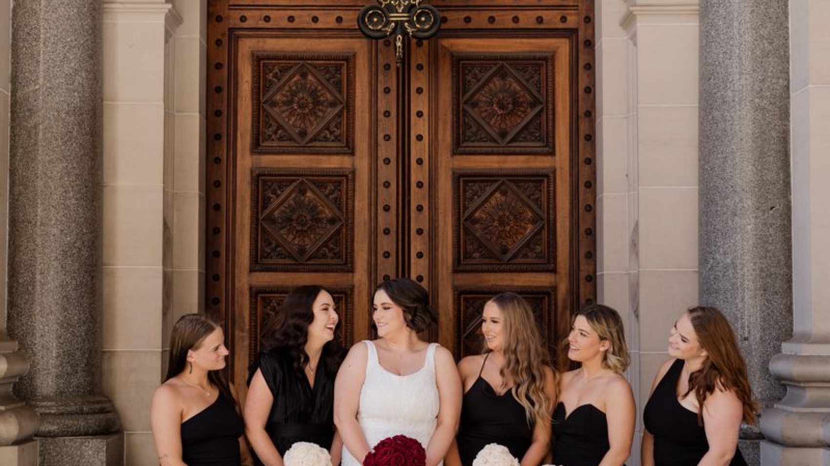
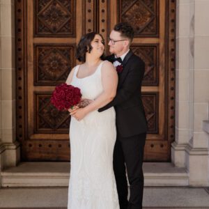
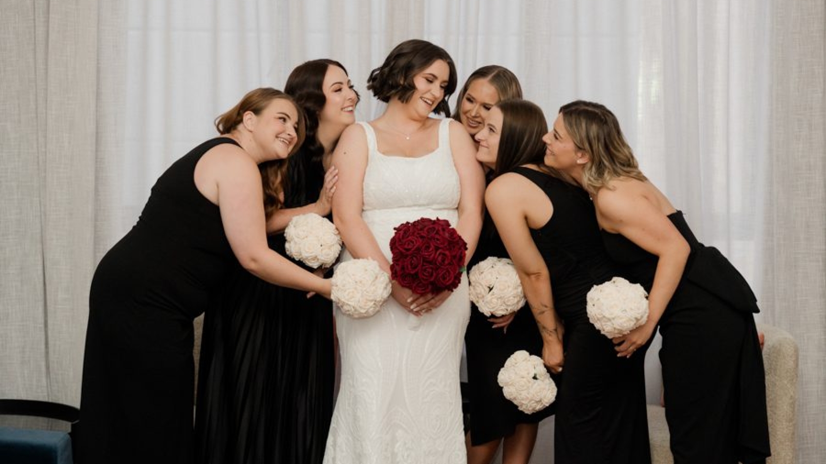
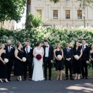
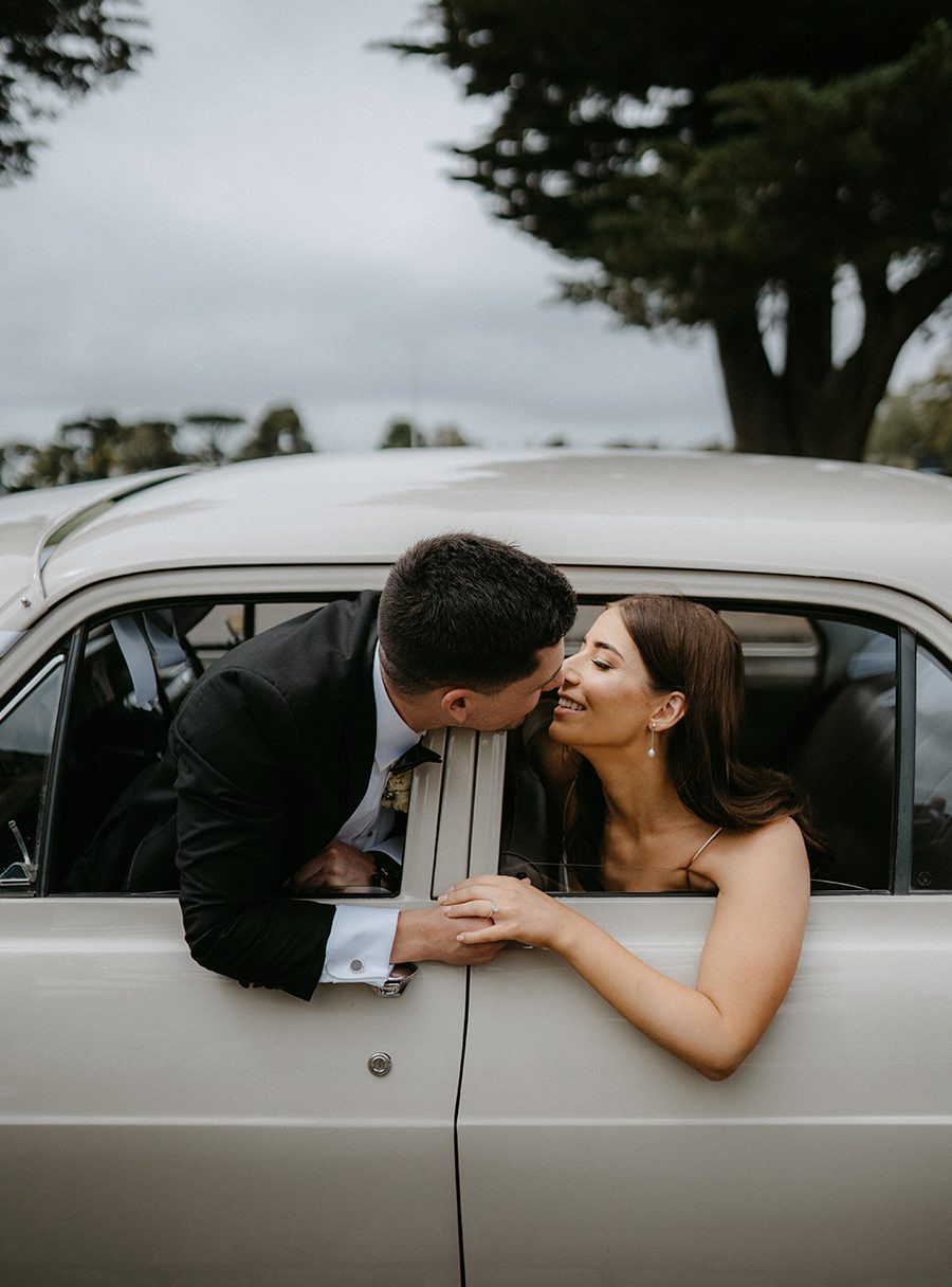
There’s something quietly powerful about a couple who shows up wearing the same colour story. Not identical outfits — that’s costume party territory — but a shared palette that ties everything together without screaming “we planned this.” Melbourne has become one of the top destinations for this exact aesthetic, and for good reason. The city’s natural light, its mix of urban grit and coastal softness, and the way couples here lean into individuality all make colour-coordinated wedding photography feel less like a trend and more like a natural choice.

wedding photography melbourne

Why Matching Colours Photograph So Well in Melbourne

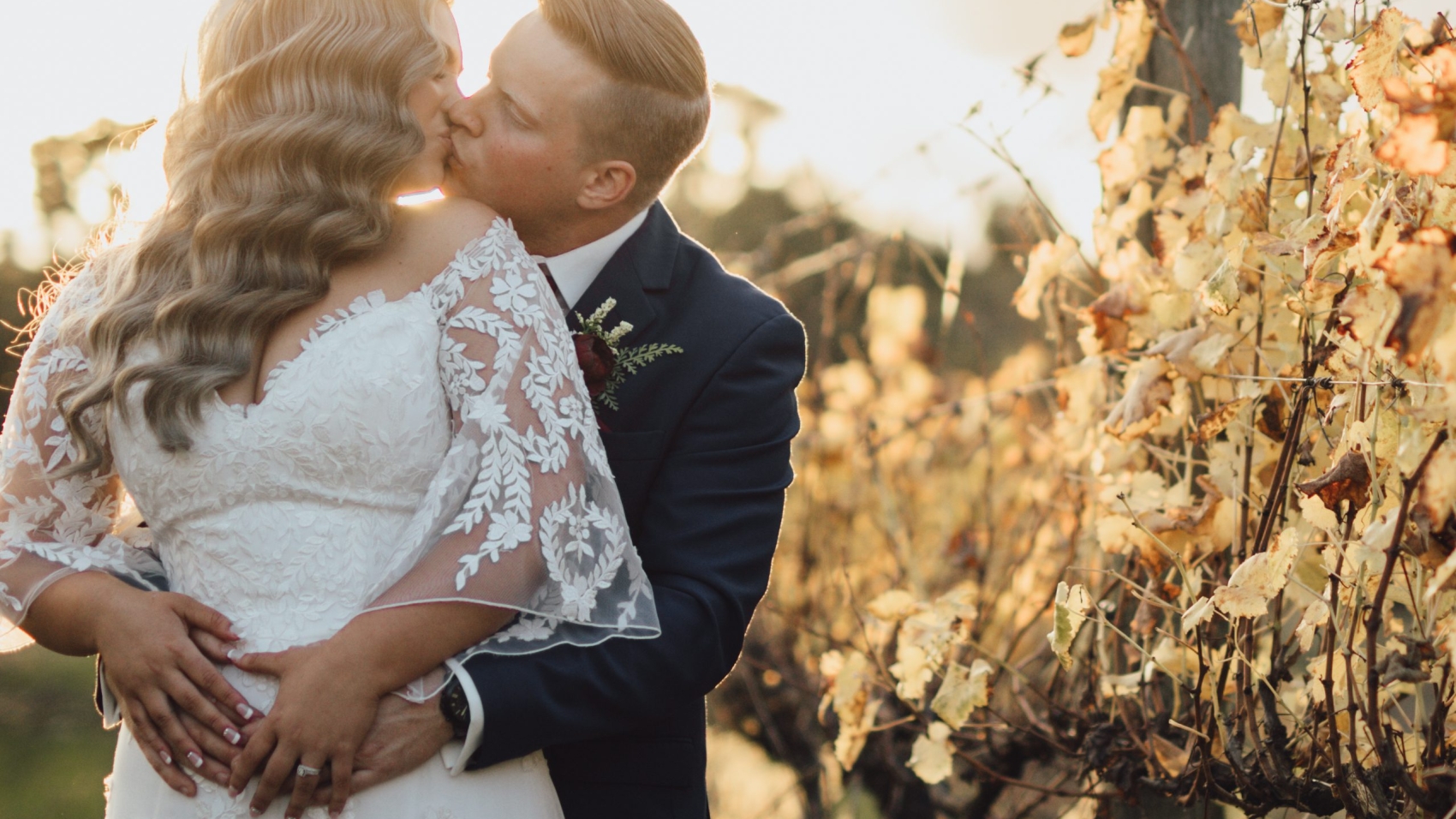
Melbourne’s light is deceptive. It shifts from cool and silvery in the morning to warm amber by late afternoon, especially along the coast or in the botanical gardens. When a couple wears a unified colour palette, that light wraps around both of them instead of competing. You get harmony in every frame without needing to overthink composition.

Photographers who shoot in Fitzroy’s colourful laneways or along the Yarra River know this instinctively. A couple in dusty rose and warm clay tones against a brick wall just works. The same couple in navy and ivory against a grey sky looks equally cinematic. The colour does the heavy lifting so the pose doesn’t have to.

This is also why Google searches for “Melbourne wedding photography matching outfits” and “couple colour coordination wedding photos” keep climbing. People aren’t just looking for ideas — they’re looking for a look that feels cohesive without feeling forced. And colour is the fastest way to get there.

Building Your Shared Palette Without Looking Like Twins

Start With One Anchor Colour, Then Branch Out

The mistake most couples make is picking two completely separate outfits that happen to share a random colour. That doesn’t read as coordinated. It reads as coincidence.

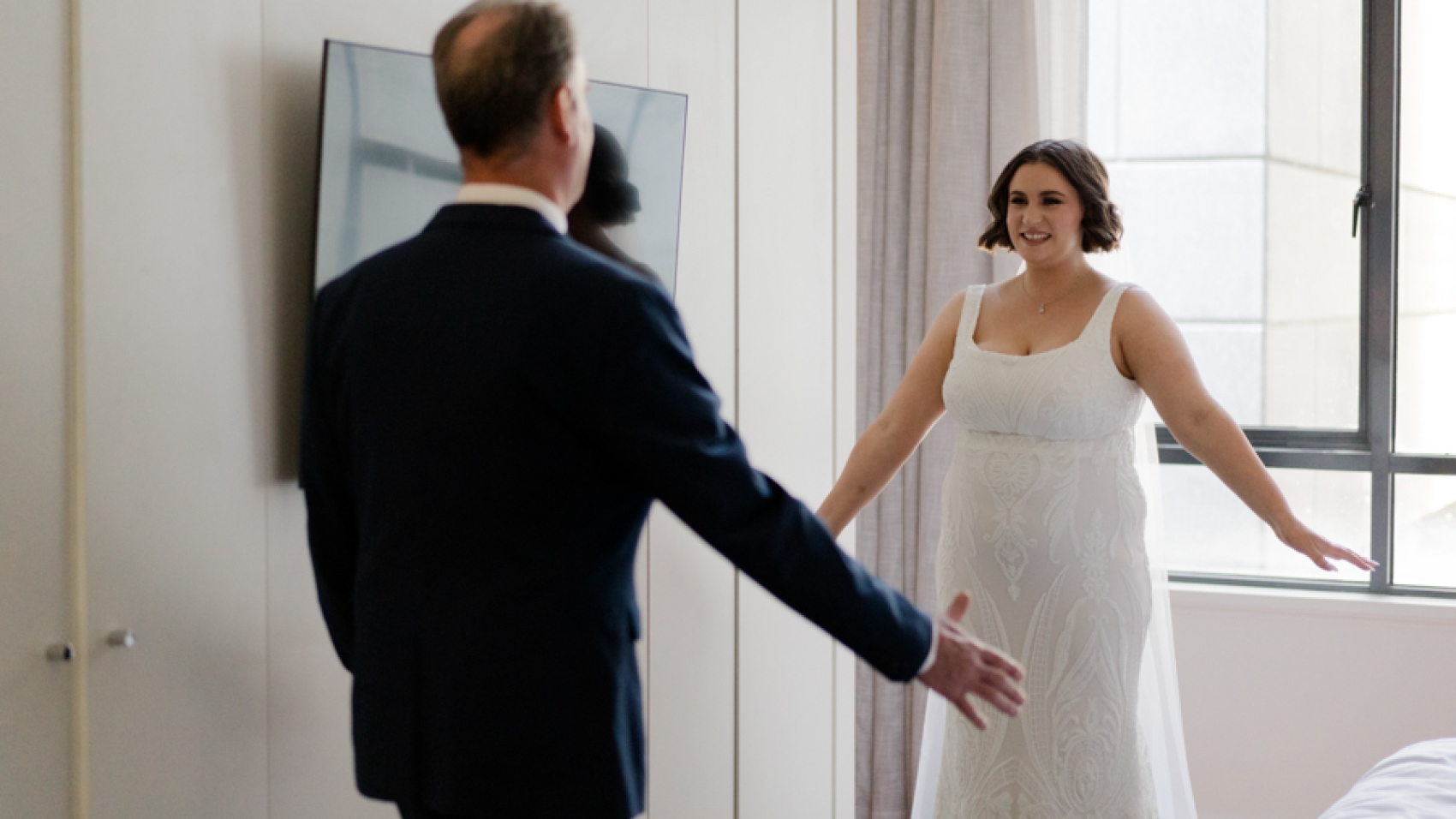
The better approach: pick one anchor colour — something like warm white, dusty blue, sage green, or terracotta — and build everything else around it. The bride might wear an off-white flowy dress while the groom goes with a cream linen shirt and khaki trousers. Same family, different expressions. It reads as intentional because it is.

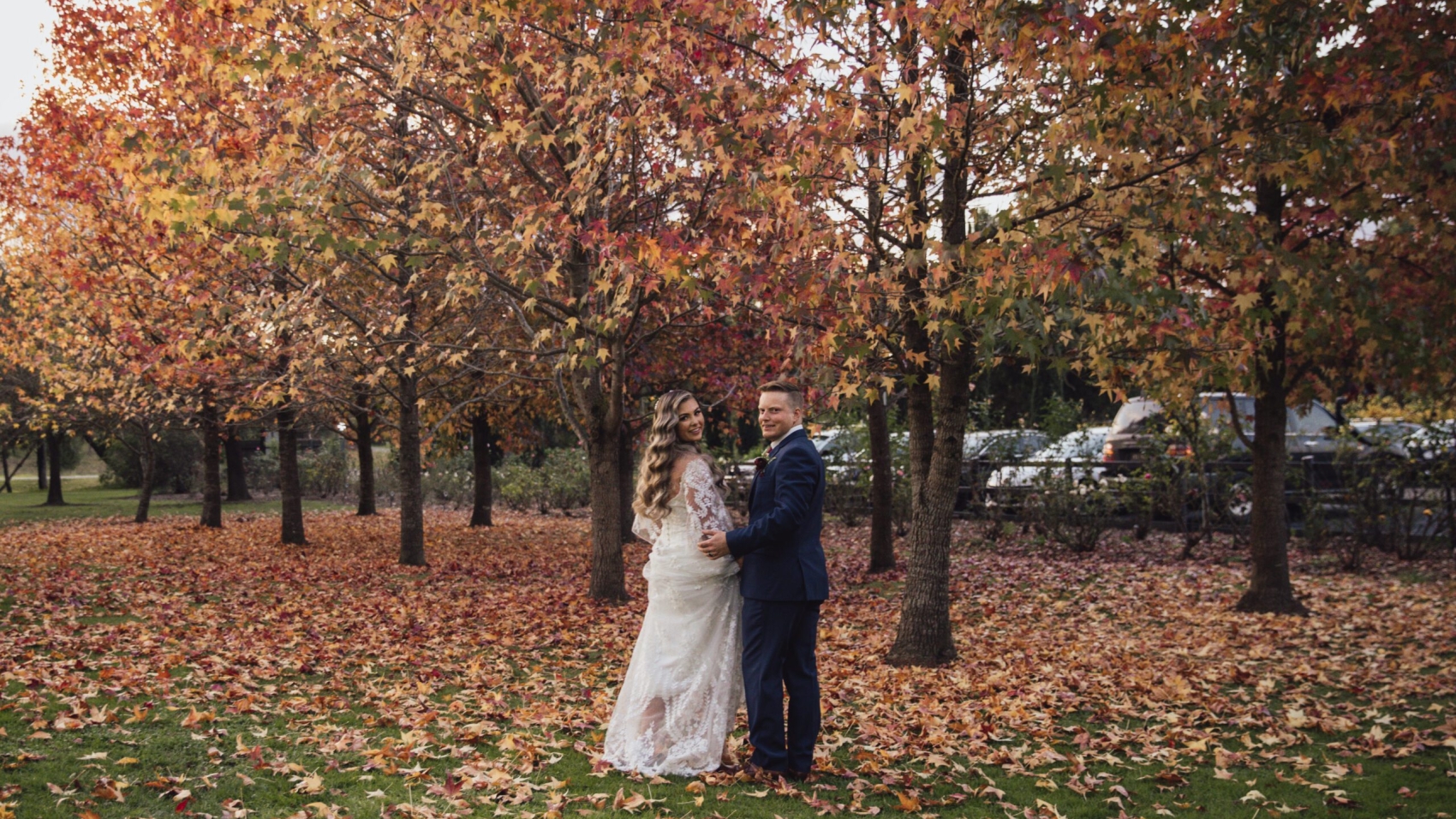
Melbourne’s autumn tones are incredible for this. Think burnt sienna, mustard yellow, deep olive, and warm sand. These colours exist everywhere in the city — in the leaves of the Royal Botanic Gardens, in the painted facades of Collingwood, in the sunset over Port Phillip Bay. Your outfit literally belongs to the location.

Tone-on-Tone Versus Contrast: Pick Your Lane

There are two directions you can go, and both work in Melbourne.

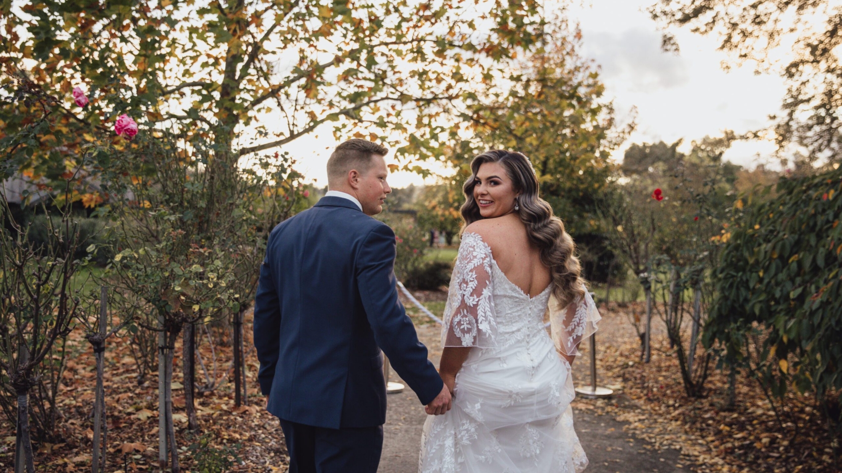
Tone-on-tone means you stay in the same colour family but vary the shades. She wears a blush pink midi dress, he wears a pale pink oxford shirt with grey trousers. It’s soft, romantic, and photographs beautifully in golden hour light. This works especially well for garden shoots, vineyard sessions, or anything near the Dandenong Ranges.

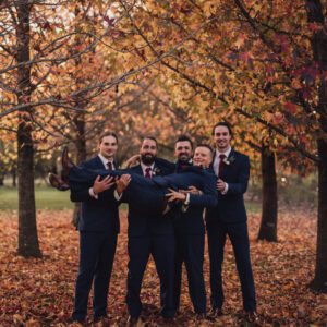
Contrast within a palette means you pick two colours from the same family and split them. She wears sage green, he wears forest green. She wears dusty blue, he wears navy. There’s still unity but more visual interest. This approach pops more in urban settings — the concrete and glass of Southbank, the street art of Hosier Lane, the industrial warehouses of Docklands.

Neither is better. It depends entirely on where you’re shooting and what mood you want.

The Role of Texture in Making Colours Feel Connected

Here’s something most styling guides skip: colour alone isn’t enough. Texture is what actually makes a coordinated look feel real instead of staged.

If the bride is in a silk slip dress in champagne, the groom shouldn’t wear a smooth cotton shirt in the same shade. That’s too matchy. Instead, he could wear a textured linen blazer in a slightly deeper tone. The silk and linen create visual contrast while staying in the same colour family. The eye reads it as “they belong together” without being able to point to exactly why.

This matters a lot in Melbourne because the city’s backdrops are already textured — exposed brick, weathered wood, ocean spray, dry grass. Your clothes need to play off that, not fight it.

Where to Shoot Your Colour-Coordinated Session in Melbourne

Coastal Spots That Love Warm Palettes

The Great Ocean Road, Brighton Beach, and Half Moon Bay are obvious picks, but here’s the thing — they don’t just look good with any colour. They love warm, earthy tones. Terracotta, sand, warm white, olive. These colours don’t compete with the ocean or the sand. They melt into it.

If you’re going with a cool palette — dusty blue, slate grey, icy white — skip the beach and head to St Kilda Pier at dusk or the Melbourne CBD skyline at blue hour. Cool tones against cool light is where that palette earns its keep.

Urban Melbourne and Muted Tones

Fitzroy, Carlton, and the CBD are where muted, desaturated palettes come alive. Think charcoal and cream, dusty rose and grey, olive and off-white. The city’s architecture — the bluestone buildings, the iron lace balconies, the concrete laneways — gives these colours a gritty, editorial edge that you simply can’t get in a studio.

Couples who shoot here often report that their photos look like they belong in a magazine spread, not a wedding album. That’s the power of letting the location inform your colour choice instead of the other way around.

Accessories: The Final Piece That Ties It All Together

This is where a lot of couples either nail it or completely miss the mark.

If your outfits are already colour-coordinated, your accessories should echo the palette — not introduce new colours. A simple leather bag in tan works with a warm palette. A woven clutch in natural fibre works with an earthy one. For the groom, a woven belt, a linen pocket square, or a simple woven bracelet all reinforce the look without adding visual noise.

Avoid anything shiny or metallic unless your entire palette is built around it. A gold watch against a dusty rose dress creates tension, not harmony. A matte brown leather watch against the same dress? That’s the kind of detail that makes a photographer nod approvingly.

Flowers and bouquets should follow the same rule. If the palette is warm, go with dried pampas, ranunculus in burnt orange, or wildflowers in muted yellow. If it’s cool, eucalyptus, white roses, or blue thistle. The bouquet is part of the colour story, not a separate element.

A Few Honest Things to Keep in Mind

Melbourne weather will test you. Wind can destroy a carefully styled look in seconds, especially near the coast or on hilltops. If your palette includes lightweight fabrics — linen, chiffon, cotton voile — they’ll move beautifully in the breeze, which is great for photos. But they’ll also wrinkle, fly up, and stick to you in humidity. Have a plan for that.

Also, don’t force a palette you don’t actually like just because it photographs well. You’ll be wearing these clothes for hours, walking, sitting, climbing, laughing. If you hate the colour, it’ll show in your face. And no amount of colour coordination can fix that.

The couples who get the best photos in Melbourne aren’t the ones with the most expensive outfits or the most perfect palette. They’re the ones who picked colours they genuinely feel good in, trusted the light, and stopped trying to look like someone else.

wedding photography melbourne

Melbourne wedding photography – casual light outfit styling combination

Melbourne Wedding Photography Casual Outfit Pairing: Effortless Elegance Down Under

Melbourne is one of those cities where every laneway, coastline, and garden feels like it was built for a love story. When it comes to wedding photography here, more and more couples are ditching the stiff, over-the-top looks and leaning into something real — casual, relaxed, and full of personality. The key to nailing this aesthetic? It all starts with how you dress.

wedding photography melbourne

Why Casual Styling Works So Well in Melbourne

The city’s photography scene has shifted dramatically. Studios and photographers across Melbourne now excel in what they call “natural” and “artistic” shooting styles — capturing raw emotions, unposed moments, and the kind of candid joy you can’t fake. Think stolen glances, laughter mid-conversation, and golden hour strolls along the coast.

This approach demands clothing that moves with you, not against you. A flowing lightweight dress paired with a simple white shirt and rolled-up sleeves tells a completely different story than a heavy ballgown. The vibe is effortless, the energy is alive, and the photos end up looking like frames from an indie film rather than a catalogue shoot.

Location plays a huge role too. Whether you’re shooting at Brighton Beach with its colourful bathing boxes, the dramatic cliffs along the Great Ocean Road, or the heritage grandeur of the Royal Exhibition Building and Carlton Gardens — your outfit needs to feel at home in that setting. Casual doesn’t mean sloppy. It means intentional.

Picking the Right Pieces for a Relaxed Wedding Look

For the Bride: Light Fabrics, Clean Lines

The go-to choice for a casual Melbourne shoot is a lightweight sheer dress or a simple slip-style gown in ivory, champagne, or soft blush. These fabrics breathe in the wind and photograph beautifully against natural backdrops like the beaches at Half Moon Bay or the green expanses of the Mornington Peninsula.

Avoid anything with heavy embroidery, long cathedral trains, or overly structured bodices. They’ll fight you on uneven terrain and kill the spontaneous energy you’re going for. A mini or tea-length hem works better for running, walking, and climbing over rocks at places like the Twelve Apostles.

Colour-wise, stick to low-saturation tones. Pure white can wash out in bright sunlight, while a warm ivory or dusty rose blends seamlessly with Melbourne’s golden light. If you’re shooting in a garden or near the Yarra Valley, soft greens and muted pastels create that dreamy, editorial feel.

For the Groom: Ditch the Full Suit

A full tuxedo feels out of place when the whole concept is “let’s just be ourselves.” Instead, opt for a well-fitted blazer in navy or charcoal paired with a crisp white shirt — no tie, or a loose knit tie if you want a touch of formality. Rolled sleeves, an open collar, and clean leather shoes strike the perfect balance between polished and relaxed.

For beach or coastal shoots, linen trousers with a simple oxford shirt work wonders. The texture of linen photographs incredibly well, and it moves naturally in the ocean breeze. If you’re heading to the urban laneways of Fitzroy or Collingwood, a fitted crew-neck sweater with dark jeans and Chelsea boots gives off that effortlessly cool Melbourne vibe.

Matching Without Matching

Here’s a trick most photographers swear by: coordinate your colour palette without wearing identical outfits. If the bride is in ivory and blush, the groom can wear navy and white. If she’s in sage green, he can go with olive or warm grey. The connection is subtle but visible, and it makes the couple look like a unit without looking costumey.

Patterns should be minimal. A solid-colour dress for her, a solid-colour shirt for him. If you both want a little pattern, keep it small — maybe a subtle textured weave on his blazer that echoes the lace detail on her dress. That’s enough.

Accessories and Details That Make or Break the Look

Less is genuinely more when you’re going for a casual aesthetic. Aim for no more than two to three accessories total. A delicate pendant necklace, simple stud earrings, and a thin bracelet — that’s the ceiling.

For the bride, a short veil or a floral hairpiece works better than a grand cathedral-length veil. It keeps the silhouette clean and lets your face be the focus. Sunglasses are actually a brilliant prop for outdoor shoots — they add attitude and protect your eyes during those harsh Melbourne UV rays.

Footwear matters more than people think. Skip the stilettos entirely for outdoor sessions. A pair of clean white sneakers, leather sandals, or even bare feet on the sand at Brighton Beach will look far more authentic in the final images. Bring your heels only for the indoor or studio portion if you have one.

For the groom, a simple watch and a pocket square in a complementary tone are all you need. No cufflinks, no boutonniere unless the setting calls for it.

Hair and Makeup: Keep It Real

Melbourne weather is unpredictable — windy, dry, and the UV is no joke. Heavy contour and flawless matte foundation will melt by noon. The smart move is a dewy, skin-first makeup look with waterproof mascara, a tinted lip balm, and a light dusting of setting powder.

Hair should look lived-in. Loose waves, a messy low bun, or a half-up style with face-framing pieces all photograph beautifully and won’t fight the wind. Use a strong hold hairspray and bobby pins, and avoid anything that requires constant touching up.

If you’re shooting across multiple locations in one day — say, starting at Carlton Gardens in the morning and ending at a beach sunset — pack a small touch-up kit with blotting papers, lip balm, and a travel-size setting spray. It takes two minutes and saves your photos from looking greasy by 4pm.

Nailing the Unposed Energy in Front of the Camera

The whole point of a casual shoot is that it shouldn’t look posed. Melbourne photographers who specialise in this natural style will guide you through simple actions — walking hand in hand, laughing at something off-camera, leaning against a wall, sharing a coffee. You don’t need to perform. You just need to be present.

The best frames from these sessions are the ones where you forgot the camera was there. So pick outfits you actually feel comfortable in. If you can’t run in your dress or sit cross-legged on the grass without worrying about wrinkling it, choose something else. Comfort translates directly into confidence, and confidence is the single most photogenic thing you can wear.

81688-Sample-176

Melbourne wedding photography – Retro red lip makeup look combination

Melbourne Wedding Photography Vintage Red Lip Look: The Bold Bridal Makeup That Still Stops Traffic

There is a reason vintage red lip never dies. It worked in the forties. It worked in the seventies. It works now, and it will work in another fifty years. A red lip on a bride in Melbourne is not a trend. It is a statement. It says the bride knows exactly who she is and she is not interested in blending in.

The problem is that most brides get the red lip wrong. They pick the wrong shade, they apply it too thick, and they pair it with the wrong eye and cheek makeup. The result looks like a costume instead of a look. The vintage red lip in bridal photography is not about being bold for the sake of being bold. It is about being bold in a way that photographs beautifully, holds up in Melbourne wind, and ages like a fine wine instead of a cheap wine cooler.

wedding photography melbourne

Why Vintage Red Lip Works Differently in Melbourne Than Anywhere Else

Melbourne has a specific light quality that makes red lips either pop or disappear. The city sits at a latitude that gives it long, warm, golden-toned daylight for most of the year. That warm light amplifies red tones. A cool-toned red lip looks muddy in Melbourne light. A warm-toned red lip looks like it was painted there.

The Warm Undertone Rule

Not all reds are created equal. A blue-based red — think cherry or cranberry — turns purple under Melbourne’s warm afternoon light. The bride thinks she is wearing a classic red, but the camera sees a bruise.

The red that works in Melbourne is warm-based. Think brick red, chili red, or a deep tomato red. These shades have orange or brown undertones that harmonize with the warm light instead of fighting it. The lip looks red in the mirror and red in the photograph. No color shift. No surprises.

The Time of Day Changes Everything

A vintage red lip at noon in Melbourne looks harsh. The overhead sun washes out the warm undertones and leaves a flat, bright red that reads as costume-like. The same lip at four PM in Fitzroy Gardens looks like a painting. The low sun wraps around the face, the warm light deepens the red, and the lip becomes the focal point of every image without any extra effort.

Schedule the red lip shots for late afternoon. Not because the photographer says so. Because the light says so. A red lip at the wrong time of day is a wasted lip.

The Eye Makeup: Understated or the Whole Look Falls Apart

A red lip is loud. The eyes need to be quiet. This is the rule that most brides break, and it is the reason their red lip photos look off.

The Barely-There Eye

Skip eyeshadow or use one neutral shade — taupe, soft brown, or a warm beige. Apply it only in the crease and blend it out until it is barely visible. The goal is to define the eye shape without adding any color that competes with the red lip.

No shimmer. No glitter. No metallic tones. Anything that catches light on the eyelid draws the eye away from the lip. The lip is the star. The eyes are the supporting cast. They should not steal the scene.

The Liner Decision: Brown, Not Black

Black eyeliner with a red lip creates a harsh, high-contrast look that reads as edgy instead of elegant. Brown liner softens the entire face. It defines the lash line without creating a hard boundary.

Use a brown kohl pencil along the upper lash line. Smudge it slightly. Do not wing it. Do not extend it past the outer corner. Keep it tight to the lash line and keep it soft. The result is an eye that looks awake and defined but does not fight the lip for attention.

The Lash Choice: Wispy, Not Dramatic

False lashes with a red lip look like a nightclub, not a wedding. The bride needs natural-looking lashes — curled, coated with one or two layers of lengthening mascara, and nothing more.

If the bride wants more volume, use individual lash extensions. They look like naturally long lashes. Strip lashes look like strip lashes, and strip lashes with a red lip create a look that is too much for bridal photography. The vintage red lip is already making a statement. The lashes should not make a second one.

The Skin: Flawless But Not Plastic

A red lip on matte, cakey skin looks like a floating mouth. The skin needs to glow so the lip has something to sit against.

The Dewy Base That Holds Up

Start with a lightweight, dewy foundation. Not full coverage. The skin should look like skin, just better. Use a tinted moisturizer or a sheer foundation that evens the tone without masking the texture.

Set the T-zone with a translucent powder. Leave the cheeks, the forehead, and the jawline dewy. The powder prevents shine where it matters. The dewy areas catch the light and give the face dimension. A red lip on dewy skin looks rich and expensive. A red lip on matte skin looks flat and cheap.

The Contour Mistake With Red Lips

Heavy contour is the enemy of a red lip. The warm brown tones of contour powder clash with the red and make the face look muddy. If contour is needed, use a cream contour in a shade that matches the skin tone — not a cool bronze, not a warm tan. Just a subtle shadow along the cheekbones and the jawline. Enough to give shape, not enough to add a second color to the face.

Highlighter Placement Matters

Highlighter should go on the high points — cheekbones, nose bridge, cupid’s bow, and inner eye corners. But with a red lip, keep the highlighter subtle. A glittery highlighter competes with the lip. A cream or liquid highlighter that melts into the skin complements it. The goal is a soft glow, not a spotlight.

The Cheek: Warm Flush, Never Pink

Pink blush with a red lip is a color clash. The pink pulls cool against the warm red and the face looks unbalanced. The cheek needs to be warm — peach, soft coral, or a light bronze.

Cream Blush Applied With Fingers

Use a cream blush in a warm peach or soft terracotta tone. Apply it with the ring finger — the lightest touch — on the apples of the cheeks. Blend upward toward the temples. The amount should be barely visible in the mirror but obvious in the photograph.

If the bride can see the blush in the mirror, there is too much. The camera amplifies color. What looks subtle on the face looks perfect in the image.

Bronzer Instead of Blush for Warm-Toned Skins

For brides with warm or olive skin tones, skip blush entirely and use a light bronzer across the forehead, temples, and jawline. The bronzer mimics the effect of sunlight and gives the face warmth without adding a separate color. It harmonizes with the red lip instead of competing with it.

The Lip Application: Technique Is Everything

The shade is only half the battle. The application determines whether the red lip looks vintage and elegant or cheap and overdone.

The Lip Liner Trick

Always line the lips before applying the lipstick. Use a lip liner that matches the lipstick shade exactly — not a shade darker, not a shade lighter. Trace the natural lip line. Do not overline. Overlining was a trend that ended years ago and it does not photograph well. The exaggerated shape looks artificial in wide-angle shots.

The liner prevents the lipstick from feathering, especially in Melbourne wind. A red lip that bleeds past the lip line looks messy in every photograph. The liner keeps it contained and clean.

The Matte Versus Satin Debate

Matte red lip looks powerful but it can look dry in photographs, especially in close-ups where the lip texture shows every crack. Satin red lip has a slight sheen that keeps the lip looking hydrated and smooth. It catches the light without creating hot spots.

For Melbourne bridal photography, satin is the safer choice. It photographs well in both outdoor and indoor light. Matte works too, but only if the lip is well-moisturized before application and the bride reapplies after every drink and every kiss.

The Blotting Method for Longevity

Apply the lipstick. Blot with a tissue. Apply again. Blot again. Apply a final thin layer. This three-layer blotting method locks the color without building up thickness. The lip looks saturated but not heavy. It lasts through the ceremony, the photos, and the first dance without smearing on the groom’s cheek.

The Hair and the Red Lip: They Need to Agree

A vintage red lip with messy hair looks accidental. A vintage red lip with a clean, structured hairstyle looks intentional.

The Updo That Lets the Lip Breathe

A low chignon or a French twist keeps the face clear and lets the red lip be the focal point. The hair should not frame the face so tightly that it competes with the lip. Pull the hair back, expose the jawline, and let the lip do the talking.

Soft waves that fall away from the face work too. The waves add movement but they do not cover the lip. The lip stays visible in every angle, which is what you want.

The Hair Color Connection

Dark hair with a red lip is a classic combination. It creates contrast and the lip pops against the dark frame. Blonde hair with a red lip works too, but the red needs to be warmer — a tomato red instead of a cherry red — to harmonize with the blonde tones.

Red hair with a red lip can look stunning or it can look like too much red. If the bride has red hair, go for a deeper, darker red lip — think burgundy or wine — to create a tonal harmony instead of a color clash.

The Dress and the Red Lip: What Works and What Does Not

The dress color changes how the red lip reads in photographs.

White Dress and Red Lip: The Classic

A white dress with a red lip is the most photographed combination in bridal history for a reason. The contrast is clean. The lip stands out against the white without any competing colors. This is the safest choice and it never looks wrong.

Ivory Dress and Red Lip: The Warmer Option

Ivory has a yellow undertone that harmonizes with warm-based reds. The combination looks richer and more vintage than white and red. It photographs beautifully in Melbourne’s warm light because the dress and the lip share the same warm tone.

Black Dress and Red Lip: The Bold Move

A black dress with a red lip is dramatic. It works for evening shoots or editorial-style sessions. But it is not a safe choice for traditional bridal photography. The black absorbs light and the red lip becomes the only source of color. In some images this looks incredible. In others it looks like the bride is floating in a dark void with a mouth. Know the lighting setup before committing to this combination.

The Accessories: Less Is More With a Red Lip

A red lip is already making a statement. The accessories should support it, not compete with it.

Gold Over Silver

Gold jewelry warms the face and complements a red lip. Silver jewelry cools the face and can make the red lip look harsh. If the bride is wearing earrings, a necklace, or a hairpiece, go gold. It harmonizes with the warm tones of the lip and the Melbourne light.

Fresh Flowers, Not Crystals

A crystal headpiece with a red lip creates too much visual noise. The crystals catch light, the lip catches light, and the eye does not know where to look. Fresh flowers — white roses, peonies, or ranunculus — complement the red lip without competing with it. The flowers add softness. The lip adds power. Together they balance.

The Wind Problem: Melbourne’s Secret Enemy

Melbourne wind does not care about your makeup. It will smudge a red lip in seconds if it is not set properly.

The Setting Spray Layer

After the lipstick is applied and blotted, mist the entire face with a setting spray. Hold the spray about thirty centimeters away and mist in a sweeping motion. Let it dry for ten seconds before touching the face. This sets the lipstick without smearing it.

The Touch-Up Kit

Pack the lipstick, the lip liner, a tissue, and a mirror. The bride should touch up the lip after every wind gust, every drink, and every kiss. A red lip that smears at the corner of the mouth looks sloppy in photographs. A red lip that stays sharp looks intentional.

The vintage red lip is not for every bride. It is for the bride who knows she wants to be remembered. It is the look that stops people on the street. It is the look that ages better than any nude, any pink, any berry. Red is forever, and in Melbourne light, it looks like it was invented for this city.

wedding photography melbourne

Melbourne wedding photography – fresh nude makeup design

Melbourne Wedding Photography Fresh Nude Makeup: The Look That Photographs Better Than Anything Bold

A bride walks into a Melbourne studio or steps out onto a Fitzroy street in golden hour light, and the camera catches her face. The skin glows. The lips look like they always looked — just better. The eyes are open and awake. There is no heavy contour, no dramatic smoky eye, no false lashes casting shadows on her cheekbones. That is the fresh nude look, and it is the single most photographed bridal makeup style in Melbourne right now. Not because it is trendy. Because it is the only look that survives the camera without looking like a different person.

Melbourne Wedding Photography Fresh Nude Makeup: The Look That Photographs Better Than Anything Bold
A bride walks into a Melbourne studio or steps out onto a Fitzroy street in golden hour light, and the camera catches her face. The skin glows. The lips look like they always looked — just better. The eyes are open and awake. There is no heavy contour, no dramatic smoky eye, no false lashes casting shadows on her cheekbones. That is the fresh nude look, and it is the single most photographed bridal makeup style in Melbourne right now. Not because it is trendy. Because it is the only look that survives the camera without looking like a different person.

Heavy makeup was made for close-up cinema. Nude makeup was made for photography. The two do not mix. A smoky eye that looks incredible at arm's length turns into a dark smudge under a ring light. A bold lip that reads well in a mirror reads as a red blob in a wide-angle portrait. Fresh nude makeup avoids all of that. It works with the light instead of fighting it.

Why Nude Makeup Dominates Melbourne Bridal Photography
Melbourne light is the reason. The city gets long stretches of soft, diffused daylight — especially in the mornings and late afternoons when most wedding shoots happen. That light is forgiving, but it is also honest. It shows every layer of foundation, every crease of eyeshadow, every line of lipstick. Heavy makeup does not hide in Melbourne light. It accumulates.

The Golden Hour Problem With Bold Makeup
Golden hour in Melbourne hits between five and seven PM in summer and earlier in winter. The light is warm, directional, and low. It wraps around the face and creates long shadows under the nose, the chin, and the brow bone.

Bold contour creates hard shadows that look unnatural in this light. The contour line that looked sculpted in studio lighting looks like a bruise in golden hour. The same applies to heavy blush — it reads as a flat color patch instead of a natural flush. Nude makeup blends into the warm light instead of clashing with it. The skin looks like skin, just perfected.

The Wind Factor Nobody Considers
Melbourne is windy. The Yarra River corridor, the coastal locations, the rooftop venues — all of them have gusts that pick up without warning. Wind moves hair across the face, and when hair sticks to makeup, it reveals every layer.

Heavy foundation cracks when hair sticks to it. Waterproof mascara smears when wind pushes tears — and Melbourne wind makes eyes water. A fresh nude look with minimal product stays intact when the wind hits. The makeup moves with the skin instead of peeling off it.

The Foundation Strategy: Less Is Always More
The base is everything. Get it wrong and nothing else matters.

Skin-First, Not Coverage-First
Most bridal makeup starts with full coverage. That is the mistake. Full coverage foundation sits on top of the skin like a mask. In photographs, it looks flat. It has no texture. It does not glow.

Start with skin. Cleanse, moisturize, and let the skin breathe for twenty minutes before any product goes on. Use a tinted moisturizer or a very light foundation — just enough to even out the tone, not enough to change the texture. The goal is to let the skin show through. The camera will pick up that translucency and it will look alive.

If there are blemishes, cover them individually with a concealer. Do not blanket the entire face. A few spot-treated areas surrounded by bare skin look more natural than a fully covered face that looks like it has been airbrushed.

The Dewy Finish That Melbourne Light Loves
Matte foundation photographs dead. It absorbs light instead of reflecting it. In Melbourne's soft daylight, matte skin looks like a wall. Dewy skin looks like skin.

Use a liquid highlighter on the high points — the tops of the cheekbones, the bridge of the nose, the cupid's bow, and the inner corners of the eyes. Not glitter. Not shimmer. A liquid or cream highlighter that melts into the skin. The light hits those points and bounces back, giving the face dimension without any visible product.

Set the dewy areas with a setting spray, not powder. Powder kills the glow. Setting spray locks the moisture in and lets the light do the work.

The Eyes: Open, Awake, and Barely There
The eyes are the focal point of every bridal portrait. But the trend in Melbourne is not to make them dramatic. It is to make them look like the bride's actual eyes, just more awake.

The No-Eyeshadow Approach
This sounds radical, but it works. Skip eyeshadow entirely. Use a lash curler and a coat of mascara. That is it. The eyes look open, clean, and natural. The absence of color lets the iris do the talking.

If the bride has blue or green eyes, skipping eyeshadow makes the color pop. If she has brown eyes, a single wash of neutral matte shadow in the crease — just one shade darker than her skin tone — adds definition without adding drama. One shade. One application. Blend it out until it looks like a shadow, not a color.

The Lash Decision: Natural or Subtle Wisp
False lashes are the enemy of the nude look. They add weight, they cast shadows, and they look obvious in every close-up. The bride's real lashes, curled and coated with one layer of lengthening mascara, are enough.

If the bride's natural lashes are short or sparse, use individual lash extensions — not a strip. Individual lashes look like real lashes that happen to be longer. Strip lashes look like strip lashes. The difference is visible in every photograph, especially in side profiles where the strip lash creates a thick black line along the lid.

The Brown Liner Trick
Black eyeliner is harsh. It creates a hard line that reads as a drawn-on mark in photographs. Brown liner softens everything. It defines the lash line without creating a boundary.

Use a brown kohl pencil or a brown gel liner. Smudge it slightly along the upper lash line. Do not wing it. Do not extend it past the outer corner. Just define the line and stop. The result is an eye that looks awake but not made up.

The Lips: The One Place You Can Add Color
If the rest of the face is nude, the lips are where the color lives. But the color should look like the bride's lips, just enhanced.

The Tinted Balm Method
Skip lipstick. Use a tinted lip balm or a lip oil. The color should be close to the bride's natural lip tone — just one or two shades deeper. The finish should be satiny, not matte and not glossy.

A matte lip photographs flat. A glossy lip catches too much light and creates hot spots in the image. Satin sits in between. It has enough sheen to look healthy but not enough to distract from the rest of the face.

Apply the balm, then blot with a tissue. Apply again. The double layer gives longevity without building up product. The bride can drink, kiss, and talk without the color shifting.

The Overlined Myth
Overlining the lips was popular five years ago. It does not photograph well. The exaggerated shape looks artificial in wide-angle shots, and the color mismatch between the liner and the lip is obvious in close-ups.

Keep the lip shape natural. If the bride wants more definition, use a lip liner that matches the balm exactly and trace the natural lip line — do not go beyond it. The definition comes from the color, not from the shape.

The Cheeks: Flush, Not Contour
Heavy blush is the fastest way to ruin a nude look. It turns the face into a color chart. The goal is a flush that looks like the bride just walked in from the cold — natural, warm, and barely visible.

Cream Blush Applied With Fingers
Use a cream blush in a peach or soft rose tone. Apply it with your ring finger — the finger with the lightest pressure. Dot it on the apples of the cheeks and blend upward toward the temples. Do not blend down toward the jaw. Upward blending lifts the face. Downward blending drags it.

The amount should be so light that the bride cannot see it in the mirror but the camera picks it up. If she can see it, there is too much.

Bronzer Instead of Blush
In Melbourne's warm light, a light dusting of bronzer across the forehead, the temples, and the jawline gives more dimension than blush. It mimics the effect of sunlight on the skin without adding a separate color. The bronzer should be two shades darker than the foundation, not orange. An orange bronzer reads as a tan line in photographs. A neutral bronzer reads as a shadow.

The Setting: How to Make It Last All Day
A nude look with minimal product should last all day without touch-ups. But Melbourne weddings are long, and the weather is unpredictable.

The Three-Layer Setting Method
First, a setting spray after foundation. Second, a light dusting of translucent powder on the T-zone only — forehead, nose, chin. Not the cheeks. The cheeks stay dewy. Third, another setting spray over everything.

This three-layer method locks the makeup without caking it. The powder controls oil in the areas that need it. The spray keeps the rest of the face fresh. The result is a look that photographs the same at hour ten as it did at hour one.

What to Pack for Touch-Ups
Even with perfect setting, the bride will need a touch-up kit. Pack the tinted balm for lips, a blotting sheet for oil, and the setting spray. That is it. No compact powder. No eyeshadow palette. No lipstick. The touch-up should take thirty seconds, not ten minutes.

The blotting sheet is the most important item. Oil is the enemy of nude makeup. It breaks down the foundation and makes the skin look greasy. A single press of a blotting sheet removes oil without removing makeup. The bride can do it herself between ceremony and reception without a mirror.

The Hair Connection: Makeup and Hair Must Agree
Nude makeup with a dramatic updo looks disjointed. The face says soft and the hair says loud. They need to match.

Soft Waves for Nude Makeup
Loose waves or a low bun complement the nude look. The hair frames the face without competing with it. The makeup is visible, the skin glows, and the hair adds movement without adding drama.

A sleek high ponytail works too, but it pulls the skin tight and can make the nude makeup look too bare. If the bride wants a ponytail, keep it low and loose. The face should look relaxed, not stretched.

Avoid Heavy Hair Accessories
A crystal headpiece with nude makeup creates two focal points. The eye does not know where to look. Keep hair accessories minimal — a few fresh flowers, a simple comb, or nothing at all. The nude look is about simplicity. Every addition fights that simplicity.

The Photographer's Perspective: What They Actually See
Most photographers in Melbourne will tell you the same thing. Nude makeup photographs better. It is not an opinion. It is physics.

Less product means less texture. Less texture means more light reflection. More light reflection means more dimension in the image. A face with three layers of foundation, contour, blush, highlighter, and powder has five different textures competing for attention. A face with tinted moisturizer, cream blush, and lip balm has one texture — skin. The camera loves skin.

The bride who walks into the shoot with a nude face and a clean canvas gives the photographer room to work with the light. The bride who walks in with a full face of product gives the photographer a problem to solve in post-production. The first image wins every time.

The fresh nude look is not about looking like you are wearing nothing. It is about looking like the best version of yourself — the version that the camera sees when the light is right and the wind is calm and you are not thinking about your makeup because it is not there to think about. That is the look Melbourne brides are choosing, and it is the look that ages better in photographs than any bold trend ever will.

Heavy makeup was made for close-up cinema. Nude makeup was made for photography. The two do not mix. A smoky eye that looks incredible at arm’s length turns into a dark smudge under a ring light. A bold lip that reads well in a mirror reads as a red blob in a wide-angle portrait. Fresh nude makeup avoids all of that. It works with the light instead of fighting it.

Why Nude Makeup Dominates Melbourne Bridal Photography

Melbourne light is the reason. The city gets long stretches of soft, diffused daylight — especially in the mornings and late afternoons when most wedding shoots happen. That light is forgiving, but it is also honest. It shows every layer of foundation, every crease of eyeshadow, every line of lipstick. Heavy makeup does not hide in Melbourne light. It accumulates.

The Golden Hour Problem With Bold Makeup

Golden hour in Melbourne hits between five and seven PM in summer and earlier in winter. The light is warm, directional, and low. It wraps around the face and creates long shadows under the nose, the chin, and the brow bone.

Bold contour creates hard shadows that look unnatural in this light. The contour line that looked sculpted in studio lighting looks like a bruise in golden hour. The same applies to heavy blush — it reads as a flat color patch instead of a natural flush. Nude makeup blends into the warm light instead of clashing with it. The skin looks like skin, just perfected.

The Wind Factor Nobody Considers

Melbourne is windy. The Yarra River corridor, the coastal locations, the rooftop venues — all of them have gusts that pick up without warning. Wind moves hair across the face, and when hair sticks to makeup, it reveals every layer.

Heavy foundation cracks when hair sticks to it. Waterproof mascara smears when wind pushes tears — and Melbourne wind makes eyes water. A fresh nude look with minimal product stays intact when the wind hits. The makeup moves with the skin instead of peeling off it.

The Foundation Strategy: Less Is Always More

The base is everything. Get it wrong and nothing else matters.

Skin-First, Not Coverage-First

Most bridal makeup starts with full coverage. That is the mistake. Full coverage foundation sits on top of the skin like a mask. In photographs, it looks flat. It has no texture. It does not glow.

Start with skin. Cleanse, moisturize, and let the skin breathe for twenty minutes before any product goes on. Use a tinted moisturizer or a very light foundation — just enough to even out the tone, not enough to change the texture. The goal is to let the skin show through. The camera will pick up that translucency and it will look alive.

If there are blemishes, cover them individually with a concealer. Do not blanket the entire face. A few spot-treated areas surrounded by bare skin look more natural than a fully covered face that looks like it has been airbrushed.

The Dewy Finish That Melbourne Light Loves

Matte foundation photographs dead. It absorbs light instead of reflecting it. In Melbourne’s soft daylight, matte skin looks like a wall. Dewy skin looks like skin.

Use a liquid highlighter on the high points — the tops of the cheekbones, the bridge of the nose, the cupid’s bow, and the inner corners of the eyes. Not glitter. Not shimmer. A liquid or cream highlighter that melts into the skin. The light hits those points and bounces back, giving the face dimension without any visible product.

Set the dewy areas with a setting spray, not powder. Powder kills the glow. Setting spray locks the moisture in and lets the light do the work.

The Eyes: Open, Awake, and Barely There

The eyes are the focal point of every bridal portrait. But the trend in Melbourne is not to make them dramatic. It is to make them look like the bride’s actual eyes, just more awake.

The No-Eyeshadow Approach

This sounds radical, but it works. Skip eyeshadow entirely. Use a lash curler and a coat of mascara. That is it. The eyes look open, clean, and natural. The absence of color lets the iris do the talking.

If the bride has blue or green eyes, skipping eyeshadow makes the color pop. If she has brown eyes, a single wash of neutral matte shadow in the crease — just one shade darker than her skin tone — adds definition without adding drama. One shade. One application. Blend it out until it looks like a shadow, not a color.

The Lash Decision: Natural or Subtle Wisp

False lashes are the enemy of the nude look. They add weight, they cast shadows, and they look obvious in every close-up. The bride’s real lashes, curled and coated with one layer of lengthening mascara, are enough.

If the bride’s natural lashes are short or sparse, use individual lash extensions — not a strip. Individual lashes look like real lashes that happen to be longer. Strip lashes look like strip lashes. The difference is visible in every photograph, especially in side profiles where the strip lash creates a thick black line along the lid.

The Brown Liner Trick

Black eyeliner is harsh. It creates a hard line that reads as a drawn-on mark in photographs. Brown liner softens everything. It defines the lash line without creating a boundary.

Use a brown kohl pencil or a brown gel liner. Smudge it slightly along the upper lash line. Do not wing it. Do not extend it past the outer corner. Just define the line and stop. The result is an eye that looks awake but not made up.

The Lips: The One Place You Can Add Color

If the rest of the face is nude, the lips are where the color lives. But the color should look like the bride’s lips, just enhanced.

The Tinted Balm Method

Skip lipstick. Use a tinted lip balm or a lip oil. The color should be close to the bride’s natural lip tone — just one or two shades deeper. The finish should be satiny, not matte and not glossy.

A matte lip photographs flat. A glossy lip catches too much light and creates hot spots in the image. Satin sits in between. It has enough sheen to look healthy but not enough to distract from the rest of the face.

Apply the balm, then blot with a tissue. Apply again. The double layer gives longevity without building up product. The bride can drink, kiss, and talk without the color shifting.

The Overlined Myth

Overlining the lips was popular five years ago. It does not photograph well. The exaggerated shape looks artificial in wide-angle shots, and the color mismatch between the liner and the lip is obvious in close-ups.

Keep the lip shape natural. If the bride wants more definition, use a lip liner that matches the balm exactly and trace the natural lip line — do not go beyond it. The definition comes from the color, not from the shape.

The Cheeks: Flush, Not Contour

Heavy blush is the fastest way to ruin a nude look. It turns the face into a color chart. The goal is a flush that looks like the bride just walked in from the cold — natural, warm, and barely visible.

Cream Blush Applied With Fingers

Use a cream blush in a peach or soft rose tone. Apply it with your ring finger — the finger with the lightest pressure. Dot it on the apples of the cheeks and blend upward toward the temples. Do not blend down toward the jaw. Upward blending lifts the face. Downward blending drags it.

The amount should be so light that the bride cannot see it in the mirror but the camera picks it up. If she can see it, there is too much.

Bronzer Instead of Blush

In Melbourne’s warm light, a light dusting of bronzer across the forehead, the temples, and the jawline gives more dimension than blush. It mimics the effect of sunlight on the skin without adding a separate color. The bronzer should be two shades darker than the foundation, not orange. An orange bronzer reads as a tan line in photographs. A neutral bronzer reads as a shadow.

The Setting: How to Make It Last All Day

A nude look with minimal product should last all day without touch-ups. But Melbourne weddings are long, and the weather is unpredictable.

The Three-Layer Setting Method

First, a setting spray after foundation. Second, a light dusting of translucent powder on the T-zone only — forehead, nose, chin. Not the cheeks. The cheeks stay dewy. Third, another setting spray over everything.

This three-layer method locks the makeup without caking it. The powder controls oil in the areas that need it. The spray keeps the rest of the face fresh. The result is a look that photographs the same at hour ten as it did at hour one.

What to Pack for Touch-Ups

Even with perfect setting, the bride will need a touch-up kit. Pack the tinted balm for lips, a blotting sheet for oil, and the setting spray. That is it. No compact powder. No eyeshadow palette. No lipstick. The touch-up should take thirty seconds, not ten minutes.

The blotting sheet is the most important item. Oil is the enemy of nude makeup. It breaks down the foundation and makes the skin look greasy. A single press of a blotting sheet removes oil without removing makeup. The bride can do it herself between ceremony and reception without a mirror.

The Hair Connection: Makeup and Hair Must Agree

Nude makeup with a dramatic updo looks disjointed. The face says soft and the hair says loud. They need to match.

Soft Waves for Nude Makeup

Loose waves or a low bun complement the nude look. The hair frames the face without competing with it. The makeup is visible, the skin glows, and the hair adds movement without adding drama.

A sleek high ponytail works too, but it pulls the skin tight and can make the nude makeup look too bare. If the bride wants a ponytail, keep it low and loose. The face should look relaxed, not stretched.

Avoid Heavy Hair Accessories

A crystal headpiece with nude makeup creates two focal points. The eye does not know where to look. Keep hair accessories minimal — a few fresh flowers, a simple comb, or nothing at all. The nude look is about simplicity. Every addition fights that simplicity.

The Photographer’s Perspective: What They Actually See

Most photographers in Melbourne will tell you the same thing. Nude makeup photographs better. It is not an opinion. It is physics.

Less product means less texture. Less texture means more light reflection. More light reflection means more dimension in the image. A face with three layers of foundation, contour, blush, highlighter, and powder has five different textures competing for attention. A face with tinted moisturizer, cream blush, and lip balm has one texture — skin. The camera loves skin.

The bride who walks into the shoot with a nude face and a clean canvas gives the photographer room to work with the light. The bride who walks in with a full face of product gives the photographer a problem to solve in post-production. The first image wins every time.

The fresh nude look is not about looking like you are wearing nothing. It is about looking like the best version of yourself — the version that the camera sees when the light is right and the wind is calm and you are not thinking about your makeup because it is not there to think about. That is the look Melbourne brides are choosing, and it is the look that ages better in photographs than any bold trend ever will.

81688-Sample-143

Melbourne wedding photography – European-style court headdress design

Melbourne Wedding Photography European Palace Veil Styling: The Look That Makes Every Bride Feel Like Royalty

There is something about a cathedral-length veil draped over a bride in a grand European setting that stops people mid-sentence. It is not just the veil. It is the way it moves, the way it catches the light, the way it frames the face like a painting. Melbourne has no shortage of stunning heritage buildings, manicured gardens, and stone architecture that makes the European palace bridal look not just possible but inevitable. The trick is in the styling. A veil that is too short looks like a costume. A veil that is too long drags in the mud. The palace veil sits somewhere in between — long enough to command attention, short enough to move gracefully, and styled with enough structure to look intentional rather than accidental.

wedding photography melbourne

This is not about buying a veil and throwing it over your head. This is about understanding how European bridal veil traditions work, how they translate to a Melbourne shoot, and how to make the veil work with your face, your dress, and the location instead of fighting against all of them.

Why the European Palace Veil Works So Well in Melbourne

Melbourne was built by people who wanted Europe. The bluestone laneways, the Victorian-era facades, the grand public buildings — everything about this city whispers old-world elegance. When a bride walks through the Fitzroy Gardens or stands on the steps of Parliament House with a palace-length veil trailing behind her, the location and the veil speak the same language.

The Architectural Match Is Not Accidental

European palace veils were designed for stone corridors, marble halls, and cathedral ceilings. Melbourne has all of those. The long train of the veil echoes the long lines of Victorian architecture. The lace details pick up the intricate stonework on heritage buildings. The veil does not look out of place because the city was literally built to match it.

The problem is that most brides shoot in generic park settings and then wonder why the palace veil looks overdressed. The veil needs architecture. It needs height. It needs stone. A meadow with eucalyptus trees is beautiful, but it will not give a palace veil the drama it deserves. Pick a location with columns, arches, or grand staircases, and the veil does half the work for you.

The Light in Melbourne Favors Veils

Melbourne gets about 140 sunny days a year, which sounds low until you realize that those sunny days have some of the cleanest, most directional light in the world. The sun sits low on the horizon for longer periods, which means the light wraps around the veil instead of blasting through it.

A palace veil in harsh midday sun looks flat. The same veil in late afternoon Melbourne light glows. The lace becomes translucent. The train catches the golden hour and turns the entire image warm. This is why the best European veil shots in Melbourne happen between four and six PM, not at noon.

The Three Palace Veil Styles That Dominate Melbourne Shoots

Not every palace veil is the same. There are three distinct styling approaches that work best in Melbourne, and each one gives a completely different look.

The Cathedral Train with Lace Edge

This is the one everyone pictures. The veil trails behind the bride for two to three meters, sometimes longer. The edges are trimmed with heavy lace — Chantilly, Alencon, or Guipure — and the lace pattern is visible in every photograph.

The cathedral train works best when the bride is moving. Walking down a grand staircase, turning on a balcony, stepping out of a doorway. The train flows behind her and the lace catches the wind. In a still portrait, it can look heavy and overwhelming. In motion, it looks like a dream.

For Melbourne locations, the cathedral train shines at places like the State Library or the Royal Exhibition Building. The long corridors give the train room to spread out, and the marble floors reflect the lace pattern, adding a second layer of detail to the image.

The Mantilla-Style Veil with Comb Attachment

The mantilla is a Spanish tradition that has crossed into European bridal styling. It is a shorter veil — usually elbow length or fingertip length — that attaches to the hair with a decorative comb rather than draping from the crown of the head.

This style is more understated than the cathedral train, but it is arguably more elegant. The comb sits in the hair like a tiara, and the veil falls from there in a soft cascade. It frames the face without covering it, which is perfect for brides who want the royal look without losing their facial features in the photographs.

In Melbourne, the mantilla works beautifully at locations like the Fitzroy Gardens or the Carlton Gardens. The shorter length means the veil does not drag on wet grass or get caught on branches. It moves with the bride instead of against her. The comb also stays in place even in Melbourne’s unpredictable wind, which is a practical advantage that the cathedral train does not have.

The Blusher Veil with Dramatic Drape

The blusher is a short veil that covers the face and is lifted at the ceremony. But for photography, the blusher can be styled dramatically — draped over one shoulder, pinned to the side of the head, or cascading down the back in an asymmetric fall.

This is the most versatile of the three styles because it works in almost any Melbourne location. It does not need grand architecture. It does not need a long train to look good. The drama comes from the way it is pinned and draped, not from its length.

The blusher veil is the best choice for couples who want multiple looks in one shoot. It works for the ceremony shot, the portrait session, and the reception entrance without any restyling. Just unpin it, let it fall, and you have a completely different image.

How to Pin the Veil So It Stays Put All Day

A palace veil is heavy. Lace, tulle, and beads add up fast. If the pins are not placed correctly, the veil slides off within an hour. In Melbourne wind, it can blow off entirely.

The Pin Placement Strategy

Start with the comb or the crown attachment. That is the anchor. Everything else hangs from that point. If the anchor is secure, the veil stays.

For a cathedral train, use at least six pins along the hairline. Do not cluster them at the top of the head. Spread them from the crown to behind the ears. This distributes the weight and prevents the veil from pulling forward on the forehead.

For a mantilla, the comb does the work. But add two bobby pins behind the comb for backup. Melbourne wind comes from unpredictable directions, and a comb alone is not enough when the gust hits from the side.

For a blusher, pin it at the temple on one side, not at the top of the head. This lets it drape naturally over the face and down the shoulder. If you pin it at the top, it sits like a hat instead of flowing like fabric.

What to Do When the Wind Picks Up

Melbourne weather changes in minutes. You can be shooting in calm sunshine and have a gust hit within seconds. Have a assistant hold the train during windy moments. For portrait shots, have the assistant stand behind the bride and hold the veil edges slightly away from the body so the wind fills it instead of pressing it against the dress.

A filled veil looks more dramatic than a flat one. The wind is not the enemy. A flat, windless veil is. Use the gusts to your advantage.

The Hair Underneath Matters More Than the Veil

The veil is only as good as the hair it sits on. A palace veil on messy hair looks like a costume. A palace veil on clean, structured hair looks like royalty.

Updos That Support the Veil

A low chignon is the classic choice. It sits at the nape of the neck, which gives the veil a clean line from the crown to the train. The veil attachment points are hidden inside the bun, so the pins do not show.

A French twist works too, but it needs to be low and wide. A high, tight French twist pulls the veil upward and makes the train look short. Keep the twist at ear level or below, and the veil falls naturally.

For mantilla-style veils, a half-up half-down style works best. The top section is pulled back to hold the comb, and the rest of the hair falls loose. This gives the veil a romantic, soft look that matches the shorter length.

Avoid These Hairstyles With Palace Veils

High ponytails fight the veil. The weight of the train pulls the ponytail down, and the pins show. Loose waves without any structure let the veil slide off the head within minutes. A sleek straight-down style works only with a blusher, not with a cathedral train, because there is nothing to anchor the weight.

The Fabric Choice Changes Everything

Not all veils are created equal. The fabric determines how the veil moves, how it catches light, and how it photographs.

Tulle Versus Lace Versus Silk

Tulle is the most common veil fabric. It is lightweight, it moves beautifully in wind, and it photographs well because it is semi-transparent. The problem is that cheap tulle looks plastic under camera flash. Use French tulle or Italian tulle — the weave is finer and it does not reflect light the way cheap tulle does.

Lace veils are heavier and more structured. They photograph with incredible detail because the lace pattern shows up in every image. But lace does not move the way tulle does. In wind, lace veils flap instead of flowing. For Melbourne shoots, lace veils work best in calm conditions or indoors.

Silk veils are the rarest and the most elegant. They have a weight that tulle does not have, and they drape with a smoothness that lace cannot match. Silk reflects light differently — it glows instead of scattering it. A silk palace veil in golden hour Melbourne light is the kind of image that gets framed and hung on a wall.

The Edge Detail Is Where the Magic Lives

The edge of the veil is what shows up in close-up portraits. A raw-cut tulle edge looks unfinished. A scalloped lace edge looks intentional. A beaded edge catches light in every photograph.

For European palace styling, the edge should be ornate. Chantilly lace with its floral motifs is the most popular choice. Guipure lace with its bold, geometric patterns works for a more modern palace look. Beaded edges add sparkle but they add weight, so make sure the pins can handle it.

The Makeup Connection Nobody Talks About

The veil frames the face. The makeup needs to work with that frame, not against it.

Bold Lips Under a Blusher

If you are wearing a blusher veil, the lips need to be visible. A blusher covers the eyes and the nose. The lips are the only feature showing. Go bold — red, berry, deep rose. A nude lip under a blusher makes the face look washed out because there is nothing to anchor the eye.

Soft Everything Under a Cathedral Train

With a cathedral train, the face is fully visible and the veil is in the background. The makeup should be softer so the veil does not compete with the features. A dewy base, a neutral eye, and a soft lip let the veil be the drama. If the makeup is as bold as the veil, the image has two focal points and neither one wins.

Shooting Sequence: When to Reveal the Veil

The order of shots matters. Do not start with the veil down. Start with it up, pinned, out of the way. Get the close-ups, the detail shots, the expressions. Then let it fall.

The reveal shot — where the veil is pulled back or lifted for the first time — is always the most powerful image in the set. It is the moment the bride becomes a bride. Time it for the best light. In Melbourne, that is usually the last twenty minutes before sunset. The light is warm, the shadows are long, and the veil catches everything.

Do not rush the reveal. Let the photographer find the angle. Let the wind do its work. Let the train settle. The best palace veil photographs are not posed. They are captured in the three seconds after the veil starts moving and before it settles. That is where the magic lives.

Evermore_weddings_registry-65

Melbourne wedding photography featuring simple pearl accessories design

Melbourne Wedding Photography Minimalist Pearl Accessories Styling Guide

Pearls and weddings have been tangled together for centuries, and for good reason. Nothing else on earth catches light the way a pearl does. It glows from within, it softens every angle of the face, and it photographs like it was made specifically for camera lenses. In Melbourne, where the light shifts from bright coastal sun to soft filtered glow through eucalyptus canopies, pearls do something no other accessory can — they adapt. They look elevated on a bluestone laneway and they look just as effortless on a vineyard hillside. The trick is not wearing more pearls. The trick is wearing the right ones in the right places so they look like they belong to you, not like you borrowed them from your grandmother’s jewelry box.

wedding photography melbourne

Why Pearls Work Better Than Diamonds for Melbourne Wedding Photos

Diamonds Fight the Light. Pearls Work With It.

Diamonds sparkle. That is their job. But in outdoor photography, especially in Melbourne’s variable light, that sparkle can work against you. A diamond earring catches the sun and throws a harsh reflection across the frame. A pearl absorbs light and returns it as a soft glow. The difference in photographs is enormous. Diamonds create hot spots. Pearls create even, flattering illumination across the face and neck.

Melbourne’s weather adds another layer. On an overcast day, diamonds go dull and look flat. Pearls actually look better in soft light — the glow intensifies when there is no direct sun competing with it. On a bright day, pearls do not throw glare the way diamonds do. They stay calm. They stay elegant. They stay in the photograph without stealing the frame.

The Vintage Factor

Melbourne’s wedding photography scene leans heavily into vintage and editorial styling right now. Pearls are the single most vintage-appropriate accessory you can wear. They do not look modern. They do not look trendy. They look timeless, and timeless is exactly what photographs age well. A photo taken in 2026 with pearl earrings will look just as good in 2056. A photo with flashy crystal drops will look dated within five years.

The Pearl Pieces That Actually Matter for Wedding Photos

Earrings Are the Only Pearl Piece You Need

If you are going to wear one pearl accessory, make it earrings. They frame the face. They catch the light when you turn your head. They show up in every single photograph — close-ups, wide shots, profile angles, candid laughs. No other pearl piece gets that kind of coverage.

For Melbourne weddings, drop earrings in a single pearl design work best. Not a cluster. Not a chandelier style. One pearl, hanging just below the earlobe, catching light as you move. The simplicity photographs cleanly against any backdrop — bluestone walls, green foliage, golden hour sky. It does not compete with the dress, the bouquet, or the groom’s suit. It just makes the face glow.

Stud earrings are the second best option. Small, round, sitting close to the ear. They photograph well in close-ups and they do not get caught in wind or hair. If you are having an outdoor ceremony in Melbourne’s often-breezy coastal locations, studs are more practical than drops.

The Necklace Decision — Wear It or Leave It

A pearl necklace is beautiful. It is also the easiest way to over-accessorize a wedding look. If your dress has a high neckline, a necklace disappears anyway. If your dress has a low or open neckline, a single-strand pearl necklace can work — but only if it sits above the collarbone, not below it. A necklace that hangs into the chest area competes with the dress neckline and creates visual clutter in photographs.

The rule is simple: if the necklace does not add something the earrings are not already doing, do not wear it. In most Melbourne wedding photos, the earrings handle everything the pearls need to handle. The necklace becomes redundant.

Bracelets and Rings — Almost Never

Pearl bracelets photograph poorly in wedding shots. They sit on the wrist where the hand is usually holding a bouquet, resting on the groom’s arm, or adjusting the dress. The bracelet gets buried in the action and never shows up in the final images. It is effort for no visual return.

Pearl rings are the same problem. They are tiny, they sit on the hand, and in ninety percent of wedding photographs the hands are either holding something or resting on something. The ring does not get its moment. Save the pearl ring for the engagement photos, not the wedding day.

How to Choose the Right Pearl Shape and Size

Round Is Always Safe. Baroque Is Always Interesting.

Round pearls are the classic choice and they photograph predictably well. They reflect light evenly, they look clean in every frame, and they match every dress style. If you want zero risk, go round.

Baroque pearls — the irregular, organic-shaped ones — are where it gets interesting. A single baroque pearl earring photographs beautifully because its uneven surface catches light in unpredictable ways. It looks artisanal, not manufactured. It looks like you found it, not bought it. For Melbourne’s editorial and vintage wedding scene, baroque pearls are actually the better choice. They add character without adding volume.

Size Matters More Than You Think

Too small and the pearl disappears in photographs. Too large and it overwhelms the face. The sweet spot for wedding earrings is eight to ten millimeters for drops, six to eight millimeters for studs. This size reads clearly in both close-up and wide-angle shots without dominating the frame.

If you are petite or have a small face, stay on the smaller end. If you have strong features or a larger frame, you can push toward ten or eleven millimeters. But do not go bigger. A twelve-millimeter pearl earring on a delicate face looks like it is wearing the person, not the other way around.

Matching Pearls to Your Dress and Location

White Pearls Go With Everything. That Is the Point.

White pearls match every wedding dress color — ivory, cream, blush, champagne, even stark white. They do not clash because they are not a bold color. They are a tone. A warm white pearl against an ivory dress creates a subtle, cohesive look that photographs as intentional. A cool white pearl against a cream dress adds contrast without competition.

The only time white pearls do not work is if your dress has heavy beading or sequin work. The pearls will blend into the dress and disappear. In that case, consider cream or champagne-toned pearls instead — they have enough warmth to stand out against a beaded surface.

Pink and Lavender Pearls for Melbourne’s Soft Palettes

Melbourne’s wedding photography palette right now leans toward dusty pink, mauve, sage, and lavender. Pink pearls fit this perfectly. They add warmth to the face without introducing a new color that fights the dress. A single pink pearl drop earring against a dusty rose dress creates a monochromatic effect that photographs like a fashion editorial.

Lavender pearls are rarer and they photograph beautifully against white or cream dresses. The soft purple tone adds a whisper of color that shows up in close-ups but does not dominate wide shots. If you want something unusual without going over the top, lavender pearls are the move.

Avoid Black Pearls Unless You Know What You Are Doing

Black pearls are stunning. They are also high-risk for wedding photography. They photograph as a dark spot against the face, and in many lighting conditions they look like a shadow rather than an accessory. They work in studio settings with controlled light. They struggle in Melbourne’s variable outdoor light. If you love black pearls, wear them for the reception, not the ceremony photos.

The Hair and Pearl Combination That Photographs Best

Updos Let Pearls Show

If your hair is up, your earrings are fully visible from every angle. This is the best scenario for pearl earrings because they get uninterrupted light and they frame the face without competing with hair. A low bun, a chignon, or a twisted updo all work. The key is keeping the neck and jawline clear so the pearl drop has room to catch light.

Avoid high updos that pull the ears upward. When the ear is pulled up, the earring sits at an angle that looks awkward in photographs. Keep the earring at the natural ear position and let the pearl hang straight down.

Down Hair Works With Studs, Not Drops

If you are wearing your hair down, drop pearl earrings will get lost in the strands. They will peek through occasionally but they will not photograph consistently. Stud earrings are the better choice here — they sit visible against the hair and they catch light when you turn your head.

If you insist on drops with down hair, choose shorter drops that end above the jawline. Long drops that hang past the jaw disappear into the hair and never show up in photographs.

Flowers and Pearls — Do Not Mix

This is the mistake that ruins more wedding photos than anything else. If you are wearing a flower crown or flowers in your hair, do not wear pearl drop earrings. The flowers and the pearls fight for the same visual space. One of them will dominate and the other will look like an afterthought.

Choose one. Flowers or pearls. Not both. If you go with pearls, skip the flower crown entirely and use a simple eucalyptus or olive branch instead. The greenery complements the pearl without competing with it.

Location-Specific Pearl Styling for Melbourne

Bluestone Laneways and City Walls

The dark, textured walls of Melbourne’s laneways make white pearls pop. The contrast between the dark background and the soft glow of the pearl creates a photograph that looks moody and editorial. Wear drop earrings here — they catch the light that filters down between the buildings and they create a vertical line that draws the eye upward.

Coastal and Beach Locations

Wind is the enemy of pearl earrings at the beach. A drop earring will swing around and catch wind, which looks dynamic in motion but chaotic in still photographs. Stud earrings are the safer choice for coastal Melbourne weddings. They stay put, they photograph cleanly against the sand and water, and they do not tangle in windblown hair.

If you want drops at the beach, choose weighted pearls — heavier pearls that do not swing as much. The weight keeps them relatively still even in a breeze.

Vineyards and Countryside

The soft, golden light of the Yarra Valley and Mornington Peninsula is the best natural light for pearls. The warm tones of the light make white pearls glow with a creamy warmth that looks incredible in photographs. This is where you can go slightly larger — ten to eleven millimeter drops photograph beautifully in this light because the golden hour amplifies their glow.

The green and gold backdrop of vineyard rows also makes champagne and cream pearls stand out more than they would in a city setting. The warm tones of the pearl echo the warm tones of the landscape, creating a cohesive color story that photographs like a painting.

Gardens and Parks

Royal Botanic Gardens, Fitzroy Gardens, and similar green spaces offer soft, filtered light that is flattering for pearls. The green foliage behind you makes white pearls read as bright focal points without looking harsh. This is the safest location for any pearl style — drops, studs, baroque, round. Everything works here because the light is even and the background is simple.

What to Avoid With Pearl Wedding Accessories

Do Not Mix Pearl Styles

Wearing pearl studs on one ear and a pearl drop on the other looks accidental, not stylish. It reads as mismatched rather than intentional. If you want asymmetry, make it deliberate — both earrings should be the same type but worn at different lengths on purpose. Mismatched by accident is not the same as mismatched by design.

Do Not Wear Pearls With Crystal or Rhinestone

Pearls and crystals do not belong together. The soft glow of a pearl next to the sharp sparkle of a crystal creates visual tension that photographs as cluttered. Pick one. If you choose pearls, leave the crystals at home. The photograph will be cleaner and the look will be more cohesive.

Do Not Over-Pearl

One pearl piece per area. Ears get one pair. Neck gets one necklace or nothing. Wrists get nothing. Fingers get nothing for the wedding day. The moment you add a second pearl piece to the same zone, the look shifts from minimalist to costume. The entire point of pearl styling for wedding photography is restraint. Less is not just more — less is everything.

Evermore_weddings_registry-59

Melbourne wedding photography featuring vintage bow tie and suit ensemble

Melbourne Wedding Photography Vintage Bow Tie Suit Styling Guide

The suit a groom wears on his wedding day says something before he opens his mouth. A standard black tie reads formal. A navy suit with a classic tie reads safe. But a vintage bow tie with the right suit, the right shirt, the right pocket square — that reads like a man who knows exactly who he is. Melbourne’s wedding photography scene has embraced this look hard over the past few years, and for good reason. The city’s architecture — those bluestone laneways, the art deco facades, the trams rattling past brick warehouses — all of it pairs perfectly with a groom who looks like he stepped out of a 1940s film and into a modern wedding album.

wedding photography melbourne

What Makes a Bow Tie Look Vintage and Not Costumey

The Difference Between Retro and Costume

There is a line between vintage styling and dress-up, and most grooms cross it without realizing it. A shiny satin bow tie with a tuxedo reads prom night. A matte silk bow tie in a muted tone with a textured suit reads old Hollywood. The texture of the fabric is what separates the two. Vintage is matte, slightly rough, imperfect. Costume is glossy, smooth, too perfect.

Melbourne grooms who get this right choose fabrics that look lived-in. Linen blends, wool with a slight nap, silk with a dull sheen rather than a mirror finish. The bow tie itself should have a soft drape — not stiff, not plastic-looking. When it hangs against the chest, it should move with the body, not sit there like a decoration glued to the shirt.

The Knot Matters More Than You Think

A pre-tied bow tie looks flat and uniform. Every pre-tied bow tie looks the same because it was made by a machine. A hand-tied bow tie has slight asymmetry — one loop sits a little higher than the other, the knot is a little off-center. That imperfection is what makes it look real and vintage.

If you have never tied a bow tie, practice at least two weeks before the wedding. The knot should sit snug against the collar but not choke it. The wings should hang evenly — not one longer than the other. A lopsided bow tie reads careless, not vintage.

The Suit Colors That Work Best With Vintage Bow Ties

Charcoal Grey Is the Undisputed King

Charcoal grey with a vintage bow tie is the combination that photographs best in almost every Melbourne location. The grey is dark enough to look formal but light enough to show texture under natural light. Pair it with a dusty rose or burgundy bow tie and the contrast is rich without being loud.

Charcoal also plays well with Melbourne’s urban backdrops. Against bluestone walls, brick facades, and the grey-green of eucalyptus trees, a charcoal suit disappears into the background just enough to let the bow tie and the groom’s face become the focus. This is what good wedding photography relies on — the subject standing out from the environment without fighting it.

Navy Works When Charcoal Feels Too Heavy

Navy is warmer than charcoal and it photographs beautifully in golden hour light. The problem is that navy can read too casual if the rest of the outfit is not sharp enough. A navy suit with a vintage bow tie only works when the shirt is crisp white, the shoes are polished leather, and the pocket square is folded with intention.

For Melbourne’s coastal and vineyard locations, navy is the better choice. It complements the blue of Port Phillip Bay and the green of the Yarra Valley without clashing. Avoid bright navy — go for a deep, almost midnight tone. That depth is what gives it the vintage feel.

Brown and Tan Suits for the Bold Groom

A brown suit with a vintage bow tie is not for everyone. But when it works, it works better than anything else. The brown should be deep — chocolate, not caramel. The bow tie should be in a complementary tone: forest green, deep burgundy, or a muted gold. This combination screams 1970s editorial and it photographs like a magazine spread against Melbourne’s autumn foliage.

The risk with brown is that it can look dated in the wrong context. A light tan suit with a patterned bow tie reads costume party. A dark chocolate suit with a solid-color matte bow tie reads intentional. The darker the suit, the more vintage it feels. The lighter it gets, the more it drifts toward costume.

The Shirt and Pocket Square Combinations That Tie It All Together

White Shirt Is Non-Negotiable

Do not wear a colored shirt under a vintage bow tie unless you are a professional stylist. White is the only shirt color that lets the bow tie do its job. The shirt should be a crisp Oxford cloth or a fine twill — not dress shirt shiny, not too casual. The collar should be a spread collar or a semi-spread, not a button-down. Button-down collars with bow ties look like you are wearing your grandfather’s clothes, not styling them intentionally.

The collar points should sit flat under the bow tie. If they curl up, the bow tie sits crooked and the whole look falls apart. Get the shirt tailored if you need to. A ten-dollar alteration makes more difference than a five-hundred-dollar suit.

The Pocket Square Should Be the Quietest Element

The pocket square is not the star. The bow tie is the star. The pocket square exists to add a layer of detail that shows up in close-up shots — the kind where the photographer captures the groom’s hand resting on the bride’s waist, or the two of them laughing with the groom’s chest in frame.

Fold it simply. A straight fold or a puff fold. No elaborate crowns, no chaotic arrangements. White linen or a muted silk in a tone that matches the bow tie but does not match it exactly. If the bow tie is burgundy, the pocket square can be cream or pale gold. It should complement, not duplicate.

Bow Tie Patterns and How to Match Them to the Suit

Solid Colors Are Safest

A solid-color bow tie in burgundy, forest green, navy, or charcoal is the safest bet and it works with every suit color mentioned above. Solid means the eye goes to the shape of the bow tie and the texture of the fabric, not to a pattern competing with the suit. In photographs, solid colors read clean and intentional.

Polka Dots Work in Moderation

Small polka dots on a bow tie add personality without overwhelming the look. The dots should be tiny — barely visible from arm’s length, clear up close. Large polka dots read clownish. Medium dots read 1950s sitcom. Tiny dots read vintage gentleman.

Match the dot color to the suit or the shirt. White dots on a navy bow tie with a navy suit create a subtle nautical feel that works beautifully in Melbourne’s coastal locations. Burgundy dots on a charcoal suit add warmth without breaking the formal tone.

Stripes and Paisley Are Advanced Moves

Striped bow ties are tricky. The stripes should run diagonally, not horizontally. Horizontal stripes make the bow tie look wider and the face look shorter. Diagonal stripes add visual interest without distorting proportions.

Paisley bow ties are the boldest choice. They work best with solid-color suits in neutral tones — charcoal, navy, dark brown. The paisley pattern should be small-scale and in muted colors. A large, bright paisley bow tie with a patterned suit is too much for any photograph to handle.

Shoes and Accessories That Complete the Look

The Shoes Should Match the Suit, Not the Bow Tie

This is a mistake almost every groom makes. They pick shoes that match the bow tie color. The shoes should match the suit. Charcoal suit, black or dark brown shoes. Navy suit, brown or oxblood shoes. Brown suit, dark brown or burgundy shoes. The bow tie is the accent — the shoes are the foundation.

Oxford shoes are the most vintage-appropriate choice. They have closed lacing, a sleek profile, and they photograph beautifully. Avoid loafers — they are too casual for a bow tie. Avoid monk straps unless you know exactly what you are doing. Oxfords are safe, they are sharp, and they work with every suit color listed here.

The Watch Should Be Simple

A vintage-style watch with a leather strap complements the bow tie look perfectly. The face should be simple — no digital displays, no chunky sports watches. A round face with Roman numerals or clean baton markers reads old-world elegance. The leather strap should match the shoes. Brown strap with brown shoes. Black strap with black shoes.

Cufflinks Should Match the Watch, Not the Bow Tie

Small, understated cufflinks in silver or gunmetal finish the look without competing with the bow tie. Avoid large, flashy cufflinks — they draw the eye away from the chest where the bow tie sits. The whole point of vintage styling is restraint. Every element should support the bow tie, not fight it for attention.

Location-Specific Styling for Melbourne

Bluestone Laneways and City Streets

Melbourne’s laneways are dark, textured, and full of character. A charcoal suit with a burgundy bow tie photographs like a film still against these backdrops. The dark walls absorb light and make the groom pop. Shoot in the early morning when the laneways are empty — the light comes in at a low angle and catches the texture of the suit and the sheen of the bow tie.

Art Deco Buildings and Theatres

The grand facades of Melbourne’s art deco theatres and cinemas have geometric patterns and warm stone tones. A navy suit with a forest green bow tie reads perfectly against these buildings. The green complements the warm stone without clashing. Shoot in late afternoon when the sun hits the building face and creates golden tones that warm the entire scene.

Vineyards and Countryside

The Yarra Valley and Mornington Peninsula offer soft, rolling landscapes that call for earth tones. A brown suit with a deep gold or olive bow tie blends into the vineyard rows while still standing out enough to be the focus. The natural light in these locations is soft and diffused, which means fabric textures show up beautifully in photographs. This is where a linen-blend suit with a matte silk bow tie really shines — the textures photograph like something out of a editorial spread.

Beach and Coastal Locations

A navy suit with a white or cream bow tie works on the beach. The contrast between the dark suit and the light bow tie against the sand and water creates a clean, timeless look. Avoid brown suits on the beach — the sand makes brown look muddy in photographs. Avoid charcoal too — it blends into the rocks and looks flat. Navy is the sweet spot for coastal Melbourne weddings.

Common Mistakes That Ruin Vintage Bow Tie Photos

Wearing the Bow Tie Too High or Too Low

The bow tie should sit at the collar, not below it. If it sags even half an inch below the collar line, it looks sloppy. If it sits so high it touches the chin, it looks like a child wearing his father’s clothes. The center of the bow tie should align with the top of the shirt collar. Measure this before the wedding.

Forgetting to Match the Suit Fit to the Bow Tie

A slim-fit suit with a wide bow tie looks unbalanced. The bow tie should be proportional to the lapels and the shirt collar. If the suit is modern and slim, choose a narrower bow tie. If the suit is classic and wider, a fuller bow tie works better. The proportions need to talk to each other.

Over-Accessorizing

One statement piece. That is the rule. The bow tie is the statement. Everything else — the pocket square, the watch, the cufflinks — should be quiet. If you add a patterned pocket square, a bold watch, and colorful cufflinks on top of a patterned bow tie, the photograph will have too many focal points and the eye will not know where to land. Less is more, especially in vintage styling.

wedding photography melbourne

Melbourne wedding photography – serene flower styling combination

Melbourne Wedding Photography Forest Fresh Flower Styling Guide

Melbourne does not look like anywhere else on earth when it comes to forest weddings. The Dandenong Ranges in autumn, the eucalyptus groves along the Yarra, the fern gullies near Healesville — these are backdrops that make every photographer’s job easier and every couple’s album unforgettable. But the flowers you choose to put in your hair, hold in your hands, and drape around your shoulders can either blend into that wild green world or fight against it completely. The forest style is not about throwing random blooms together. It is about choosing flowers that look like they grew there, that move like the wind moves through the trees, and that photograph like they were always meant to be part of the landscape.

wedding photography melbourne

What Forest Style Actually Means in Melbourne

It Is Not the Same as Bohemian

People confuse forest style with boho style constantly. They are not the same thing. Bohemian is about layered textures, fringe, feathers, and eclectic mix-and-match. Forest style is quieter. It is about muted tones, organic shapes, and flowers that look like they were picked from the ground beside you five minutes ago. Think wildflowers, not garden roses. Think trailing greenery, not structured arrangements. The goal is to look like you stepped out of the trees, not like you brought a flower shop into the woods.

Melbourne’s climate gives you an advantage here. The city sits in a temperate zone where wildflowers bloom in rotation from August through November. Wattle, eucalyptus blossoms, flannel flowers, boronia — these are native to the land and they photograph beautifully against the green canopy. Using native blooms instead of imported roses or peonies is the single easiest way to make your forest wedding look authentic instead of staged.

The Color Palette That Works With Every Melbourne Forest

Forget bright reds and hot pinks. They pop in a studio but they scream in a forest. The colors that work are the ones the trees already wear: dusty rose, mauve, cream, soft peach, sage green, lavender, and muted gold. These tones sit inside the green background instead of competing with it. When you look at a photo of a bride holding a bouquet of dusty pink ranunculus and sage eucalyptus against dark green ferns, the flowers do not jump out — they belong.

White works too, but not bright white. Ivory, off-white, and cream blend better with the soft light that filters through Melbourne’s eucalyptus canopy. Pure white looks clinical next to bark and moss.

The Best Flowers for Melbourne Forest Wedding Photos

Native Blooms That Photograph Like Dreams

Wattle is the unofficial flower of Melbourne and for good reason. Its golden puffball shape catches light beautifully and the yellow-gold tone glows against green foliage. It blooms from late winter through spring, which covers most of Melbourne’s wedding season. Use it in your hair, tie it into a loose bouquet, or scatter it along the ground for flat-lay details.

Boronia has a delicate, almost fragile look that photographs incredibly well. The pink-to-mauve gradient on each tiny petal creates depth in close-up shots. It grows wild in the Dandenongs and along creek beds. A few sprigs tucked behind the ear or woven into a low bun add texture without volume.

Flannel flowers are another native gem. Their fuzzy, soft appearance adds a tactile quality to photos that you cannot get from smooth-petaled roses. They come in white, pink, and purple, and they look especially good in autumn when the surrounding foliage turns gold and rust.

Imported Blooms That Still Fit the Forest Look

If you want something beyond native flowers, choose varieties that have an organic, unstructured shape. Garden roses in muted tones — dusty pink, mauve, antique peach — work because their petals are loose and ruffled, not tight and geometric. Ranunculus in cream or blush adds round, soft shapes that echo the wattle puffs.

Anemones are underrated for forest weddings. Their papery petals and dark centers create contrast in photos without adding bright color. They look wild, they move beautifully in wind, and they photograph well in both close-ups and wide shots.

Peonies are classic but pick the loose, open varieties — not the tight ball-shaped ones. A fully blown peony in dusty pink or cream looks like it grew in a meadow, not a vase. Avoid white peonies in forest settings — they are too bright and too round. They read as formal, not organic.

Greenery That Makes or Breaks the Look

The greenery matters more than the flowers in forest style. Eucalyptus is non-negotiable for Melbourne. Silver dollar eucalyptus has round, dusty-blue leaves that frame the face beautifully. Seeded eucalyptus has smaller leaves and a more delicate texture. Both photograph well and both smell incredible — a detail that matters when you are standing still for thirty minutes while a photographer adjusts the light.

Ferns are everywhere in Melbourne’s forest locations and they should be everywhere in your styling too. Sword ferns, soft tree ferns, and maidenhair ferns all add movement and texture. Tuck a frond behind your ear or let it drape over your bouquet handle. It looks effortless.

Olive branches add a Mediterranean touch that works surprisingly well in Melbourne forests. The silvery-green leaves and small black olives create a contrast that reads as elevated without being overdone.

How to Style Your Hair With Forest Flowers

Loose and Low Is the Only Rule

Forest style hair is never tight, never slicked, never perfectly placed. It is messy on purpose. A low bun with pieces falling loose around the face. A half-up style with tendrils framing the cheeks. Or completely down with flowers woven through the strands. The hair should look like wind moved it, not a comb.

For a low bun, tuck a few sprigs of wattle or eucalyptus into the base of the bun where it meets the neck. Add one or two larger blooms — a dusty rose or a single peony — off to one side. Do not center everything. Off-center looks more natural and photographs better because it creates asymmetry, which the eye finds more interesting than perfect symmetry.

Flowers Behind the Ear for Close-Up Shots

The most photographed angle in wedding photography is the close-up of the bride’s face — eyes, lips, the flower behind her ear. This single detail can make or break a forest-style shoot. Use one small bloom or a tiny cluster of two to three flowers tucked behind the ear on the side facing the camera. Boronia, waxflower, or a single small ranunculus work perfectly here.

Do not use a large flower behind the ear. It will overwhelm the face in the photo and draw attention away from your expression. Small and delicate is the move.

Crowns and Wreaths That Do Not Look Costumey

Flower crowns are everywhere in wedding photography and most of them look fake. The trick is to make the crown look like it grew on your head, not like you bought it from a craft store. Use thin wire as the base, wrap it with eucalyptus or olive branches, and attach flowers sparingly. Five to seven blooms maximum. Leave gaps where the greenery shows through.

A wreath made entirely of eucalyptus with no flowers at all is also a strong option. It photographs beautifully, it stays in place better than a flower crown, and it gives the photographer a clean frame around your face without competing with your features.

Bouquet Styling for Forest Wedding Photos

Keep It Loose and Let It Hang

A tight, round bouquet looks like a wedding bouquet. A loose, trailing bouquet looks like you gathered flowers from the forest floor on your way to the ceremony. That is the difference. Use long stems, let some flowers droop below the main cluster, and mix in plenty of greenery that extends beyond the blooms.

The shape should be asymmetrical — longer on one side, shorter on the other. Hold it low, near your hip, not at chest height. A low bouquet photographs better against a forest background because it does not block your dress or your face.

What to Leave Out of a Forest Bouquet

Do not include bright red flowers. Do not include lilies — they are too formal and too structured. Do not include baby’s breath — it looks like a filler from a grocery store arrangement. Do not include anything with a strong geometric shape. Forest bouquets should look like they were assembled by hand in a field, not arranged on a table with scissors and tape.

Matching Your Partner’s Look Without Matching Exactly

His Boutonniere Should Be Minimal

The groom’s flower in a forest wedding should be one small element, not a statement piece. A single sprig of eucalyptus, a tiny wattle puff, or one small bloom in the same muted palette as your bouquet. Pin it to the lapel and let it sit there quietly. If his boutonniere is as big as your bouquet, the photos will look unbalanced.

Coordinate Colors, Not Flowers

You do not need to carry the same flowers as your partner. You need to share the same color story. If your bouquet is dusty pink and sage, his boutonniere can be a cream rose with a sage leaf. The colors match. The flowers do not need to. This looks intentional in photos rather than matchy-matchy.

Timing Your Shoot Around Melbourne’s Light

Golden Hour in the Forest Is Different From Golden Hour on the Beach

Forest light is filtered. The canopy blocks direct sun and creates soft, diffused light that is flattering on skin but low on contrast. The best window is the first hour after sunrise when mist hangs in the trees and the light comes through at an angle. This is when native flowers look their best — the dew is still on the petals and the mist adds a dreamy quality that no filter can replicate.

Late afternoon works too, but the light drops fast under the trees. You have about forty-five minutes of usable golden light in a dense forest before it goes flat. Plan your portrait shots for that window and do your detail shots — rings, shoes, bouquet close-ups — earlier in the day when the light is even.

Overcast Days Are Actually Better for Forest Photos

This sounds wrong but it is true. Direct sun in a forest creates harsh shadows on the face and blown-out highlights on the flowers. An overcast sky acts like a giant softbox. The light wraps around everything evenly, colors stay true, and flowers do not lose detail in bright spots. If your Melbourne wedding day is cloudy, do not panic. It might be the best lighting you get.

A Few Location-Specific Tips

Dandenong Ranges in Autumn

The trees turn gold, rust, and deep red from late March through May. Pair your flowers with the foliage — use burgundy dahlias, deep mauve anemones, and orange ranunculus to echo the leaves. The contrast between warm flowers and warm leaves creates a monochromatic palette that photographs like a painting.

Yarra Valley Vineyards

The rows of vines create leading lines that draw the eye into the photo. Use trailing bouquets that follow the direction of the rows. Long stems of eucalyptus and fennel fronds extend the line and make the composition feel expansive. Avoid round bouquets here — they break the geometry of the vineyard.

Healesville Sanctuary and Surrounding Bush

The eucalyptus forest here is dense and dark. Use lighter flowers — cream, ivory, soft pink — to stand out against the deep green and brown. A single white orchid or a cluster of pale waxflowers pops beautifully against dark bark. The contrast does the work for you.

Royal Botanic Gardens

The gardens are manicured, not wild. This is where you can get away with slightly more structured arrangements — a rounded bouquet with defined shapes still looks natural among the curated beds. But keep the color palette muted. Bright flowers look out of place next to the gardens’ careful planting.

Evermore_weddings_registry-31

Melbourne wedding photography – French-style relaxed wavy hairstyle look

French Loose Curls for Melbourne Bridal Photography: The Undone Look That Feels Like a Love Story

There is a reason French bridal hair keeps showing up in Melbourne shoots. It is not about perfection. It is about the opposite — that slightly messy, wind-kissed, “I just woke up like this” energy that somehow looks more romantic than any polished updo. The French loose curl has become one of the most sought-after bridal hairstyles in Melbourne, and it works especially well when paired with the city’s moody, overcast skies and golden-hour rooftops. This is not a hairstyle that tries too hard. That is exactly why it works.

wedding photography melbourne

What Makes French Loose Curls Different From Regular Bridal Waves

Most bridal waves are uniform. Every curl is the same size, placed in the same spot, looking like it was done with a curling iron and a prayer. French loose curls are not like that. They are irregular. Some curls are tight, some are barely there. The hair looks like it has a life of its own — like the bride walked through a garden and the wind did the rest.

This style draws from the French approach to beauty, which has always been about looking effortless even when nothing could be further from the truth. The curls are not about volume or structure. They are about movement. And in bridal photography, movement is everything. A photo of a bride with French loose curls always looks like it was taken mid-laugh or mid-turn, never mid-pose.

Why Melbourne Photographers Love Shooting This Hair

Melbourne’s light is soft and diffused most of the year, and that plays directly into the French curl aesthetic. Harsh sunlight kills loose curls — it makes them look frizzy and undefined. But Melbourne’s cloudy days and late-afternoon glow? They make the curls look silky, alive, and three-dimensional. The light catches each curl differently, which gives the photos depth without any extra work.

Photographers also appreciate that French loose curls frame the face naturally. There are no hard lines, no tight pulls that distort the jaw or forehead. The hair falls where it wants to fall, and that randomness creates frames within the frame — the face becomes the focus because everything around it is soft.

How to Get the French Loose Curl Right for Your Bridal Shoot

This is not a style you can fake with a cheap curling iron the morning of. It requires preparation, the right products, and a stylist who understands the difference between “curly” and “French curly.” The goal is texture, not uniformity. Every curl should look like it belongs to that specific head of hair, not like it was copied from a tutorial.

The Texture Factor That Most People Get Wrong

The biggest mistake brides make is aiming for bouncy, defined curls. French loose curls are not bouncy. They are relaxed. They fall. They have weight. The texture should feel almost heavy, like the hair is full of moisture and gravity is winning. This is achieved by using the right products — usually a mousse or sea salt spray applied to damp hair before diffusing, never brushing through after curling.

The diffuser is key here. A round brush and a blow dryer will give you tight, uniform waves. A diffuser gives you that airy, undefined curl that looks like it happened by accident. Melbourne stylists who know this style will spend extra time on the diffusing stage because that is where the magic lives.

Pairing French Curls With Veils and Dresses

French loose curls work with almost every veil style, but they are especially stunning with a simple blusher or a sheer mid-length veil. The veil sits on top of the curls without flattening them, and the combination creates layers of softness that photograph beautifully. With a cathedral veil, the curls need to be pinned carefully so the weight of the fabric does not pull them straight.

For dresses, this hairstyle suits anything from a minimalist slip dress to a full A-line gown. The curls add romantic volume that balances a simple neckline, and they soften the look of a more structured dress. In Melbourne, where brides often shoot in laneways, rooftops, and gardens, the French curl moves with the wind in a way that looks completely natural on camera.

The Mood This Style Creates in a Melbourne Bridal Shoot

French loose curls are not about looking like a princess. They are about looking like a woman who is in love and does not care if her hair is perfect. That energy translates directly into the photos. The bride looks relaxed, approachable, and genuinely happy — not performatively happy, but the real thing.

Melbourne couples have gravitated toward this style because it matches the city’s vibe. Melbourne is not flashy. It is not over-the-top. It is cool, understated, and a little bit moody. French loose curls fit right into that aesthetic. They do not scream “wedding day.” They whisper it. And that is why these photos age so well. Ten years from now, a bride will look at her pictures and see herself — not a costume, not a character, just her on the best day of her life with hair that looks like it belongs there.

The Wind Factor That Makes Melbourne the Perfect City for This Look

One thing Melbourne has that most other cities do not is wind. And for French loose curls, wind is not the enemy — it is the best friend. A gust of wind during a rooftop shoot in Fitzroy or along the Yarra can turn a good photo into a great one. The curls move, the veil lifts, the bride laughs. That is the moment every photographer is waiting for, and the French loose curl makes it happen more often than any other bridal style.

If you are planning a bridal shoot in Melbourne and want something that feels romantic without feeling staged, the French loose curl is the move. Find a stylist who gets the texture right, shoot in soft light, and let the wind do its thing. The photos will speak for themselves.

Evermore_weddings_registry-37

Melbourne wedding photography – Korean-style low-updo hairstyle

Korean Low Bun Bridal Hair in Melbourne: The Hairstyle That Defines Effortless Elegance

Brides walking into Melbourne studios lately have been asking for one specific look — the Korean low bun. Not the tight, severe chignons from ten years ago, but the soft, slightly undone version that frames the face and looks like it took five minutes when it actually took an hour. This hairstyle has quietly become the most requested bridal look in Melbourne, and for good reason. It photographs beautifully, it suits almost every face shape, and it carries that understated Korean bridal aesthetic that feels fresh without trying too hard.

wedding photography melbourne

What Exactly Is the Korean Low Bun and Why Does It Matter

The Korean low bun sits at the nape of the neck, usually low enough to show the back of the dress but high enough to keep the neckline visible. It is not slicked back. It is not overly polished. The hair has texture — loose strands near the ears, a soft curve around the crown, and just enough volume to look alive rather than sculpted.

This is not your mother’s updo. The Korean approach to bridal hair prioritizes the face above everything else. The bun exists to support the veil, the earrings, the jawline — not to steal attention. In Melbourne’s bridal scene, where couples increasingly want photos that feel candid and romantic rather than stiff and formal, this hairstyle fits like it was made for the city.

The Difference Between a Traditional Updo and a Korean Low Bun

A traditional updo often means tight pulls, heavy pins, and a finished look that reads “event.” The Korean low bun flips that. It starts with loose waves or soft curls, then gets gathered low with a few strategic pins. The result is something that looks like the bride just decided to pull her hair back before walking out the door. That casual intentionality is what makes it work so well on camera.

Photographers in Melbourne have noticed this shift. The Korean low bun gives them clean lines around the face, which means better focus in portraits. It also works with natural light because the hair does not create harsh shadows the way a heavily teased updo can.

How Stylists in Melbourne Are Nailing This Look

Getting the Korean low bun right is not about technique alone. It is about understanding the bride’s face, her dress, and the shoot location. Melbourne stylists who specialize in bridal hair have adapted this look to work with the city’s diverse bride population — different hair textures, different face shapes, different veil lengths.

Making It Work for Different Hair Types

One of the reasons this style has taken off in Melbourne is its versatility. For brides with fine hair, the stylist adds volume at the crown before gathering everything low, so the bun looks full without being fake. For thick or curly hair, the approach is softer — less pulling, more wrapping, letting the natural texture do the work.

The key is that the bun never looks forced. If the hair is fighting the style, it shows in the photos. Melbourne stylists know this and will adjust the approach based on what the hair actually wants to do. That is why consultation matters more than the day of.

Pairing the Bun with Veils and Accessories

The Korean low bun was practically designed to work with veils. A blusher veil sits right on top of the bun and drapes forward, framing the face in the most flattering way. A cathedral veil works too, but it needs to be pinned carefully so it does not pull the bun apart.

For accessories, less is more. Small pearl earrings, a delicate hair comb tucked to one side, or a single floral pin — these complement the bun without competing with it. The whole point is that the hair should feel like a quiet background, not a statement piece.

Why This Style Photographs So Well in Melbourne’s Light

Melbourne’s lighting is unpredictable, and that is actually an advantage for the Korean low bun. On overcast days, the soft diffused light makes the hair look silky without any harsh shine. On golden hour shoots along the Yarra or in the laneways of Fitzroy, the low bun catches warm light from behind and creates a glow that looks almost editorial.

The hairstyle also ages well in photos. Unlike trendy styles that look dated within a few years, the Korean low bun has a timeless quality. It does not scream any particular season or year. A bride looking at her photos ten years from now will still see something that feels elegant and current.

The Emotional Quality This Look Brings to a Shoot

There is something about the Korean low bun that makes a bride look calm. Not posed. Not performing. Just calm. The loose strands, the soft volume, the way the hair sits low and lets the shoulders breathe — it all adds up to a feeling of ease. And that is exactly what Melbourne bridal photography has been moving toward. Couples do not want to look like they are at a photoshoot. They want to look like they are in love, and this hairstyle helps them get there.

If you are getting married in Melbourne and have been scrolling through Korean bridal photos wondering how to get that look, start with the low bun. Find a stylist who understands the Korean approach — not just the shape, but the philosophy behind it. The rest will follow.