Melbourne Wedding Photography Vintage Bow Tie Suit Styling Guide
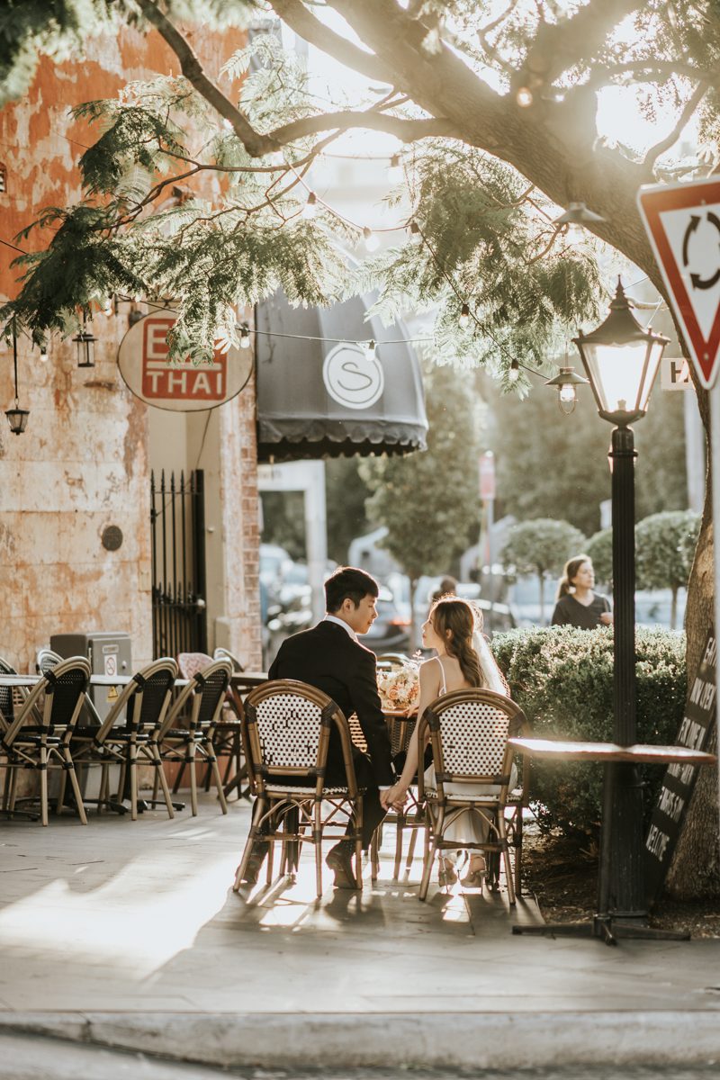
The suit a groom wears on his wedding day says something before he opens his mouth. A standard black tie reads formal. A navy suit with a classic tie reads safe. But a vintage bow tie with the right suit, the right shirt, the right pocket square — that reads like a man who knows exactly who he is. Melbourne's wedding photography scene has embraced this look hard over the past few years, and for good reason. The city's architecture — those bluestone laneways, the art deco facades, the trams rattling past brick warehouses — all of it pairs perfectly with a groom who looks like he stepped out of a 1940s film and into a modern wedding album.
What Makes a Bow Tie Look Vintage and Not Costumey
The Difference Between Retro and Costume
There is a line between vintage styling and dress-up, and most grooms cross it without realizing it. A shiny satin bow tie with a tuxedo reads prom night. A matte silk bow tie in a muted tone with a textured suit reads old Hollywood. The texture of the fabric is what separates the two. Vintage is matte, slightly rough, imperfect. Costume is glossy, smooth, too perfect.
Melbourne grooms who get this right choose fabrics that look lived-in. Linen blends, wool with a slight nap, silk with a dull sheen rather than a mirror finish. The bow tie itself should have a soft drape — not stiff, not plastic-looking. When it hangs against the chest, it should move with the body, not sit there like a decoration glued to the shirt.
The Knot Matters More Than You Think
A pre-tied bow tie looks flat and uniform. Every pre-tied bow tie looks the same because it was made by a machine. A hand-tied bow tie has slight asymmetry — one loop sits a little higher than the other, the knot is a little off-center. That imperfection is what makes it look real and vintage.
If you have never tied a bow tie, practice at least two weeks before the wedding. The knot should sit snug against the collar but not choke it. The wings should hang evenly — not one longer than the other. A lopsided bow tie reads careless, not vintage.
The Suit Colors That Work Best With Vintage Bow Ties
Charcoal Grey Is the Undisputed King
Charcoal grey with a vintage bow tie is the combination that photographs best in almost every Melbourne location. The grey is dark enough to look formal but light enough to show texture under natural light. Pair it with a dusty rose or burgundy bow tie and the contrast is rich without being loud.
Charcoal also plays well with Melbourne's urban backdrops. Against bluestone walls, brick facades, and the grey-green of eucalyptus trees, a charcoal suit disappears into the background just enough to let the bow tie and the groom's face become the focus. This is what good wedding photography relies on — the subject standing out from the environment without fighting it.
Navy Works When Charcoal Feels Too Heavy
Navy is warmer than charcoal and it photographs beautifully in golden hour light. The problem is that navy can read too casual if the rest of the outfit is not sharp enough. A navy suit with a vintage bow tie only works when the shirt is crisp white, the shoes are polished leather, and the pocket square is folded with intention.
For Melbourne's coastal and vineyard locations, navy is the better choice. It complements the blue of Port Phillip Bay and the green of the Yarra Valley without clashing. Avoid bright navy — go for a deep, almost midnight tone. That depth is what gives it the vintage feel.
Brown and Tan Suits for the Bold Groom
A brown suit with a vintage bow tie is not for everyone. But when it works, it works better than anything else. The brown should be deep — chocolate, not caramel. The bow tie should be in a complementary tone: forest green, deep burgundy, or a muted gold. This combination screams 1970s editorial and it photographs like a magazine spread against Melbourne's autumn foliage.
The risk with brown is that it can look dated in the wrong context. A light tan suit with a patterned bow tie reads costume party. A dark chocolate suit with a solid-color matte bow tie reads intentional. The darker the suit, the more vintage it feels. The lighter it gets, the more it drifts toward costume.
The Shirt and Pocket Square Combinations That Tie It All Together
White Shirt Is Non-Negotiable
Do not wear a colored shirt under a vintage bow tie unless you are a professional stylist. White is the only shirt color that lets the bow tie do its job. The shirt should be a crisp Oxford cloth or a fine twill — not dress shirt shiny, not too casual. The collar should be a spread collar or a semi-spread, not a button-down. Button-down collars with bow ties look like you are wearing your grandfather's clothes, not styling them intentionally.
The collar points should sit flat under the bow tie. If they curl up, the bow tie sits crooked and the whole look falls apart. Get the shirt tailored if you need to. A ten-dollar alteration makes more difference than a five-hundred-dollar suit.
The Pocket Square Should Be the Quietest Element
The pocket square is not the star. The bow tie is the star. The pocket square exists to add a layer of detail that shows up in close-up shots — the kind where the photographer captures the groom's hand resting on the bride's waist, or the two of them laughing with the groom's chest in frame.
Fold it simply. A straight fold or a puff fold. No elaborate crowns, no chaotic arrangements. White linen or a muted silk in a tone that matches the bow tie but does not match it exactly. If the bow tie is burgundy, the pocket square can be cream or pale gold. It should complement, not duplicate.
Bow Tie Patterns and How to Match Them to the Suit
Solid Colors Are Safest
A solid-color bow tie in burgundy, forest green, navy, or charcoal is the safest bet and it works with every suit color mentioned above. Solid means the eye goes to the shape of the bow tie and the texture of the fabric, not to a pattern competing with the suit. In photographs, solid colors read clean and intentional.
Polka Dots Work in Moderation
Small polka dots on a bow tie add personality without overwhelming the look. The dots should be tiny — barely visible from arm's length, clear up close. Large polka dots read clownish. Medium dots read 1950s sitcom. Tiny dots read vintage gentleman.
Match the dot color to the suit or the shirt. White dots on a navy bow tie with a navy suit create a subtle nautical feel that works beautifully in Melbourne's coastal locations. Burgundy dots on a charcoal suit add warmth without breaking the formal tone.
Stripes and Paisley Are Advanced Moves
Striped bow ties are tricky. The stripes should run diagonally, not horizontally. Horizontal stripes make the bow tie look wider and the face look shorter. Diagonal stripes add visual interest without distorting proportions.
Paisley bow ties are the boldest choice. They work best with solid-color suits in neutral tones — charcoal, navy, dark brown. The paisley pattern should be small-scale and in muted colors. A large, bright paisley bow tie with a patterned suit is too much for any photograph to handle.
Shoes and Accessories That Complete the Look
The Shoes Should Match the Suit, Not the Bow Tie
This is a mistake almost every groom makes. They pick shoes that match the bow tie color. The shoes should match the suit. Charcoal suit, black or dark brown shoes. Navy suit, brown or oxblood shoes. Brown suit, dark brown or burgundy shoes. The bow tie is the accent — the shoes are the foundation.
Oxford shoes are the most vintage-appropriate choice. They have closed lacing, a sleek profile, and they photograph beautifully. Avoid loafers — they are too casual for a bow tie. Avoid monk straps unless you know exactly what you are doing. Oxfords are safe, they are sharp, and they work with every suit color listed here.
The Watch Should Be Simple
A vintage-style watch with a leather strap complements the bow tie look perfectly. The face should be simple — no digital displays, no chunky sports watches. A round face with Roman numerals or clean baton markers reads old-world elegance. The leather strap should match the shoes. Brown strap with brown shoes. Black strap with black shoes.
Cufflinks Should Match the Watch, Not the Bow Tie
Small, understated cufflinks in silver or gunmetal finish the look without competing with the bow tie. Avoid large, flashy cufflinks — they draw the eye away from the chest where the bow tie sits. The whole point of vintage styling is restraint. Every element should support the bow tie, not fight it for attention.
Location-Specific Styling for Melbourne
Bluestone Laneways and City Streets
Melbourne's laneways are dark, textured, and full of character. A charcoal suit with a burgundy bow tie photographs like a film still against these backdrops. The dark walls absorb light and make the groom pop. Shoot in the early morning when the laneways are empty — the light comes in at a low angle and catches the texture of the suit and the sheen of the bow tie.
Art Deco Buildings and Theatres
The grand facades of Melbourne's art deco theatres and cinemas have geometric patterns and warm stone tones. A navy suit with a forest green bow tie reads perfectly against these buildings. The green complements the warm stone without clashing. Shoot in late afternoon when the sun hits the building face and creates golden tones that warm the entire scene.
Vineyards and Countryside
The Yarra Valley and Mornington Peninsula offer soft, rolling landscapes that call for earth tones. A brown suit with a deep gold or olive bow tie blends into the vineyard rows while still standing out enough to be the focus. The natural light in these locations is soft and diffused, which means fabric textures show up beautifully in photographs. This is where a linen-blend suit with a matte silk bow tie really shines — the textures photograph like something out of a editorial spread.
Beach and Coastal Locations
A navy suit with a white or cream bow tie works on the beach. The contrast between the dark suit and the light bow tie against the sand and water creates a clean, timeless look. Avoid brown suits on the beach — the sand makes brown look muddy in photographs. Avoid charcoal too — it blends into the rocks and looks flat. Navy is the sweet spot for coastal Melbourne weddings.
Common Mistakes That Ruin Vintage Bow Tie Photos
Wearing the Bow Tie Too High or Too Low
The bow tie should sit at the collar, not below it. If it sags even half an inch below the collar line, it looks sloppy. If it sits so high it touches the chin, it looks like a child wearing his father's clothes. The center of the bow tie should align with the top of the shirt collar. Measure this before the wedding.
Forgetting to Match the Suit Fit to the Bow Tie
A slim-fit suit with a wide bow tie looks unbalanced. The bow tie should be proportional to the lapels and the shirt collar. If the suit is modern and slim, choose a narrower bow tie. If the suit is classic and wider, a fuller bow tie works better. The proportions need to talk to each other.
Over-Accessorizing
One statement piece. That is the rule. The bow tie is the statement. Everything else — the pocket square, the watch, the cufflinks — should be quiet. If you add a patterned pocket square, a bold watch, and colorful cufflinks on top of a patterned bow tie, the photograph will have too many focal points and the eye will not know where to land. Less is more, especially in vintage styling.