Evermore_weddings_registry-65

Melbourne wedding photography featuring simple pearl accessories design

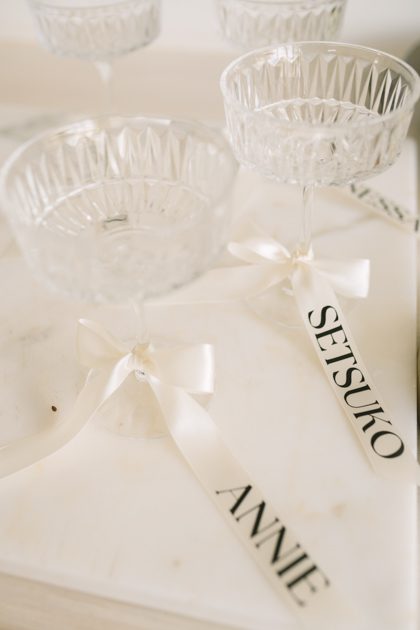
Melbourne Wedding Photography Minimalist Pearl Accessories Styling Guide

Pearls and weddings have been tangled together for centuries, and for good reason. Nothing else on earth catches light the way a pearl does. It glows from within, it softens every angle of the face, and it photographs like it was made specifically for camera lenses. In Melbourne, where the light shifts from bright coastal sun to soft filtered glow through eucalyptus canopies, pearls do something no other accessory can — they adapt. They look elevated on a bluestone laneway and they look just as effortless on a vineyard hillside. The trick is not wearing more pearls. The trick is wearing the right ones in the right places so they look like they belong to you, not like you borrowed them from your grandmother’s jewelry box.

wedding photography melbourne

Why Pearls Work Better Than Diamonds for Melbourne Wedding Photos

Diamonds Fight the Light. Pearls Work With It.

Diamonds sparkle. That is their job. But in outdoor photography, especially in Melbourne’s variable light, that sparkle can work against you. A diamond earring catches the sun and throws a harsh reflection across the frame. A pearl absorbs light and returns it as a soft glow. The difference in photographs is enormous. Diamonds create hot spots. Pearls create even, flattering illumination across the face and neck.

Melbourne’s weather adds another layer. On an overcast day, diamonds go dull and look flat. Pearls actually look better in soft light — the glow intensifies when there is no direct sun competing with it. On a bright day, pearls do not throw glare the way diamonds do. They stay calm. They stay elegant. They stay in the photograph without stealing the frame.

The Vintage Factor

Melbourne’s wedding photography scene leans heavily into vintage and editorial styling right now. Pearls are the single most vintage-appropriate accessory you can wear. They do not look modern. They do not look trendy. They look timeless, and timeless is exactly what photographs age well. A photo taken in 2026 with pearl earrings will look just as good in 2056. A photo with flashy crystal drops will look dated within five years.

The Pearl Pieces That Actually Matter for Wedding Photos

Earrings Are the Only Pearl Piece You Need

If you are going to wear one pearl accessory, make it earrings. They frame the face. They catch the light when you turn your head. They show up in every single photograph — close-ups, wide shots, profile angles, candid laughs. No other pearl piece gets that kind of coverage.

For Melbourne weddings, drop earrings in a single pearl design work best. Not a cluster. Not a chandelier style. One pearl, hanging just below the earlobe, catching light as you move. The simplicity photographs cleanly against any backdrop — bluestone walls, green foliage, golden hour sky. It does not compete with the dress, the bouquet, or the groom’s suit. It just makes the face glow.

Stud earrings are the second best option. Small, round, sitting close to the ear. They photograph well in close-ups and they do not get caught in wind or hair. If you are having an outdoor ceremony in Melbourne’s often-breezy coastal locations, studs are more practical than drops.

The Necklace Decision — Wear It or Leave It

A pearl necklace is beautiful. It is also the easiest way to over-accessorize a wedding look. If your dress has a high neckline, a necklace disappears anyway. If your dress has a low or open neckline, a single-strand pearl necklace can work — but only if it sits above the collarbone, not below it. A necklace that hangs into the chest area competes with the dress neckline and creates visual clutter in photographs.

The rule is simple: if the necklace does not add something the earrings are not already doing, do not wear it. In most Melbourne wedding photos, the earrings handle everything the pearls need to handle. The necklace becomes redundant.

Bracelets and Rings — Almost Never

Pearl bracelets photograph poorly in wedding shots. They sit on the wrist where the hand is usually holding a bouquet, resting on the groom’s arm, or adjusting the dress. The bracelet gets buried in the action and never shows up in the final images. It is effort for no visual return.

Pearl rings are the same problem. They are tiny, they sit on the hand, and in ninety percent of wedding photographs the hands are either holding something or resting on something. The ring does not get its moment. Save the pearl ring for the engagement photos, not the wedding day.

How to Choose the Right Pearl Shape and Size

Round Is Always Safe. Baroque Is Always Interesting.

Round pearls are the classic choice and they photograph predictably well. They reflect light evenly, they look clean in every frame, and they match every dress style. If you want zero risk, go round.

Baroque pearls — the irregular, organic-shaped ones — are where it gets interesting. A single baroque pearl earring photographs beautifully because its uneven surface catches light in unpredictable ways. It looks artisanal, not manufactured. It looks like you found it, not bought it. For Melbourne’s editorial and vintage wedding scene, baroque pearls are actually the better choice. They add character without adding volume.

Size Matters More Than You Think

Too small and the pearl disappears in photographs. Too large and it overwhelms the face. The sweet spot for wedding earrings is eight to ten millimeters for drops, six to eight millimeters for studs. This size reads clearly in both close-up and wide-angle shots without dominating the frame.

If you are petite or have a small face, stay on the smaller end. If you have strong features or a larger frame, you can push toward ten or eleven millimeters. But do not go bigger. A twelve-millimeter pearl earring on a delicate face looks like it is wearing the person, not the other way around.

Matching Pearls to Your Dress and Location

White Pearls Go With Everything. That Is the Point.

White pearls match every wedding dress color — ivory, cream, blush, champagne, even stark white. They do not clash because they are not a bold color. They are a tone. A warm white pearl against an ivory dress creates a subtle, cohesive look that photographs as intentional. A cool white pearl against a cream dress adds contrast without competition.

The only time white pearls do not work is if your dress has heavy beading or sequin work. The pearls will blend into the dress and disappear. In that case, consider cream or champagne-toned pearls instead — they have enough warmth to stand out against a beaded surface.

Pink and Lavender Pearls for Melbourne’s Soft Palettes

Melbourne’s wedding photography palette right now leans toward dusty pink, mauve, sage, and lavender. Pink pearls fit this perfectly. They add warmth to the face without introducing a new color that fights the dress. A single pink pearl drop earring against a dusty rose dress creates a monochromatic effect that photographs like a fashion editorial.

Lavender pearls are rarer and they photograph beautifully against white or cream dresses. The soft purple tone adds a whisper of color that shows up in close-ups but does not dominate wide shots. If you want something unusual without going over the top, lavender pearls are the move.

Avoid Black Pearls Unless You Know What You Are Doing

Black pearls are stunning. They are also high-risk for wedding photography. They photograph as a dark spot against the face, and in many lighting conditions they look like a shadow rather than an accessory. They work in studio settings with controlled light. They struggle in Melbourne’s variable outdoor light. If you love black pearls, wear them for the reception, not the ceremony photos.

The Hair and Pearl Combination That Photographs Best

Updos Let Pearls Show

If your hair is up, your earrings are fully visible from every angle. This is the best scenario for pearl earrings because they get uninterrupted light and they frame the face without competing with hair. A low bun, a chignon, or a twisted updo all work. The key is keeping the neck and jawline clear so the pearl drop has room to catch light.

Avoid high updos that pull the ears upward. When the ear is pulled up, the earring sits at an angle that looks awkward in photographs. Keep the earring at the natural ear position and let the pearl hang straight down.

Down Hair Works With Studs, Not Drops

If you are wearing your hair down, drop pearl earrings will get lost in the strands. They will peek through occasionally but they will not photograph consistently. Stud earrings are the better choice here — they sit visible against the hair and they catch light when you turn your head.

If you insist on drops with down hair, choose shorter drops that end above the jawline. Long drops that hang past the jaw disappear into the hair and never show up in photographs.

Flowers and Pearls — Do Not Mix

This is the mistake that ruins more wedding photos than anything else. If you are wearing a flower crown or flowers in your hair, do not wear pearl drop earrings. The flowers and the pearls fight for the same visual space. One of them will dominate and the other will look like an afterthought.

Choose one. Flowers or pearls. Not both. If you go with pearls, skip the flower crown entirely and use a simple eucalyptus or olive branch instead. The greenery complements the pearl without competing with it.

Location-Specific Pearl Styling for Melbourne

Bluestone Laneways and City Walls

The dark, textured walls of Melbourne’s laneways make white pearls pop. The contrast between the dark background and the soft glow of the pearl creates a photograph that looks moody and editorial. Wear drop earrings here — they catch the light that filters down between the buildings and they create a vertical line that draws the eye upward.

Coastal and Beach Locations

Wind is the enemy of pearl earrings at the beach. A drop earring will swing around and catch wind, which looks dynamic in motion but chaotic in still photographs. Stud earrings are the safer choice for coastal Melbourne weddings. They stay put, they photograph cleanly against the sand and water, and they do not tangle in windblown hair.

If you want drops at the beach, choose weighted pearls — heavier pearls that do not swing as much. The weight keeps them relatively still even in a breeze.

Vineyards and Countryside

The soft, golden light of the Yarra Valley and Mornington Peninsula is the best natural light for pearls. The warm tones of the light make white pearls glow with a creamy warmth that looks incredible in photographs. This is where you can go slightly larger — ten to eleven millimeter drops photograph beautifully in this light because the golden hour amplifies their glow.

The green and gold backdrop of vineyard rows also makes champagne and cream pearls stand out more than they would in a city setting. The warm tones of the pearl echo the warm tones of the landscape, creating a cohesive color story that photographs like a painting.

Gardens and Parks

Royal Botanic Gardens, Fitzroy Gardens, and similar green spaces offer soft, filtered light that is flattering for pearls. The green foliage behind you makes white pearls read as bright focal points without looking harsh. This is the safest location for any pearl style — drops, studs, baroque, round. Everything works here because the light is even and the background is simple.

What to Avoid With Pearl Wedding Accessories

Do Not Mix Pearl Styles

Wearing pearl studs on one ear and a pearl drop on the other looks accidental, not stylish. It reads as mismatched rather than intentional. If you want asymmetry, make it deliberate — both earrings should be the same type but worn at different lengths on purpose. Mismatched by accident is not the same as mismatched by design.

Do Not Wear Pearls With Crystal or Rhinestone

Pearls and crystals do not belong together. The soft glow of a pearl next to the sharp sparkle of a crystal creates visual tension that photographs as cluttered. Pick one. If you choose pearls, leave the crystals at home. The photograph will be cleaner and the look will be more cohesive.

Do Not Over-Pearl

One pearl piece per area. Ears get one pair. Neck gets one necklace or nothing. Wrists get nothing. Fingers get nothing for the wedding day. The moment you add a second pearl piece to the same zone, the look shifts from minimalist to costume. The entire point of pearl styling for wedding photography is restraint. Less is not just more — less is everything.

Evermore_weddings_registry-59

Melbourne wedding photography featuring vintage bow tie and suit ensemble

Melbourne Wedding Photography Vintage Bow Tie Suit Styling Guide

The suit a groom wears on his wedding day says something before he opens his mouth. A standard black tie reads formal. A navy suit with a classic tie reads safe. But a vintage bow tie with the right suit, the right shirt, the right pocket square — that reads like a man who knows exactly who he is. Melbourne’s wedding photography scene has embraced this look hard over the past few years, and for good reason. The city’s architecture — those bluestone laneways, the art deco facades, the trams rattling past brick warehouses — all of it pairs perfectly with a groom who looks like he stepped out of a 1940s film and into a modern wedding album.

wedding photography melbourne

What Makes a Bow Tie Look Vintage and Not Costumey

The Difference Between Retro and Costume

There is a line between vintage styling and dress-up, and most grooms cross it without realizing it. A shiny satin bow tie with a tuxedo reads prom night. A matte silk bow tie in a muted tone with a textured suit reads old Hollywood. The texture of the fabric is what separates the two. Vintage is matte, slightly rough, imperfect. Costume is glossy, smooth, too perfect.

Melbourne grooms who get this right choose fabrics that look lived-in. Linen blends, wool with a slight nap, silk with a dull sheen rather than a mirror finish. The bow tie itself should have a soft drape — not stiff, not plastic-looking. When it hangs against the chest, it should move with the body, not sit there like a decoration glued to the shirt.

The Knot Matters More Than You Think

A pre-tied bow tie looks flat and uniform. Every pre-tied bow tie looks the same because it was made by a machine. A hand-tied bow tie has slight asymmetry — one loop sits a little higher than the other, the knot is a little off-center. That imperfection is what makes it look real and vintage.

If you have never tied a bow tie, practice at least two weeks before the wedding. The knot should sit snug against the collar but not choke it. The wings should hang evenly — not one longer than the other. A lopsided bow tie reads careless, not vintage.

The Suit Colors That Work Best With Vintage Bow Ties

Charcoal Grey Is the Undisputed King

Charcoal grey with a vintage bow tie is the combination that photographs best in almost every Melbourne location. The grey is dark enough to look formal but light enough to show texture under natural light. Pair it with a dusty rose or burgundy bow tie and the contrast is rich without being loud.

Charcoal also plays well with Melbourne’s urban backdrops. Against bluestone walls, brick facades, and the grey-green of eucalyptus trees, a charcoal suit disappears into the background just enough to let the bow tie and the groom’s face become the focus. This is what good wedding photography relies on — the subject standing out from the environment without fighting it.

Navy Works When Charcoal Feels Too Heavy

Navy is warmer than charcoal and it photographs beautifully in golden hour light. The problem is that navy can read too casual if the rest of the outfit is not sharp enough. A navy suit with a vintage bow tie only works when the shirt is crisp white, the shoes are polished leather, and the pocket square is folded with intention.

For Melbourne’s coastal and vineyard locations, navy is the better choice. It complements the blue of Port Phillip Bay and the green of the Yarra Valley without clashing. Avoid bright navy — go for a deep, almost midnight tone. That depth is what gives it the vintage feel.

Brown and Tan Suits for the Bold Groom

A brown suit with a vintage bow tie is not for everyone. But when it works, it works better than anything else. The brown should be deep — chocolate, not caramel. The bow tie should be in a complementary tone: forest green, deep burgundy, or a muted gold. This combination screams 1970s editorial and it photographs like a magazine spread against Melbourne’s autumn foliage.

The risk with brown is that it can look dated in the wrong context. A light tan suit with a patterned bow tie reads costume party. A dark chocolate suit with a solid-color matte bow tie reads intentional. The darker the suit, the more vintage it feels. The lighter it gets, the more it drifts toward costume.

The Shirt and Pocket Square Combinations That Tie It All Together

White Shirt Is Non-Negotiable

Do not wear a colored shirt under a vintage bow tie unless you are a professional stylist. White is the only shirt color that lets the bow tie do its job. The shirt should be a crisp Oxford cloth or a fine twill — not dress shirt shiny, not too casual. The collar should be a spread collar or a semi-spread, not a button-down. Button-down collars with bow ties look like you are wearing your grandfather’s clothes, not styling them intentionally.

The collar points should sit flat under the bow tie. If they curl up, the bow tie sits crooked and the whole look falls apart. Get the shirt tailored if you need to. A ten-dollar alteration makes more difference than a five-hundred-dollar suit.

The Pocket Square Should Be the Quietest Element

The pocket square is not the star. The bow tie is the star. The pocket square exists to add a layer of detail that shows up in close-up shots — the kind where the photographer captures the groom’s hand resting on the bride’s waist, or the two of them laughing with the groom’s chest in frame.

Fold it simply. A straight fold or a puff fold. No elaborate crowns, no chaotic arrangements. White linen or a muted silk in a tone that matches the bow tie but does not match it exactly. If the bow tie is burgundy, the pocket square can be cream or pale gold. It should complement, not duplicate.

Bow Tie Patterns and How to Match Them to the Suit

Solid Colors Are Safest

A solid-color bow tie in burgundy, forest green, navy, or charcoal is the safest bet and it works with every suit color mentioned above. Solid means the eye goes to the shape of the bow tie and the texture of the fabric, not to a pattern competing with the suit. In photographs, solid colors read clean and intentional.

Polka Dots Work in Moderation

Small polka dots on a bow tie add personality without overwhelming the look. The dots should be tiny — barely visible from arm’s length, clear up close. Large polka dots read clownish. Medium dots read 1950s sitcom. Tiny dots read vintage gentleman.

Match the dot color to the suit or the shirt. White dots on a navy bow tie with a navy suit create a subtle nautical feel that works beautifully in Melbourne’s coastal locations. Burgundy dots on a charcoal suit add warmth without breaking the formal tone.

Stripes and Paisley Are Advanced Moves

Striped bow ties are tricky. The stripes should run diagonally, not horizontally. Horizontal stripes make the bow tie look wider and the face look shorter. Diagonal stripes add visual interest without distorting proportions.

Paisley bow ties are the boldest choice. They work best with solid-color suits in neutral tones — charcoal, navy, dark brown. The paisley pattern should be small-scale and in muted colors. A large, bright paisley bow tie with a patterned suit is too much for any photograph to handle.

Shoes and Accessories That Complete the Look

The Shoes Should Match the Suit, Not the Bow Tie

This is a mistake almost every groom makes. They pick shoes that match the bow tie color. The shoes should match the suit. Charcoal suit, black or dark brown shoes. Navy suit, brown or oxblood shoes. Brown suit, dark brown or burgundy shoes. The bow tie is the accent — the shoes are the foundation.

Oxford shoes are the most vintage-appropriate choice. They have closed lacing, a sleek profile, and they photograph beautifully. Avoid loafers — they are too casual for a bow tie. Avoid monk straps unless you know exactly what you are doing. Oxfords are safe, they are sharp, and they work with every suit color listed here.

The Watch Should Be Simple

A vintage-style watch with a leather strap complements the bow tie look perfectly. The face should be simple — no digital displays, no chunky sports watches. A round face with Roman numerals or clean baton markers reads old-world elegance. The leather strap should match the shoes. Brown strap with brown shoes. Black strap with black shoes.

Cufflinks Should Match the Watch, Not the Bow Tie

Small, understated cufflinks in silver or gunmetal finish the look without competing with the bow tie. Avoid large, flashy cufflinks — they draw the eye away from the chest where the bow tie sits. The whole point of vintage styling is restraint. Every element should support the bow tie, not fight it for attention.

Location-Specific Styling for Melbourne

Bluestone Laneways and City Streets

Melbourne’s laneways are dark, textured, and full of character. A charcoal suit with a burgundy bow tie photographs like a film still against these backdrops. The dark walls absorb light and make the groom pop. Shoot in the early morning when the laneways are empty — the light comes in at a low angle and catches the texture of the suit and the sheen of the bow tie.

Art Deco Buildings and Theatres

The grand facades of Melbourne’s art deco theatres and cinemas have geometric patterns and warm stone tones. A navy suit with a forest green bow tie reads perfectly against these buildings. The green complements the warm stone without clashing. Shoot in late afternoon when the sun hits the building face and creates golden tones that warm the entire scene.

Vineyards and Countryside

The Yarra Valley and Mornington Peninsula offer soft, rolling landscapes that call for earth tones. A brown suit with a deep gold or olive bow tie blends into the vineyard rows while still standing out enough to be the focus. The natural light in these locations is soft and diffused, which means fabric textures show up beautifully in photographs. This is where a linen-blend suit with a matte silk bow tie really shines — the textures photograph like something out of a editorial spread.

Beach and Coastal Locations

A navy suit with a white or cream bow tie works on the beach. The contrast between the dark suit and the light bow tie against the sand and water creates a clean, timeless look. Avoid brown suits on the beach — the sand makes brown look muddy in photographs. Avoid charcoal too — it blends into the rocks and looks flat. Navy is the sweet spot for coastal Melbourne weddings.

Common Mistakes That Ruin Vintage Bow Tie Photos

Wearing the Bow Tie Too High or Too Low

The bow tie should sit at the collar, not below it. If it sags even half an inch below the collar line, it looks sloppy. If it sits so high it touches the chin, it looks like a child wearing his father’s clothes. The center of the bow tie should align with the top of the shirt collar. Measure this before the wedding.

Forgetting to Match the Suit Fit to the Bow Tie

A slim-fit suit with a wide bow tie looks unbalanced. The bow tie should be proportional to the lapels and the shirt collar. If the suit is modern and slim, choose a narrower bow tie. If the suit is classic and wider, a fuller bow tie works better. The proportions need to talk to each other.

Over-Accessorizing

One statement piece. That is the rule. The bow tie is the statement. Everything else — the pocket square, the watch, the cufflinks — should be quiet. If you add a patterned pocket square, a bold watch, and colorful cufflinks on top of a patterned bow tie, the photograph will have too many focal points and the eye will not know where to land. Less is more, especially in vintage styling.

wedding photography melbourne

Melbourne wedding photography – serene flower styling combination

Melbourne Wedding Photography Forest Fresh Flower Styling Guide

Melbourne does not look like anywhere else on earth when it comes to forest weddings. The Dandenong Ranges in autumn, the eucalyptus groves along the Yarra, the fern gullies near Healesville — these are backdrops that make every photographer’s job easier and every couple’s album unforgettable. But the flowers you choose to put in your hair, hold in your hands, and drape around your shoulders can either blend into that wild green world or fight against it completely. The forest style is not about throwing random blooms together. It is about choosing flowers that look like they grew there, that move like the wind moves through the trees, and that photograph like they were always meant to be part of the landscape.

wedding photography melbourne

What Forest Style Actually Means in Melbourne

It Is Not the Same as Bohemian

People confuse forest style with boho style constantly. They are not the same thing. Bohemian is about layered textures, fringe, feathers, and eclectic mix-and-match. Forest style is quieter. It is about muted tones, organic shapes, and flowers that look like they were picked from the ground beside you five minutes ago. Think wildflowers, not garden roses. Think trailing greenery, not structured arrangements. The goal is to look like you stepped out of the trees, not like you brought a flower shop into the woods.

Melbourne’s climate gives you an advantage here. The city sits in a temperate zone where wildflowers bloom in rotation from August through November. Wattle, eucalyptus blossoms, flannel flowers, boronia — these are native to the land and they photograph beautifully against the green canopy. Using native blooms instead of imported roses or peonies is the single easiest way to make your forest wedding look authentic instead of staged.

The Color Palette That Works With Every Melbourne Forest

Forget bright reds and hot pinks. They pop in a studio but they scream in a forest. The colors that work are the ones the trees already wear: dusty rose, mauve, cream, soft peach, sage green, lavender, and muted gold. These tones sit inside the green background instead of competing with it. When you look at a photo of a bride holding a bouquet of dusty pink ranunculus and sage eucalyptus against dark green ferns, the flowers do not jump out — they belong.

White works too, but not bright white. Ivory, off-white, and cream blend better with the soft light that filters through Melbourne’s eucalyptus canopy. Pure white looks clinical next to bark and moss.

The Best Flowers for Melbourne Forest Wedding Photos

Native Blooms That Photograph Like Dreams

Wattle is the unofficial flower of Melbourne and for good reason. Its golden puffball shape catches light beautifully and the yellow-gold tone glows against green foliage. It blooms from late winter through spring, which covers most of Melbourne’s wedding season. Use it in your hair, tie it into a loose bouquet, or scatter it along the ground for flat-lay details.

Boronia has a delicate, almost fragile look that photographs incredibly well. The pink-to-mauve gradient on each tiny petal creates depth in close-up shots. It grows wild in the Dandenongs and along creek beds. A few sprigs tucked behind the ear or woven into a low bun add texture without volume.

Flannel flowers are another native gem. Their fuzzy, soft appearance adds a tactile quality to photos that you cannot get from smooth-petaled roses. They come in white, pink, and purple, and they look especially good in autumn when the surrounding foliage turns gold and rust.

Imported Blooms That Still Fit the Forest Look

If you want something beyond native flowers, choose varieties that have an organic, unstructured shape. Garden roses in muted tones — dusty pink, mauve, antique peach — work because their petals are loose and ruffled, not tight and geometric. Ranunculus in cream or blush adds round, soft shapes that echo the wattle puffs.

Anemones are underrated for forest weddings. Their papery petals and dark centers create contrast in photos without adding bright color. They look wild, they move beautifully in wind, and they photograph well in both close-ups and wide shots.

Peonies are classic but pick the loose, open varieties — not the tight ball-shaped ones. A fully blown peony in dusty pink or cream looks like it grew in a meadow, not a vase. Avoid white peonies in forest settings — they are too bright and too round. They read as formal, not organic.

Greenery That Makes or Breaks the Look

The greenery matters more than the flowers in forest style. Eucalyptus is non-negotiable for Melbourne. Silver dollar eucalyptus has round, dusty-blue leaves that frame the face beautifully. Seeded eucalyptus has smaller leaves and a more delicate texture. Both photograph well and both smell incredible — a detail that matters when you are standing still for thirty minutes while a photographer adjusts the light.

Ferns are everywhere in Melbourne’s forest locations and they should be everywhere in your styling too. Sword ferns, soft tree ferns, and maidenhair ferns all add movement and texture. Tuck a frond behind your ear or let it drape over your bouquet handle. It looks effortless.

Olive branches add a Mediterranean touch that works surprisingly well in Melbourne forests. The silvery-green leaves and small black olives create a contrast that reads as elevated without being overdone.

How to Style Your Hair With Forest Flowers

Loose and Low Is the Only Rule

Forest style hair is never tight, never slicked, never perfectly placed. It is messy on purpose. A low bun with pieces falling loose around the face. A half-up style with tendrils framing the cheeks. Or completely down with flowers woven through the strands. The hair should look like wind moved it, not a comb.

For a low bun, tuck a few sprigs of wattle or eucalyptus into the base of the bun where it meets the neck. Add one or two larger blooms — a dusty rose or a single peony — off to one side. Do not center everything. Off-center looks more natural and photographs better because it creates asymmetry, which the eye finds more interesting than perfect symmetry.

Flowers Behind the Ear for Close-Up Shots

The most photographed angle in wedding photography is the close-up of the bride’s face — eyes, lips, the flower behind her ear. This single detail can make or break a forest-style shoot. Use one small bloom or a tiny cluster of two to three flowers tucked behind the ear on the side facing the camera. Boronia, waxflower, or a single small ranunculus work perfectly here.

Do not use a large flower behind the ear. It will overwhelm the face in the photo and draw attention away from your expression. Small and delicate is the move.

Crowns and Wreaths That Do Not Look Costumey

Flower crowns are everywhere in wedding photography and most of them look fake. The trick is to make the crown look like it grew on your head, not like you bought it from a craft store. Use thin wire as the base, wrap it with eucalyptus or olive branches, and attach flowers sparingly. Five to seven blooms maximum. Leave gaps where the greenery shows through.

A wreath made entirely of eucalyptus with no flowers at all is also a strong option. It photographs beautifully, it stays in place better than a flower crown, and it gives the photographer a clean frame around your face without competing with your features.

Bouquet Styling for Forest Wedding Photos

Keep It Loose and Let It Hang

A tight, round bouquet looks like a wedding bouquet. A loose, trailing bouquet looks like you gathered flowers from the forest floor on your way to the ceremony. That is the difference. Use long stems, let some flowers droop below the main cluster, and mix in plenty of greenery that extends beyond the blooms.

The shape should be asymmetrical — longer on one side, shorter on the other. Hold it low, near your hip, not at chest height. A low bouquet photographs better against a forest background because it does not block your dress or your face.

What to Leave Out of a Forest Bouquet

Do not include bright red flowers. Do not include lilies — they are too formal and too structured. Do not include baby’s breath — it looks like a filler from a grocery store arrangement. Do not include anything with a strong geometric shape. Forest bouquets should look like they were assembled by hand in a field, not arranged on a table with scissors and tape.

Matching Your Partner’s Look Without Matching Exactly

His Boutonniere Should Be Minimal

The groom’s flower in a forest wedding should be one small element, not a statement piece. A single sprig of eucalyptus, a tiny wattle puff, or one small bloom in the same muted palette as your bouquet. Pin it to the lapel and let it sit there quietly. If his boutonniere is as big as your bouquet, the photos will look unbalanced.

Coordinate Colors, Not Flowers

You do not need to carry the same flowers as your partner. You need to share the same color story. If your bouquet is dusty pink and sage, his boutonniere can be a cream rose with a sage leaf. The colors match. The flowers do not need to. This looks intentional in photos rather than matchy-matchy.

Timing Your Shoot Around Melbourne’s Light

Golden Hour in the Forest Is Different From Golden Hour on the Beach

Forest light is filtered. The canopy blocks direct sun and creates soft, diffused light that is flattering on skin but low on contrast. The best window is the first hour after sunrise when mist hangs in the trees and the light comes through at an angle. This is when native flowers look their best — the dew is still on the petals and the mist adds a dreamy quality that no filter can replicate.

Late afternoon works too, but the light drops fast under the trees. You have about forty-five minutes of usable golden light in a dense forest before it goes flat. Plan your portrait shots for that window and do your detail shots — rings, shoes, bouquet close-ups — earlier in the day when the light is even.

Overcast Days Are Actually Better for Forest Photos

This sounds wrong but it is true. Direct sun in a forest creates harsh shadows on the face and blown-out highlights on the flowers. An overcast sky acts like a giant softbox. The light wraps around everything evenly, colors stay true, and flowers do not lose detail in bright spots. If your Melbourne wedding day is cloudy, do not panic. It might be the best lighting you get.

A Few Location-Specific Tips

Dandenong Ranges in Autumn

The trees turn gold, rust, and deep red from late March through May. Pair your flowers with the foliage — use burgundy dahlias, deep mauve anemones, and orange ranunculus to echo the leaves. The contrast between warm flowers and warm leaves creates a monochromatic palette that photographs like a painting.

Yarra Valley Vineyards

The rows of vines create leading lines that draw the eye into the photo. Use trailing bouquets that follow the direction of the rows. Long stems of eucalyptus and fennel fronds extend the line and make the composition feel expansive. Avoid round bouquets here — they break the geometry of the vineyard.

Healesville Sanctuary and Surrounding Bush

The eucalyptus forest here is dense and dark. Use lighter flowers — cream, ivory, soft pink — to stand out against the deep green and brown. A single white orchid or a cluster of pale waxflowers pops beautifully against dark bark. The contrast does the work for you.

Royal Botanic Gardens

The gardens are manicured, not wild. This is where you can get away with slightly more structured arrangements — a rounded bouquet with defined shapes still looks natural among the curated beds. But keep the color palette muted. Bright flowers look out of place next to the gardens’ careful planting.