Evermore_weddings_Jack_Rabbit_Winery-46

Melbourne wedding photography featuring minimalist Korean-style fresh aesthetics

Melbourne Wedding Photography: Minimalist Korean Fresh Style That Breathes

Sometimes less is so much more. A wide open space. Two people. Soft light falling on white fabric. No clutter, no props, no forced smiles. Just a quiet moment that looks like it belongs in a Seoul cafe on a Sunday afternoon. That is the minimalist Korean fresh aesthetic, and it has taken Melbourne by storm. Couples who are tired of over-styled, over-produced wedding albums are turning to this look because it feels honest. It feels clean. It feels like a deep breath after a loud day.

wedding photography melbourne

Melbourne happens to be one of the easiest cities in the world to shoot this style. The architecture is already minimal. The light is already soft. The parks are already wide and green and full of negative space. You do not have to build a set. You just have to find the right corner and let the simplicity do the work.

What Makes Korean Fresh Different From Regular Minimalist

Korean fresh is not the same as Scandinavian minimalism or Japanese wabi-sabi. It has its own personality. The color palette is warmer — not cold white and grey, but creamy white, soft beige, pale blush, and muted sage. The lighting is brighter but still diffused — not harsh sunlight, not dark moody shadows, but a soft glow that makes everything look clean without looking flat.

The compositions are simple but not empty. There is always a focal point — usually the couple — but the space around them matters just as much. Wide shots with lots of sky. Close-ups with blurred backgrounds. Everything is intentionally uncluttered. If it does not add to the feeling, it is not in the frame.

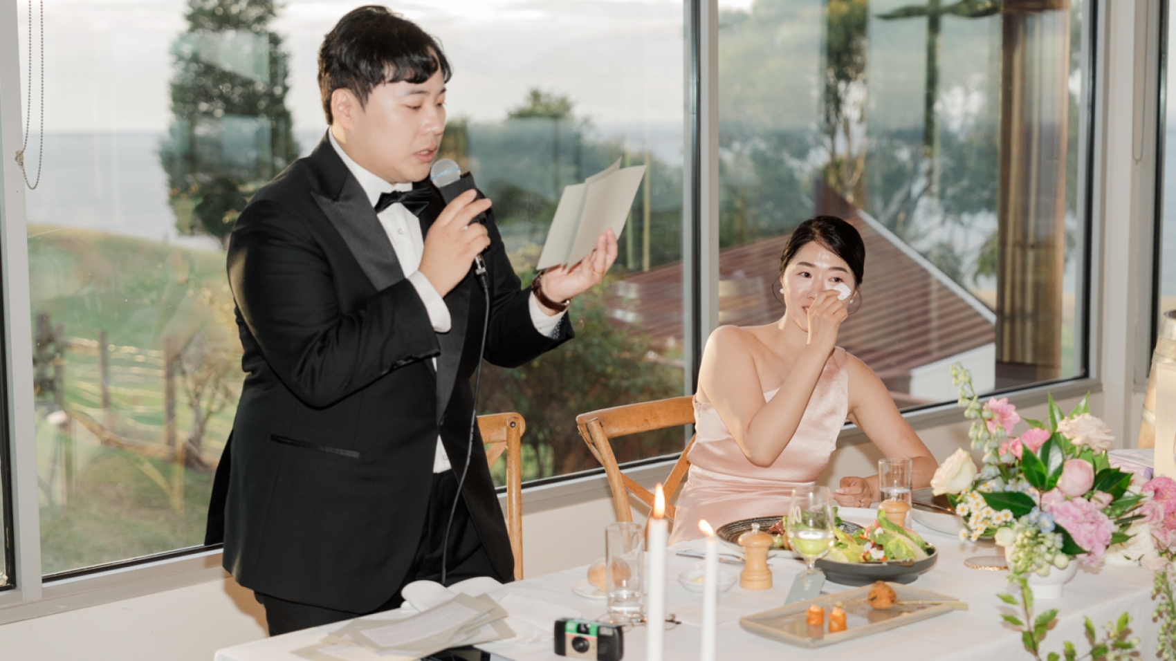
And then there is the emotion. Korean fresh wedding photography is quiet. It does not shout. It captures small gestures — a hand touching a cheek, a forehead resting against a shoulder, a laugh that is half-hidden. The mood is tender, not dramatic. It is the visual equivalent of a soft piano melody playing in an empty room.

Melbourne Locations That Nail the Korean Fresh Look

You do not need a studio. You do not need a permit. You need a clean background and good light, and Melbourne has both in abundance.

The Southbank Promenade and River Views

The Southbank promenade along the Yarra is basically a Korean fresh dream. The wide concrete paths, the flat water, the clean lines of the bridges and buildings across the river — it all looks like it was designed for this style. The space is enormous, which means you can shoot wide and the couple stays small in the frame. That ratio — small people, big space — is the foundation of the Korean fresh aesthetic.

Go early in the morning or late in the afternoon when the light is soft and golden. Midday sun here is too harsh and too direct. But golden hour turns the concrete warm and the water glassy. A couple walking slowly along the path, she in a simple white dress that moves with the breeze, he in a light linen suit — shot from a distance with a telephoto lens that compresses the background into soft washes of grey and gold — that image looks like it belongs on the cover of a Korean lifestyle magazine.

The Arts Centre spire in the background adds a clean geometric shape that frames the couple without competing with them. The spire is white and tall and simple, and it photographs like a minimalist sculpture. Position the couple so the spire rises behind them and the whole image feels balanced, airy, and effortless.

Royal Botanic Gardens: The Ornamental Lake and Beyond

The Royal Botanic Gardens are perfect for this style, but you have to know where to go. The main lawns near the lake are too busy on weekends. Instead, walk to the Ornamental Lake area near the Palace Gate entrance or head toward the Guilfoyle’s Volcano section where the paths wind through quieter gardens.

The weeping willows near the lake are a Korean fresh staple. Their branches hang down in soft curtains that frame the couple naturally. Stand under a willow, let the branches frame the shot, and shoot upward so the sky fills the top of the frame. The result is an image that feels like a painting — soft green, pale sky, two people in the center, nothing else.

The glasshouses in the garden also work beautifully. The glass diffuses the light and creates a soft, even glow inside. A couple standing among the plants, surrounded by green but lit by that diffused glass light, looks fresh and clean and alive. The glass structures add a modern architectural element that keeps the image from looking too rustic or too countryside.

Inner City Rooftops and Terraces

Melbourne has more rooftop bars and terraces than almost any city in Australia, and several of them are surprisingly minimal. The rooftop of the National Gallery of Victoria has a clean concrete surface with sweeping views of the city. No clutter, no furniture, just open space and sky. A couple standing at the edge, the city skyline behind them, shot in soft overcast light — the image is clean, modern, and deeply atmospheric.

South Melbourne rooftops offer similar opportunities. The old warehouse buildings have flat roofs with minimal railings and wide open views. The brick walls are a warm neutral tone that photographs beautifully against white dresses. Climb up, find a clean corner, and let the city be your backdrop. The less there is in the frame, the more the couple stands out. That is the entire philosophy of Korean fresh — remove everything that is not essential and watch the essential glow.

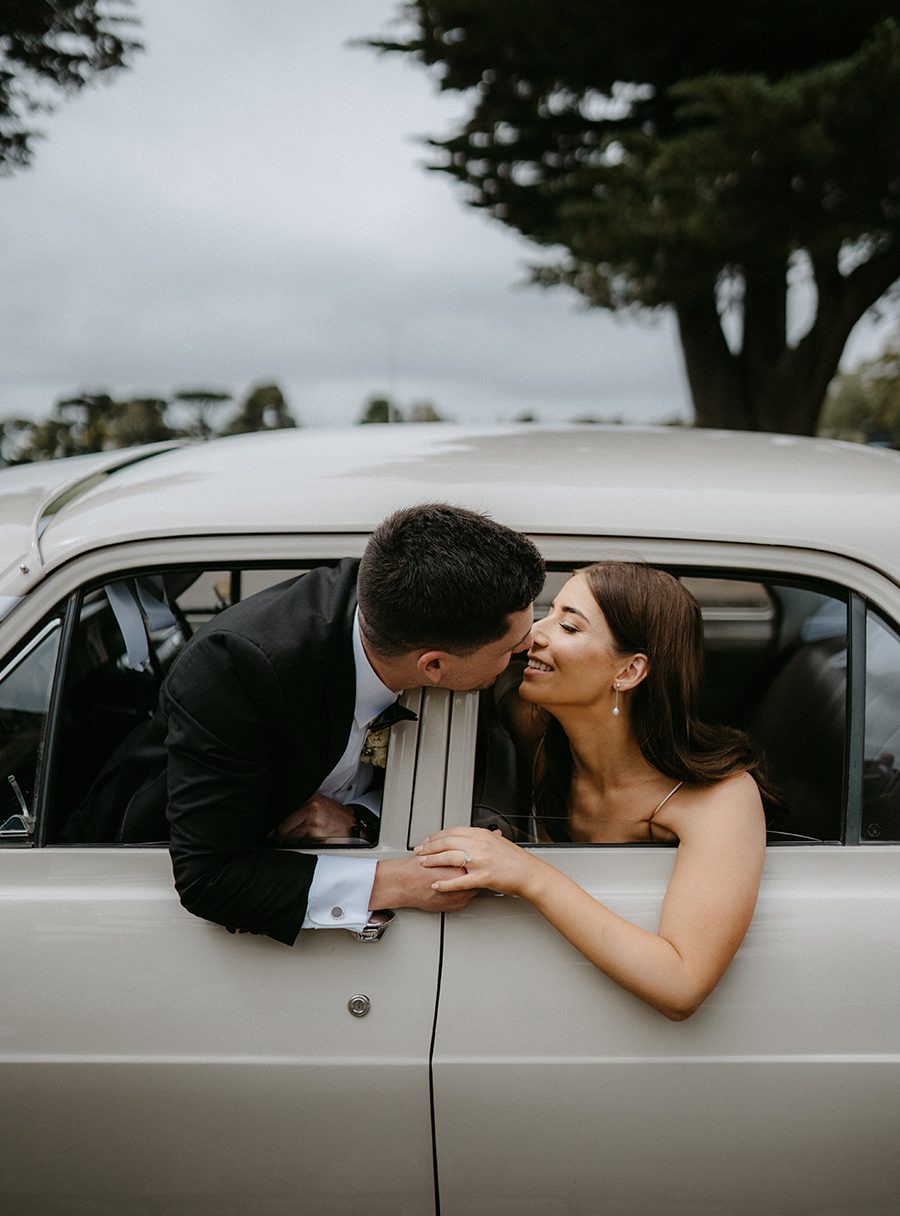
The Wardrobe: Less Is Always More

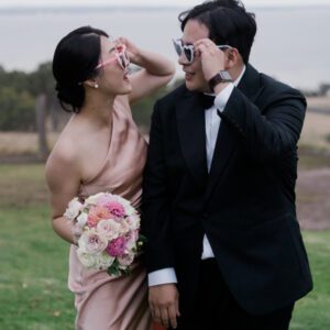
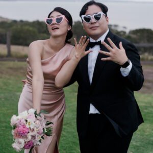
Korean fresh wardrobe is the opposite of traditional wedding fashion. No ballgowns. No veils that trail for ten feet. No jeweled headpieces. Just clean, simple, beautiful clothing that lets the couple be the focus.

The Dress: Simple, Flowy, White

A simple slip dress in ivory or soft white is the ultimate Korean fresh wedding dress. It moves with the body, it catches light without reflecting it harshly, and it photographs clean against any background. The fabric should be lightweight — silk, chiffon, or crepe — something that drapes rather than structures.

A-line dresses in matte satin work too, but avoid anything with lace overlays, beading, or heavy embroidery. Those details add visual noise that fights the minimalism. You want the dress to disappear into the image so the couple is all that matters.

Colors: white, ivory, soft blush, pale champagne. That is it. No red, no navy, no black. The palette is deliberately limited because limitation creates cohesion. When everything in the frame is soft and neutral, the eye goes straight to the people, not the clothing.

The Groom: Clean and Understated

A white or cream suit is the Korean fresh groom uniform. Not off-white, not ecru — actual white. It looks modern, it looks clean, and it photographs beautifully against the soft Melbourne palette. If white feels too bold, a light grey suit works too.

No tie. Or a very thin silk tie in a tone that matches the suit. The shirt should be simple — white or pale blue, no pattern, no cufflinks that catch light. The shoes should be clean white or light tan. No brogues, no oxfords, no anything that looks heavy.

The groom’s hair should be simple too. Not a sculpted quiff, not a slicked-back look. Just neat, natural, slightly tousled. Like he rolled out of bed and walked straight into the frame. That effortlessness is the point.

The Light: Soft, Even, Forgiving

Korean fresh photography does not work in harsh light. It needs soft, diffused, even illumination that wraps around faces and eliminates every harsh shadow. Melbourne’s overcast skies are basically a built-in softbox for this style.

Overcast Is Your Best Friend

When the sky is grey, the light becomes a giant diffuser. It comes from everywhere, not from one direction, which means there are no hard shadows under eyes or noses. Skin looks smooth. Colors stay saturated without being blown out. The whole scene looks like it has been gently lit by a professional studio — except it is just a cloudy Tuesday in Melbourne.

Do not check the weather forecast and cancel if it says clouds. Cancel if it says clear blue sky. Clouds are what you want. They are the reason Korean fresh photography looks so good in this city.

Open Shade for Outdoor Shoots

If you must shoot in sun, find open shade — the kind of shade you get under a large tree or beside a tall building. The light here is soft and directional, coming from the sky above rather than the sun behind. It sculpts faces gently and creates a natural catchlight in the eyes that makes them look alive.

Avoid dappled light from tree leaves. It creates spotty shadows on faces that look messy in a minimalist edit. You want even, consistent light across the entire frame. Open shade gives you that. A large building’s shadow gives you that. A cloudy sky gives you that.

Indoor Light Near Windows

The best indoor light for Korean fresh is a large window on a cloudy day. The light that comes through is soft, white, and even. Position the couple near the window and let the light fall across both faces equally. If the room is dark, the window becomes the only light source, and that single-source look is incredibly clean and cinematic.

Old Melbourne homes with tall sash windows are perfect for this. The light comes in as a wide rectangle that illuminates the couple and lets the rest of the room fall into soft shadow. That contrast — bright couple, dark room — creates depth without clutter. The eye goes straight to the lit area. Everything else disappears.

Composition Rules That Make It Work

Korean fresh photography follows a few simple rules that separate it from just taking a nice photo.

Negative Space Is Everything

Leave room. Lots of it. If the couple is in the bottom third of the frame, let the top two-thirds be sky, or wall, or water, or nothing. That empty space is not wasted — it is the point. It gives the image room to breathe. It makes the couple feel small and the moment feel big.

Do not fill the frame. Do not crop tight. Let the image be wide and open. A couple that takes up twenty percent of the frame with eighty percent empty space around them looks more powerful than a couple that fills the entire frame. That counterintuitive truth is what makes Korean fresh work.

Centered and Symmetrical

Most Korean fresh shots are centered. The couple in the middle, the background symmetrical on both sides. This creates a sense of calm and order that mirrors the minimalist aesthetic. It is not boring — it is intentional. The symmetry draws the eye directly to the couple and says “this is the only thing that matters.”

Leading lines work too — a path that draws the eye toward the couple, a railing that points at them, a row of trees that frames them from both sides. But the lines should be simple and clean, not busy or chaotic. One leading line, not five.

Shoot From Above and From Far Away

Two angles dominate Korean fresh photography. The first is overhead — shooting straight down at the couple from above. This flattens the perspective and turns the scene into a graphic, almost abstract composition. A couple lying in the grass, shot from directly above, with green filling the frame and their bodies forming a simple shape in the center — that image is iconic for a reason.

The second is far away. Use a telephoto lens and step back. Let the background compress into soft washes of color. The couple becomes small in the frame, surrounded by space. That sense of scale makes the image feel cinematic and emotional without being dramatic. It is quiet. It is vast. It is Korean fresh.

The Edit: Clean, Bright, Barely There

The editing for this style is the opposite of dark and moody. It is bright, clean, and almost invisible. The goal is to make the photo look like it was taken with perfect light and no post-processing at all.

Lift Everything Slightly

The shadows should not be dark. Lift them in editing so the darkest areas are light grey, not black. The midtones should be bright but not blown out. The highlights should be soft, not clipped. The entire image should feel airy, like it is floating.

This is not the same as overexposing. It is about controlling the tonal range so that nothing is truly dark and nothing is truly bright. Everything lives in the middle — soft, even, gentle. That flatness is what makes the image look clean and modern.

Desaturate Selectively

The greens should be muted — not grey, but softer. Think sage, not emerald. The blues should be pale — think powder blue, not navy. The reds should be almost gone — if there is any red in the frame, it should be a soft blush, not a bold pop. The overall palette should feel like it has been washed with milk — still colorful, but gentle.

Skin tones should stay warm and natural. Do not desaturate the skin. That is the one area where color should be real and alive, because it is the area the viewer connects with most.

Grain: None or Almost None

Unlike the retro film styles, Korean fresh is clean. No grain. No texture overlays. No vintage effects. The image should look sharp and smooth and digital in the best possible way. If there is any grain, it should be so fine that you only see it when you zoom in. The aesthetic is polished, not raw.

The Emotion: Quiet Love, Loudly Felt

Korean fresh wedding photography is not about big gestures. It is not about the dramatic dip kiss or the spin in the rain. It is about the in-between moments. The way he tucks her hair behind her ear. The way she rests her head on his chest while they stand still. The way they look at each other with that soft, private expression that says more than any pose ever could.

The photographer’s job is to be invisible. To wait. To watch. To catch the moment when the couple forgets the camera is there and just exists together. That is when the Korean fresh magic happens — not when they are performing, but when they are just being.

Melbourne gives you the space, the light, the clean lines, and the soft palette. All you have to do is show up in simple clothes, find a quiet corner, and let the simplicity do what it does best — make everything else disappear so all that is left is the two of you.

Evermore_weddings_Jack_Rabbit_Winery-61

Melbourne wedding photography in a light retro film style

Melbourne Wedding Photography: Light Retro Film Style That Feels Like a Memory You Almost Had

There is a sweet spot between modern and vintage that most photographers never find. It is not full-on 1970s grain. It is not heavy desaturation. It is not sepia tones everywhere. It is something lighter — a whisper of film, a suggestion of analog warmth, a color palette that looks like it was shot on a camera someone found in a grandmother’s closet. This is the light retro film style, and Melbourne is one of the best cities on earth to shoot it because the city already looks like it was photographed on film. You just have to let the camera do what it already wants to do.

wedding photography melbourne

What Light Retro Film Actually Means

People hear “film photography” and they think heavy grain, blown-out highlights, and muddy shadows. That is not what light retro is. Light retro takes the best parts of film — the warm color shifts, the soft contrast, the way skin tones glow without looking orange — and leaves behind the parts that do not serve a wedding album. The result is an image that looks like it was shot on film but does not look like it was shot in 1974. It looks timeless. It looks like a photograph that could belong to any decade and still feel right.

The colors lean warm but not orange. The shadows are lifted slightly so nothing is ever truly black. The highlights roll off gently instead of clipping hard. The greens shift toward olive. The blues shift toward teal. The reds stay red but get a little dusty, like a rose that has been sitting in a vase for a week. It is subtle. You would not notice it if someone described it to you. But you would feel it when you saw the image.

Melbourne’s natural palette makes this style effortless. The city is already muted — grey skies, bluestone streets, sandstone buildings, green parks that are never quite bright green. You do not have to fight the environment to get this look. You just have to stop fighting it.

Locations That Were Already Shot on Film

You do not need to travel anywhere. Melbourne has corners that look like they were waiting for a light retro edit.

The Old Streets of Fitzroy and Collingwood

Fitzroy’s side streets are a goldmine for this style. Not Brunswick Street — that is too busy, too colorful, too now. The streets one block over — Gertrude Street’s quieter end, Johnston Street near the edges, the lanes behind the main drag — these are where the magic lives. Old brick walls with peeling paint. Iron lace balconies that have rusted to a deep brown. Wooden doors that have been repainted so many times they have their own history.

Shooting here in the late afternoon gives you that warm, golden light that film loves. The sun comes in low through the buildings and paints long rectangles of gold on the bluestone. A couple leaning against a brick wall, lit by that golden rectangle, shot with a slightly wide lens so the walls frame them — the image looks like it was pulled from a shoebox. Not a clean shoebox. A shoebox that has been sitting in an attic for thirty years, with a few coffee stains on the prints.

Collingwood offers a grittier version of the same thing. The factories along Wellington Parade have massive windows that let in soft, even light. The brick is red and cracked. The streets are narrow. Everything feels industrial but warm. A couple standing in a doorway with the street behind them, the light falling across their faces from the side — that half-lit, half-shadow look is pure light retro.

South Melbourne’s Heritage Homes

South Melbourne has some of the best-preserved Victorian terraces in the city. The houses here are painted in muted tones — sage green, dusty pink, pale blue, cream — and the front gardens have overgrown hedges and old gas lamps that look like they have not been updated since 1920.

Walking down these streets feels like stepping into a different time. The light here is soft because the buildings block the harsh midday sun. Everything is shaded, everything is gentle. A couple standing on the front steps of a sage-green terrace, she in a simple ivory dress, he in a linen suit — the colors blend into the background in a way that looks effortless. The image does not look posed. It looks like someone happened to be walking by with a camera and caught a beautiful moment.

The Inner City Laneways

Melbourne’s laneways are not all neon and graffiti. Some of them are quiet, narrow, and full of texture. Degraves Lane, Duckboard Place, and the smaller passages off Flinders Lane have old brick walls, wooden doors, and cobblestone paths that photograph beautifully in the light retro style.

The trick is to shoot these lanes in the early morning or late evening when the light is directional and warm. Midday light in a laneway is flat and unflattering. But golden hour light raking across old brick creates shadows that add depth and texture that no filter can replicate. A couple walking down a narrow lane, the light hitting one side of their face, the other side in soft shadow — that is the entire aesthetic in a single frame.

The Technical Side: How to Get the Look Without Going Full Analog

You do not need to shoot on actual film to get this style. Modern cameras can replicate the look with the right settings and the right editing. But understanding what film actually does helps you make better choices even with digital.

Shooting for Warmth and Softness

Start with your white balance. Set it slightly warm — around 5800K instead of 5500K. This gives you a subtle warmth straight out of camera that mimics the color shift of warm film stock. You do not want it to look orange — just warm. Like late afternoon light even when it is not late afternoon.

Shoot in aperture priority with a wide aperture — f/1.8 to f/2.8. This gives you that shallow depth of field where the background goes soft and the couple stays sharp. Film does this naturally because of the way lenses were designed decades ago. Replicating it digitally means using a fast lens and getting close to your subjects.

Do not overexpose. Film handles overexposure differently than digital — it rolls off the highlights gently instead of clipping them. To mimic this, expose slightly to the right but pull the highlights back in editing. This gives you that soft, glowing highlight look that is the signature of light retro.

The Grain Question

Full film grain looks heavy and dated on a wedding album. Light retro uses grain the way a chef uses salt — a little bit, in the right places. Add grain in editing, but keep it fine. Not the chunky, noisy grain of high ISO digital. The smooth, even grain of medium-speed film. It should be visible when you look closely but invisible when you step back. That is the sweet spot.

Too much grain and the images look dirty. Too little and they look digital. The right amount makes the image feel tactile — like you could reach into the photo and touch the texture of the wall behind the couple.

Styling That Feels Lived-In, Not Costumed

The light retro style falls apart if the wardrobe looks too new, too perfect, too 2024. Everything needs to look like it has a story. Like it has been worn before. Like it was found in a vintage shop, not bought off a rack last week.

Dresses With Character

Lace is your best friend here. A lace dress in cream or ivory photographs like a dream in this style — the texture of the lace catches the warm light and creates tiny shadows that add depth. Satin works too, but only if it is not too shiny. A matte satin in champagne or dusty rose has a softness that mirrors the film aesthetic.

Avoid anything with sequins, metallic fabric, or heavy beading. These materials reflect light in harsh, digital ways that fight the softness of the style. You want fabric that absorbs light, not bounces it. Cotton, linen, silk, lace, chiffon — these are your materials. They move gently, they wrinkle slightly, and they photograph with a warmth that synthetic fabrics never achieve.

Colors should be muted. Ivory, champagne, blush, sage, dusty blue, soft terracotta. Nothing pure white — it looks too clean, too modern. A warm ivory picks up the golden light and glows. A dusty blue against old brick looks like a painting.

Groom Style That Looks Like It Belongs in the Frame

A well-fitted suit in charcoal, brown, or navy works better than black for this style. Black is too sharp, too contrasty. Charcoal has a softness that blends into the warm palette. Brown suits in particular look incredible in light retro — the warm tone of the fabric echoes the warm tone of the edit, and the whole image feels cohesive.

Linen suits in oatmeal or stone are perfect for outdoor shoots. They wrinkle, they move, they look lived-in. A linen suit with a loose silk tie and no jacket — that is the light retro groom. Relaxed but intentional. Not sloppy, just easy.

Hair and Makeup That Does Not Fight the Grain

Heavy makeup looks terrible with film-style editing. The grain amplifies every line, every cakey patch, every overly contoured cheek. Keep it simple. Dewy skin, groomed brows, a lip that is slightly warmer than your natural shade. That is it.

Hair should be soft, not sculpted. Loose waves, a low chignon, or simply down and wind-tousled. The goal is to look like you woke up like this, not like you spent two hours in a chair. A few flyaway hairs are not a problem — they are actually an asset. They add to the lived-in feeling that this style depends on.

The Light That Makes or Breaks Everything

Light retro film photography lives and dies on light. The wrong light turns it muddy. The right light turns it magical.

Golden Hour Is Non-Negotiable

Shoot during the hour before sunset. The light is low, warm, and directional. It comes in at an angle that creates long shadows and soft highlights. It turns sandstone buildings gold and bluestone streets amber. It makes skin glow without any retouching.

In Melbourne, golden hour is shorter than in other cities because the clouds roll in fast. But when it hits, it hits hard. Plan your outdoor shots for this window. Indoor shots can happen after, when the light is fading and the windows become the main light source.

Overcast Days Are Secret Weapons

A grey sky is not a problem — it is a gift. Overcast light is even, diffused, and shadowless. It eliminates every harsh line and makes skin look flawless. The colors under overcast skies are also more saturated without being blown out. The greens go deeper, the reds go richer, and the whole scene looks like a faded photograph that has been brought back to life.

Do not cancel for clouds. Shoot in them. An overcast day in Fitzroy or South Melbourne produces images that look like they were shot on Kodak Portra in 1995 — warm, soft, slightly desaturated, and deeply nostalgic.

Window Light Indoors

Old Melbourne homes have large sash windows that throw long rectangles of soft light across wooden floors. This is the best indoor light for light retro. Position your couple near the window and let the light fall across one side of their face. The other side falls into soft shadow. That half-lit, half-dark look is the visual signature of every great film photograph ever made.

If the room has fireplace light or candlelight, even better. The mix of warm tungsten from the fire and cool daylight from the window creates a color contrast that looks rich and layered. It also adds that flicker, that movement, that sense of life that makes the image feel like a memory rather than a photograph.

Editing: The Part Where the Style Actually Happens

The shoot gets you eighty percent of the way there. The edit gets you the rest. Light retro editing is subtle but deliberate — every adjustment should feel like it was made by someone who cares, not by someone who downloaded a preset.

Color Grading That Feels Warm, Not Orange

Shift the whites slightly toward warm — not a lot, just enough to take the digital edge off. Pull the greens toward olive. Shift the blues toward teal. Desaturate the yellows slightly so they do not compete with the skin tones. The overall palette should feel like a faded photograph that someone kept in a drawer — warm, slightly muted, and full of character.

Do not crush the blacks. In light retro, the darkest shadows are dark grey, not pure black. Pure black looks digital and harsh. Dark grey looks like film. It looks like the shadows have texture and depth, not emptiness.

Contrast That Rolls, Not Clips

Film has a specific way of handling contrast — it compresses the highlights and lifts the shadows, which means the image has detail in both the brightest and darkest areas. Replicate this by pulling down the highlights and lifting the shadows in editing. The result is an image that looks soft but still has punch. It is not flat. It is just gentle.

The Grain and the Vignette

Add fine grain — just enough to break up the digital smoothness. Not so much that it looks noisy. Just enough that the image feels tactile. Then add a subtle vignette — darker corners that draw the eye to the center of the frame where the couple is lit. The vignette should be barely noticeable at first glance but obvious when you look closely. It creates a tunnel effect that makes the viewer feel like they are peering into a private moment.

The Feeling: Nostalgia Without the Costume

Light retro film photography is not about pretending you live in a different decade. It is about capturing a feeling — the feeling of looking at an old photograph and remembering something you cannot quite place. It is warmth without sentimentality. It is softness without weakness. It is an aesthetic that says “this moment mattered” without shouting it.

Melbourne gives you everything you need for this style — the old streets, the muted architecture, the moody light, the laneways full of texture, the parks that look like they have not changed in a hundred years. You do not need to force anything. You just need to show up with the right lens, the right light, and the willingness to let the image be a little imperfect. Because in light retro, imperfection is not a flaw. It is the whole point.

Evermore_weddings_Jack_Rabbit_Winery-82

Melbourne wedding photography with a dark tone and high-end texture style

Melbourne Wedding Photography: The Dark and Moody Luxe Edit

There is a kind of wedding photography that does not need sunshine. It thrives in shadows. It finds beauty in a single shaft of light cutting through a dim room, in the reflection of a streetlamp on wet asphalt, in the deep blue of a sky that refuses to go completely black. This is the dark, moody, high-end aesthetic — the look that says you are not trying to impress anyone, but somehow you are impossible to look away from. Melbourne, with its moody weather, its bluestone alleyways, and its love of dramatic contrast, is one of the few cities on earth where this style does not feel forced. It feels inevitable.

wedding photography melbourne

Why Dark and Moody Works in Melbourne Specifically

Most wedding photography trends come from California or Europe — places with guaranteed sun and pastel palettes. Melbourne does not do guaranteed sun. It does overcast skies, sudden rain, and light that changes every eleven minutes. And that unpredictability is exactly what dark photography needs.

When the sky goes grey, the world loses its flatness. Shadows deepen. Colors saturate. The bluestone footpaths turn almost blue. The brick buildings go warm and rich. Everything gains dimension because the light is not blasting everything equally — it is selective, moody, and full of drama. That is the canvas a dark-style photographer works on.

The city’s architecture helps enormously. Melbourne is full of Victorian and Edwardian buildings with deep verandas, dark wood interiors, stained glass windows, and heavy ironwork. These spaces were not designed to be bright and airy — they were designed to be atmospheric. A ballroom with dark paneling and crystal chandeliers throws light in every direction, creating pools of gold on dark floors. That contrast — light against dark — is the entire foundation of this aesthetic.

And then there is the people. Melburnians have a certain look — understated, slightly melancholic, effortlessly cool. They do not smile for the camera the way people in other cities do. They look away. They drink their coffee. They walk fast. That natural reserve translates perfectly into dark wedding photography, where the best images are the ones where the couple looks like they are in their own private world, untouched by the chaos around them.

The Locations That Were Built for Shadow

You do not need a studio. You do not need black backdrops. Melbourne has real places that are genuinely dark, genuinely atmospheric, and genuinely beautiful without any help.

Old Churches and Heritage Interiors

Churches are the obvious choice, but most people shoot them wrong — they blast them with flash and turn every cathedral into a bright, flat wedding venue. The trick is to shoot them with available light only. Let the stained glass do the work.

St Paul’s Cathedral on Flinders Street has interiors that go dark fast — the stone absorbs light, the ceiling disappears into shadow, and the only color comes from the windows. Standing in the nave with nothing but a sliver of colored light falling across your face creates a portrait that looks like a Caravaggio painting. The darkness around you is not empty — it is full of texture, of history, of centuries of accumulated silence.

St James Old Cathedral on King Street is even better for this style. It is smaller, darker, and more intimate. The wooden pews, the low ceiling, the candlelight from the side chapels — it all feels like a secret room. A couple standing near the altar with a single candle between them, lit only by the warm flicker, creates an image so moody it could hang in a gallery. The shadows swallow everything except their faces, and that focus on just the two of them in the dark is deeply romantic in a way that bright photos never achieve.

All Saints Church in East Melbourne has a different kind of darkness — more Gothic, more dramatic, with pointed arches that create natural frames of shadow. The light comes through narrow windows in thin beams that cut across the stone floor. Walking through one of those beams, caught mid-stride, with the rest of the church in deep shadow behind you — that single moment of light in a sea of dark is the visual definition of this style.

Laneways and Arcades After Dark

Melbourne’s laneways transform completely when the sun goes down. The graffiti that looks colorful at noon becomes mysterious and layered under streetlights. The narrow passages get darker, the walls press in closer, and the only light comes from the ends of the lanes or from neon signs bleeding through doorways.

Hosier Lane at night is not the tourist trap it is by day. After 10pm, the crowds thin out, the streetlights cast long orange pools on the bluestone, and the graffiti glows in ways it never does in sunlight. A couple walking down the center of the lane, lit only by the warm streetlight from above, looks like they are in a film noir. The shadows under their eyes, the contrast between the light on their faces and the dark behind them — it is cinematic without a single artificial light.

The Block Arcade and Royal Arcade in the CBD offer a different kind of dark luxury. These Victorian shopping arcades have glass ceilings that let in the last of the daylight, marble floors that reflect what little light there is, and iron railings that create geometric shadow patterns. The light here is fading — blue hour, that window between day and night — and it casts everything in deep indigo. A couple standing under the glass roof as the sky outside goes dark, with the arcade’s warm gas lamps just starting to glow, creates an image that feels like the last frame of a very good movie.

Industrial Spaces and Warehouses

The darker the better. Abbotsford Convent, Collingwood warehouses, Footscray factories — these spaces have high ceilings that disappear into blackness, concrete floors that absorb light, and massive windows that let in just enough to create silhouette and shape.

The interior of the Old Melbourne Gaol is extreme, but it works. The stone cells, the iron doors, the narrow corridors — it is genuinely dark and genuinely eerie. A couple standing in a cell doorway, lit by a single bare bulb swinging from the ceiling, creates an image that is haunting and beautiful at the same time. It is not for everyone. But for couples who want their wedding photos to feel like something out of a gothic novel, it is unmatched.

More accessible are the warehouses along the Yarra in Richmond and South Melbourne. The old brick buildings have huge windows that face west, which means they catch the last light of the day in long, warm rectangles that stretch across the floor. As the sun drops, those rectangles shrink and the room gets darker. Shooting in that transition — when half the room is gold and half is shadow — gives you images that feel like they are between two worlds.

The Art of Seeing in Low Light

Dark photography is not about making things dark. It is about seeing where the light is and building everything around its absence. That is a different skill set entirely, and it changes how you approach every shoot.

Working With Available Light Only

No flash. No reflectors. No LED panels. Just what is already there — a window, a lamp, a streetlight, the last glow of the sky. This forces you to move the couple toward the light, to position them so the shadow falls where you want it, to wait for the cloud to move so a beam of sun hits just right. It is slower than traditional wedding photography. It is more patient. And the results are infinitely more interesting because every frame is shaped by the environment rather than by equipment.

The camera does the heavy lifting here. Modern mirrorless bodies handle low light astonishingly well — you can shoot at ISO 6400 and still get clean images with beautiful, natural grain. That grain is not a flaw. In dark photography, grain is texture. It is atmosphere. It is the visual equivalent of velvet.

Silhouettes and Shapes Over Detail

When the light is low, stop trying to see faces. Start seeing shapes. The curve of a jaw in silhouette. The outline of a couple embracing against a bright window. The shape of a hand reaching for another hand in near-darkness. These abstract, graphic images often carry more emotion than a sharp portrait because they ask the viewer to fill in the blanks — to imagine the expression, the feeling, the story.

A silhouette of a bride and groom standing in a church doorway, the light behind them blowing out the window into pure white, their figures completely black — that image is iconic. It is simple. It is graphic. And it says more about love than a thousand detailed portraits ever could.

The Window Light Trick

The single most beautiful light source for dark wedding photography is a large window on an overcast day. The light that comes through is soft, directional, and falls off fast — meaning one side of the face is lit and the other side falls into deep shadow. That half-light, half-dark look is called chiaroscuro, and it has been used by painters from Rembrandt to Vermeer to create the most emotional portraits in history.

In Melbourne, almost every old building has these windows. Find one. Place the couple next to it. Let the light fall on one side of their face. Let the other side disappear. Do not fill the shadow. Do not add light. Let the darkness stay. That contrast is where the emotion lives — in the tension between what you can see and what you cannot.

Wardrobe and Styling for the Dark Edit

Bright white dresses do not work here. Pastels do not work. Neon does not work. The dark aesthetic demands rich, deep, saturated colors — or total black.

Deep Colors That Absorb Light

Burgundy, navy, forest green, deep plum, charcoal — these colors disappear into shadow and then suddenly catch light in a way that white never does. A burgundy velvet dress in a dark church looks like liquid wine. A navy suit in a dimly lit warehouse looks like midnight. The fabric matters too — velvet, silk, heavy crepe — materials that have their own light and shadow built into the texture.

Black is the ultimate dark color, and a black wedding dress shot in a black room with a single light source is one of the most striking images you can make. The dress disappears into the background and only the face and hands emerge — floating in darkness. It is dramatic, it is modern, and it is not for the faint of heart. But when it works, it works like nothing else.

Minimal Accessories, Maximum Impact

In bright photography, you can get away with big earrings, chunky necklaces, elaborate headpieces. In dark photography, everything competes with the shadow. Keep it simple. A single ring catching light. A small earring that glints when the head turns. A veil that catches the edge of a light beam and turns translucent. Less is more — always — but in the dark, it is not a suggestion. It is a rule.

The Edit: Deep Shadows, Warm Highlights

The post-processing for dark wedding photography is where the style truly comes together. It is not about making the photo darker — it is about controlling where the dark goes and where the light stays.

Lift the blacks slightly so the deepest shadows are dark grey, not pure black. Pure black looks digital and flat. Dark grey looks like film. Push the contrast so the midtones separate from the shadows — this gives the image depth and makes it feel three-dimensional.

Desaturate the greens and blues. Dark photography lives in warm tones — amber, gold, deep red, brown. Cool colors recede and feel distant. Warm colors come forward and feel intimate. Shift the white balance slightly toward warm, even if the light was cool. That warmth unifies everything and makes the image feel like a memory rather than a photograph.

Add grain. Not a lot — just enough to break up the digital smoothness and give the image a tactile, analog quality. Film grain in a dark photo looks like atmosphere. It looks like the air itself has texture.

And finally, vignette. Heavy vignette. Push the corners to black so the eye is forced to the center of the frame where the couple is lit. That tunnel effect draws the viewer in and creates a sense of intimacy — like you are peering into a private moment that was not meant for you.

The Emotional Core: Intimacy in the Dark

Dark wedding photography is not about sadness. It is not about goth or drama or trying to be edgy. It is about intimacy. When everything around you is dark, the only thing that matters is the person next to you. The light falls on their face and nowhere else. The world disappears. It is just the two of you in a pool of warmth surrounded by shadow.

That feeling — of being alone together, of the world falling away, of love existing in a small bright space inside a vast dark one — is what makes this style so powerful. It is not photogenic because it is dark. It is photogenic because it is honest. And honesty, in a world of overlit, over-filtered, over-shared images, is the rarest thing a photograph can offer.

Melbourne gives you the churches, the laneways, the warehouses, the grey skies, the bluestone shadows, and the moody light that makes everything look like a painting. All you need is the courage to let the dark in — to stop fighting the shadow and start using it. Because in the dark, every point of light becomes a story. And your wedding day is full of them — you just have to be willing to see them.