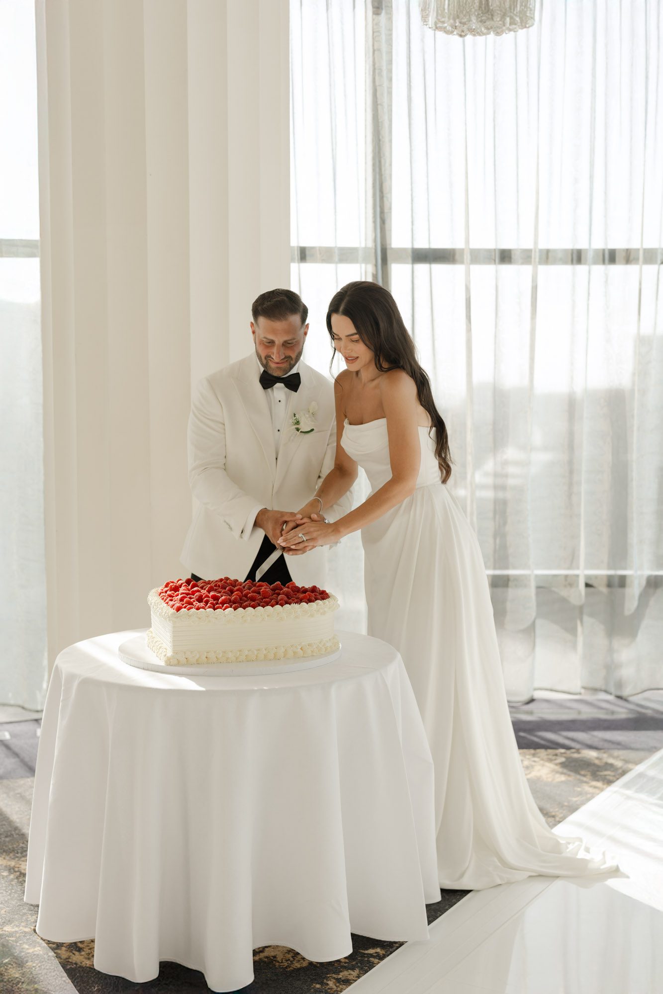
Melbourne wedding photography final images offer multi-size output compatibility
Melbourne wedding photography final images offer multi-size output compatibility
When finalizing wedding photos for couples across Melbourne, multi-size output adaptation ensures every frame looks crisp, perfectly composed, and true to the original creative vision no matter where it is viewed or printed. This process is not just a simple resize, it is a careful, detail-focused adjustment that preserves the photo’s emotional impact across every possible use case, from small social media posts to large wall displays.
Aspect Ratio Alignment for Different Use Scenarios
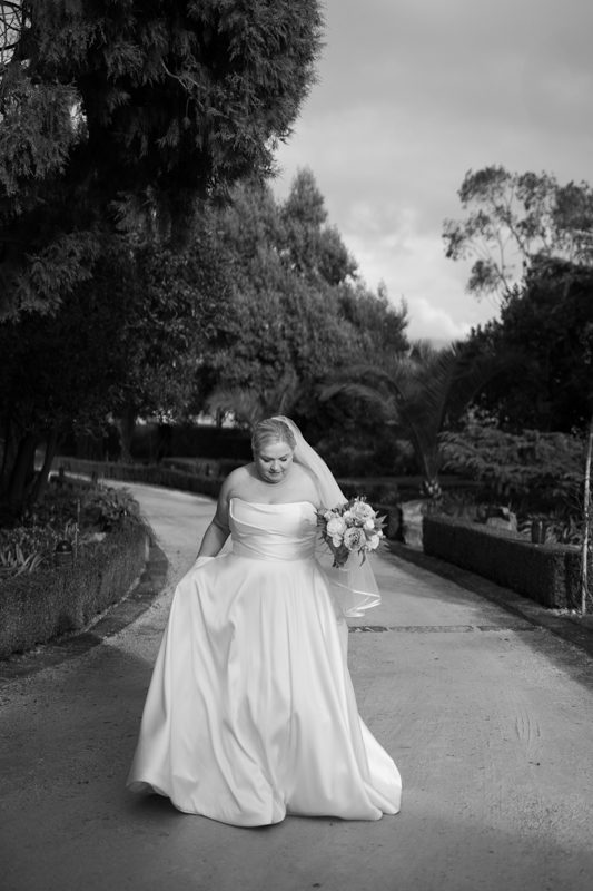
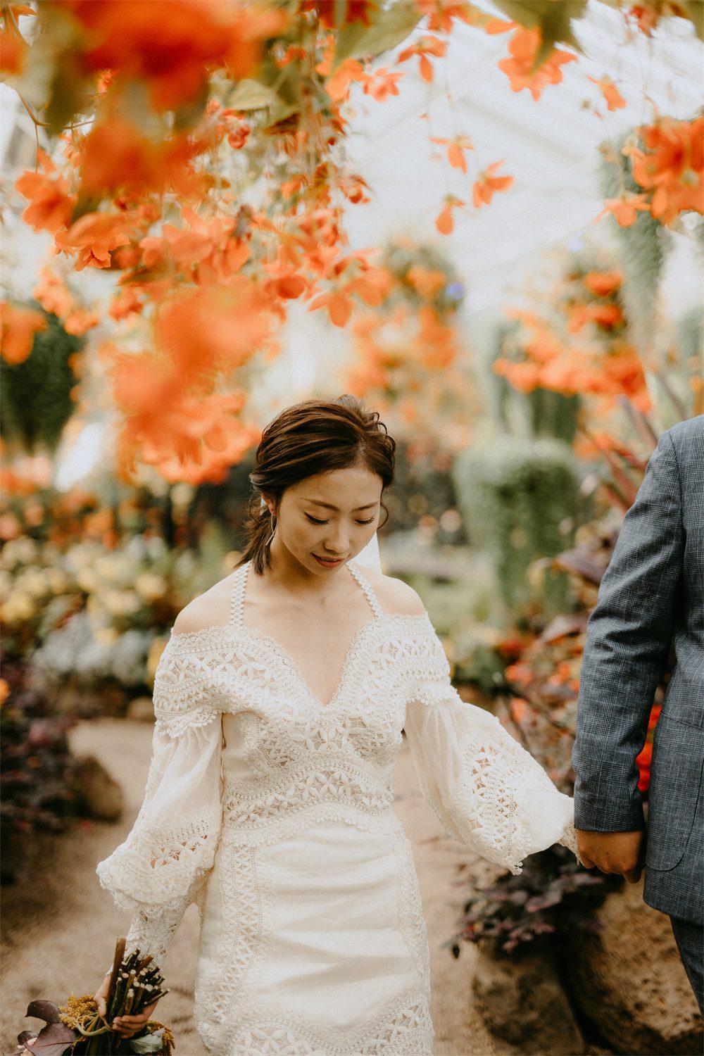
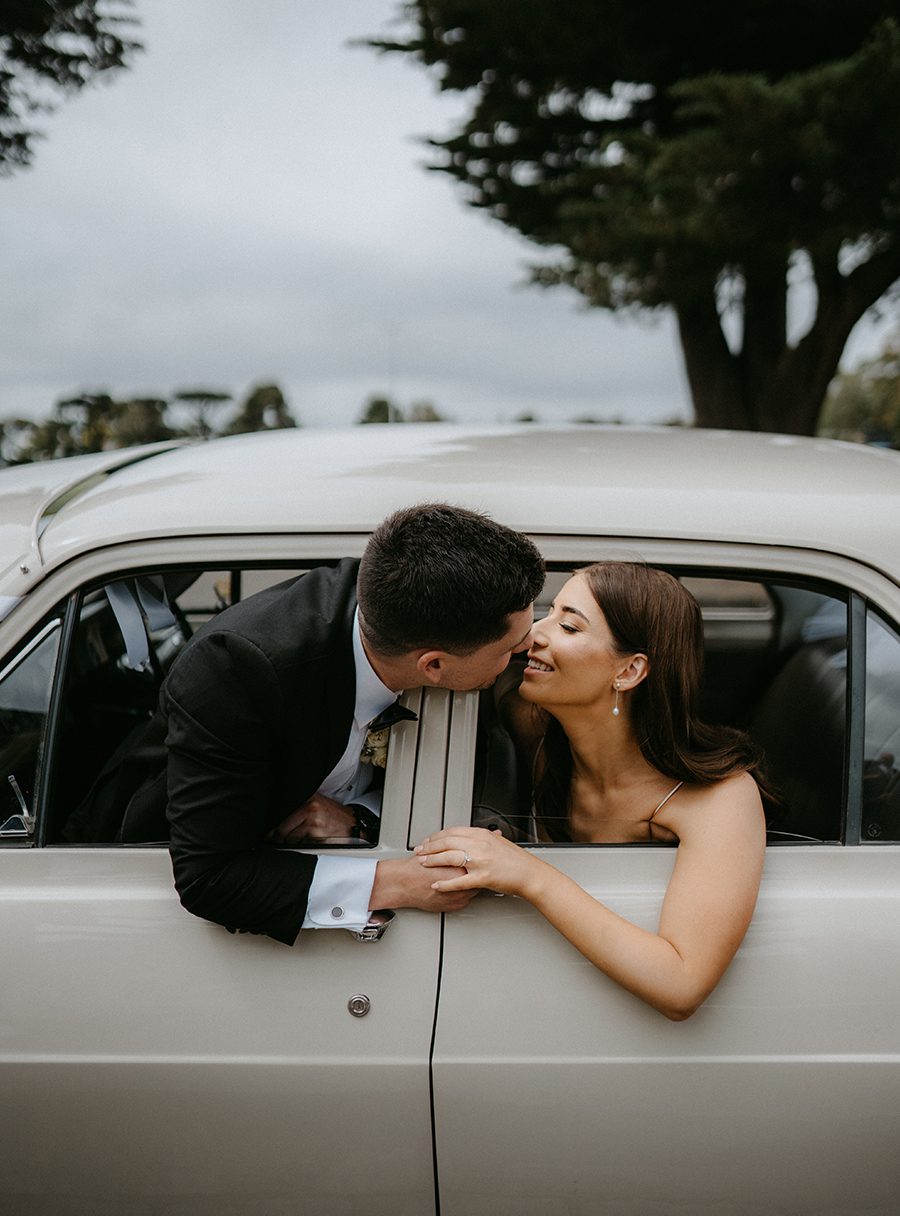
The first step is to reframe each shot to fit the unique aspect ratios of common use cases, without cutting out critical, meaningful details from the original frame. For wide panoramic prints meant to hang above a living room sofa, you extend soft background elements like sky or distant landscape subtly instead of cropping the couple’s feet or the top of their veil. For vertical formats designed for mobile viewing, you gently shift the central focus of the couple toward the middle of the new frame, making sure no key facial expressions or small, beloved details like a held bouquet get trimmed away. For standard square formats often used for sharing online, you expand empty negative space around the edges of the original shot rather than squeezing the couple into a tight, cramped center position. Every reframe choice keeps the original mood and composition of the photographer’s shot fully intact, no matter the final dimensions.
Resolution and Sharpness Tuning for Each Output
Different sizes and viewing platforms demand customized sharpness and resolution settings to avoid soft, blurry results or over-sharpened, harsh artifacts. For large-format prints that will be viewed from a short distance, you export at full high resolution, applying a subtle, targeted sharpening pass that brings out fine texture in lace, foliage, and facial features without creating unnatural edges. For smaller digital files meant to be viewed on phone or laptop screens, you adjust the sharpening profile specifically for screen display, making sure fine details stay crisp even when the file is compressed for fast loading. For files that will be used in physical photo albums, you calibrate the resolution to match the exact paper type and printing process, ensuring skin tones stay smooth and no fine detail gets lost in the physical printing process. No single universal sharpness setting is applied across all sizes, every version gets its own tailored adjustment.
Color Consistency Across All Output Dimensions
Even the most perfectly resized photo can feel disconnected if its color shifts drastically between a small phone screen view and a large wall print. You embed a consistent, widely supported color profile into every exported file, so skin tones, the soft blue of Port Phillip Bay, and the warm green of Yarra Valley vineyards look identical no matter the display size. For files meant for digital sharing, you make tiny, targeted hue adjustments to compensate for the common color shifts that happen on different mobile device screens, ensuring the photo’s signature warm tone stays consistent for every viewer. For large print files, you run a soft proof check to map the original digital color palette to the full range of colors the physical printing process can reproduce, making sure no subtle sunset gradients or soft shadow tones get clipped or distorted in the final physical output. Every version of the photo carries the exact same color mood, no matter what size or format it is delivered in.