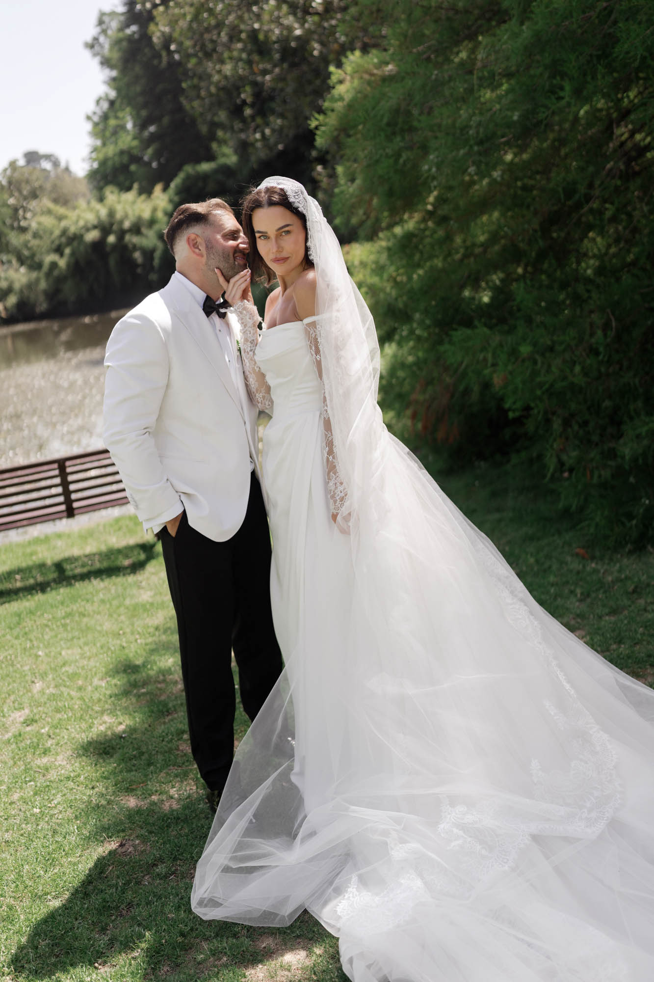
Melbourne wedding photography - Retro style post-processing color adjustment
Melbourne wedding photography - Retro style post-processing color adjustment
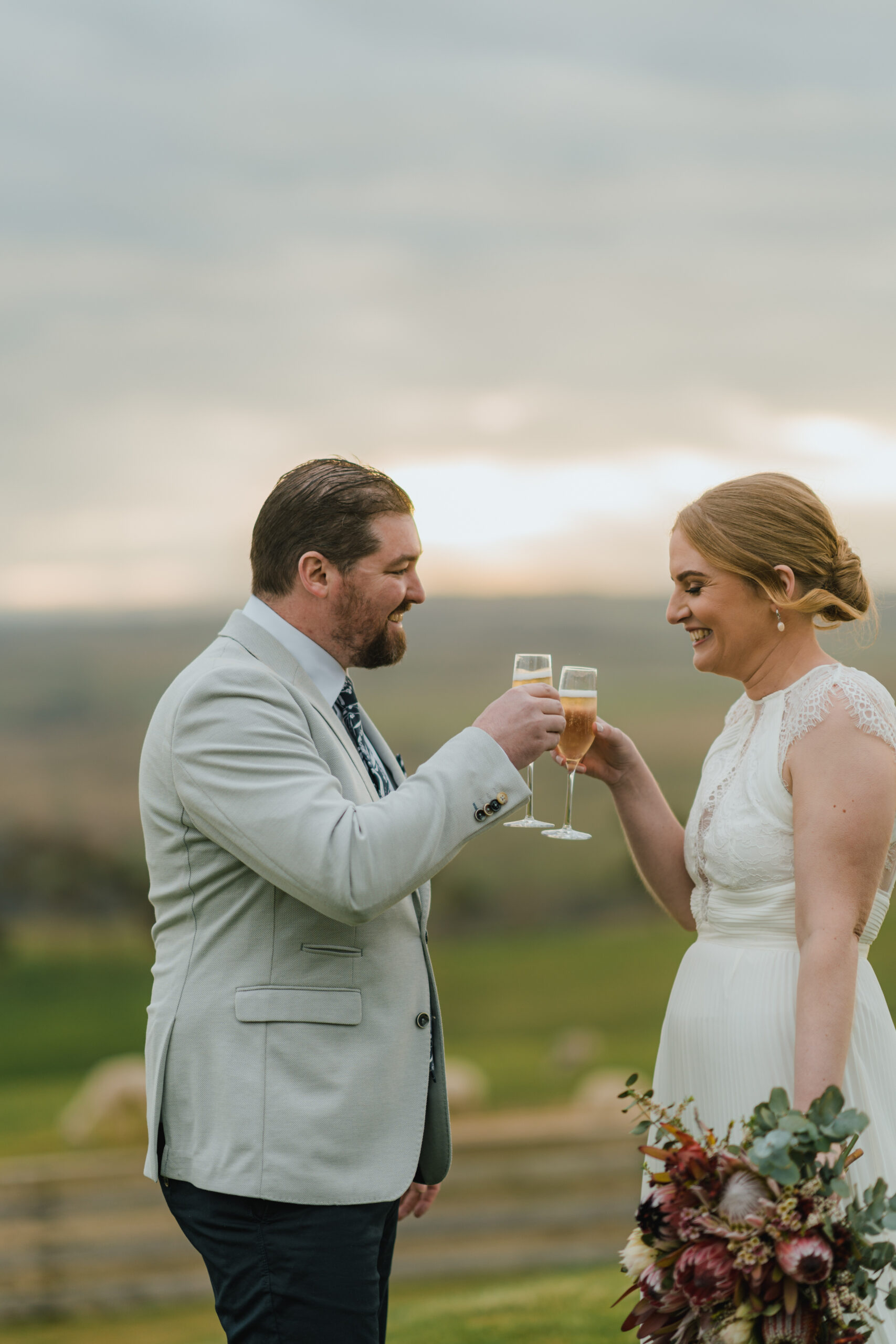
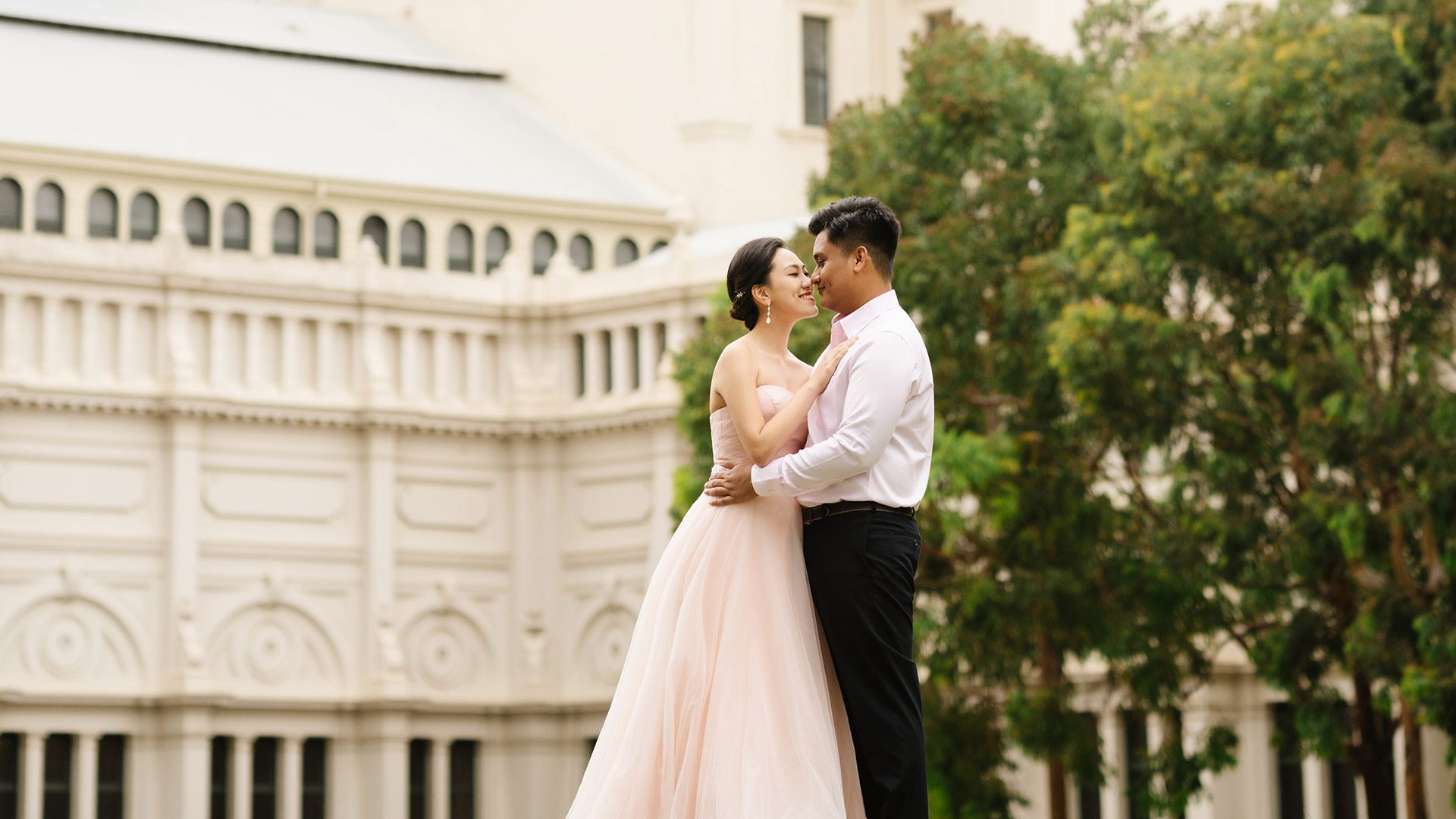
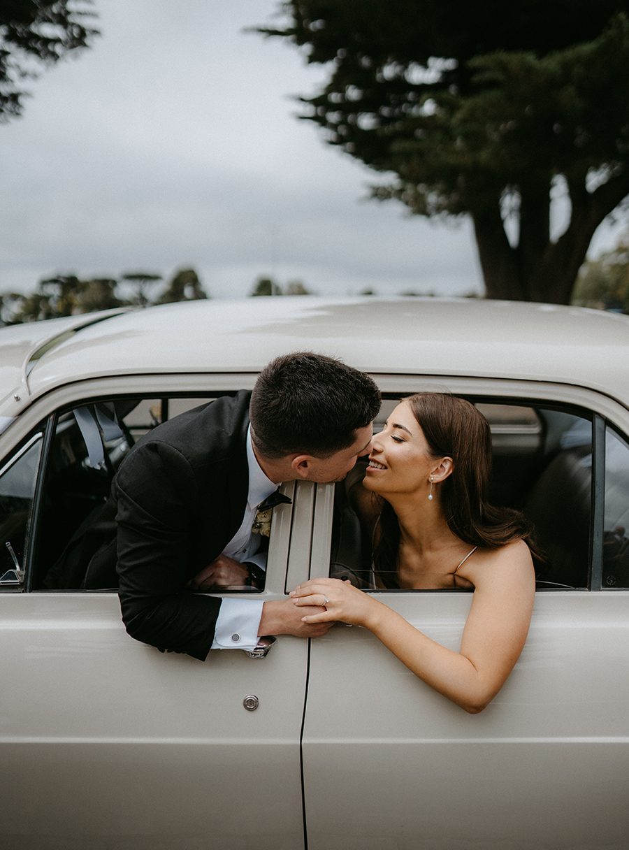
Vintage-style color grading for Melbourne wedding photography takes raw captures from the city’s rich, layered backdrops and wraps them in a warm, nostalgic glow that feels pulled straight from a decades-old photo album. This approach does not chase sharp, modern digital perfection. Instead, it leans into soft tones, muted contrast, and gentle color shifts that give every frame a quiet, timeless weight that couples often search for when they want their wedding memories to feel lived-in rather than overly polished.
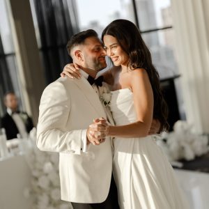
Building a Faded, Warm Tonal Foundation
The core of any vintage edit starts with the tonal curve, where you gently lift the black point so that nothing in the frame ever sits at true, flat black. This creates that signature faded, matte look where even the darkest shadows carry a hint of soft grey or warm brown, never harsh darkness. You pull down the highlights just enough to tame any bright blowouts from harsh Melbourne sun, letting the sky and light sources roll off gently into creamy whites rather than cutting off sharply. The midtones get a very subtle lift in warmth, pushing them toward a soft amber or honey tone that wraps the entire frame in a quiet, golden haze. This base adjustment happens before any color work, setting the emotional mood for the rest of the edit and making every subsequent color tweak feel grounded in that warm, nostalgic foundation.
Shifting Color Channels Toward Muted Nostalgia
Once the tonal base is set, you move to the color channels to push the palette away from modern vibrancy and toward softer, desaturated hues. You lower the saturation of greens significantly, turning the bright eucalyptus leaves of a Royal Botanic Gardens shot into a muted, sage-toned backdrop that feels like an old film still. You shift reds and oranges slightly toward a warm brick or terracotta tone, so the bride’s bouquet and the couple’s skin tones feel rich but never overly punchy. Blues get desaturated and pushed toward a soft teal or dusty slate, making the Melbourne sky or Port Phillip Bay water look like it was captured on aged film stock rather than a sharp digital sensor. You never fully desaturate any single color to the point it loses all identity, you just soften each hue enough to strip away modern digital sharpness while keeping enough color for the scene to feel natural and recognizable.
Adding Film-Like Texture and Subtle Imperfections
The final layer of a vintage edit is what makes it feel truly analog rather than digitally filtered. You add a fine, organic grain across the full frame, adjusting its size and intensity to match the look of slower film speeds, so it sits naturally in the shadows and midtones without overwhelming the highlights. You apply a very subtle, warm vignette that darkens the corners just enough to draw the eye toward the couple, mimicking the natural light falloff of old camera lenses. For shots taken during golden hour, you can add a faint, soft warm light leak along one edge of the frame, the kind of gentle imperfection that makes a photo feel like it was truly shot on physical film. These small, intentional touches tie the whole edit together, giving every frame that quiet, irreplaceable feeling of a memory preserved in time rather than a file sitting on a hard drive.