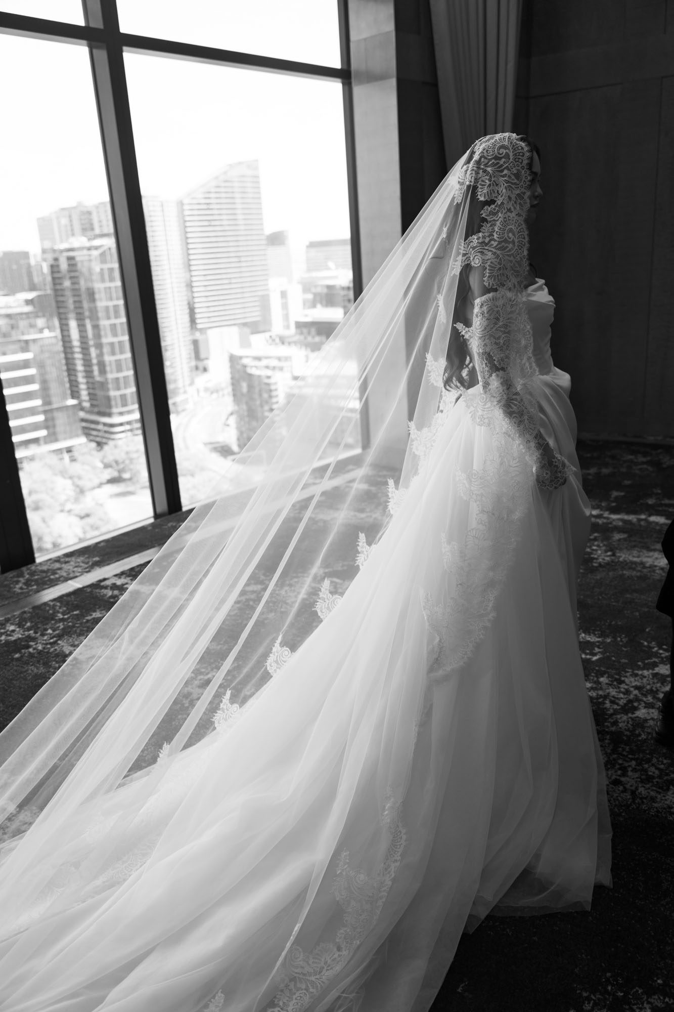
Melbourne wedding photography: Uniform color tone adjustment of the final photos
Melbourne wedding photography: Uniform color tone adjustment of the final photos
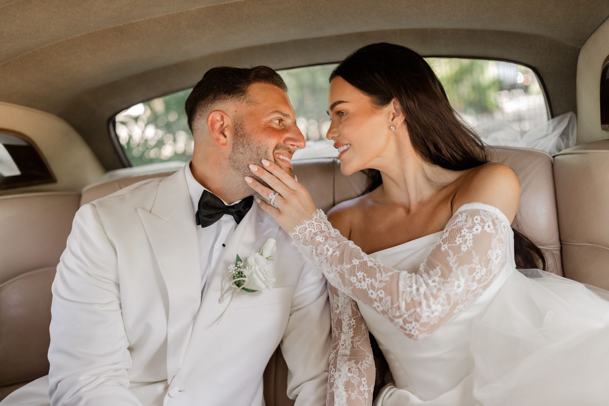
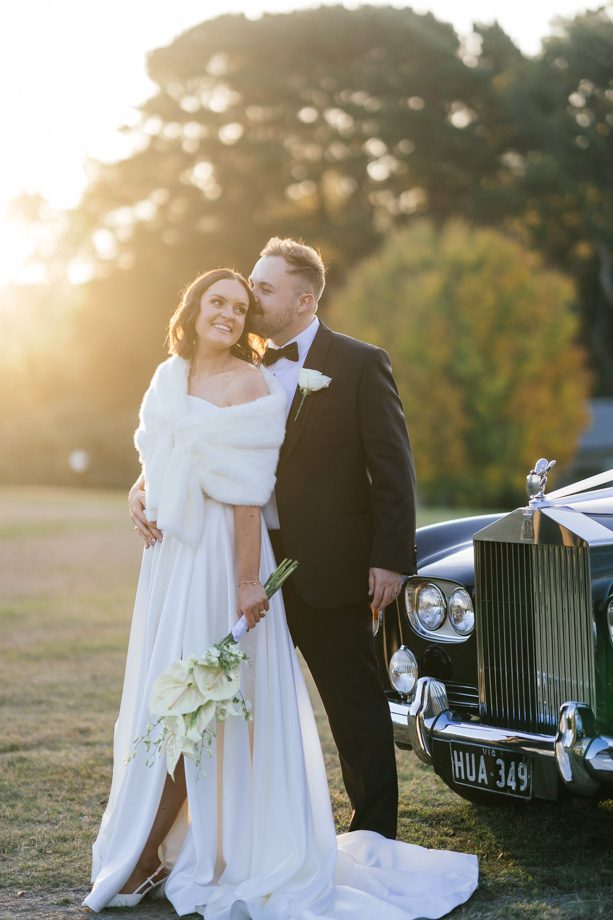
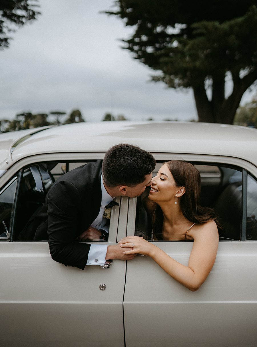
When editing a full gallery of wedding photos shot across Melbourne’s wildly varied locations and lighting conditions, unifying every frame’s color tone creates a cohesive visual story that feels intentional, not like a random collection of disconnected snapshots. This process ties together shots taken under bright midday coastal sun, dim heritage venue indoor light, golden hour garden glow, and late city night neon into a single, consistent body of work that carries the same quiet mood across every image.
Locking in a Shared Base Exposure Foundation
The first step to consistent tones is standardizing the core exposure values across every single photo in the full set, before making any color adjustments at all. You pick one carefully balanced key frame from the middle of the wedding day, usually a golden hour portrait of the couple that already feels perfectly exposed, and use its brightness, contrast, and black point as the reference baseline. You apply matching exposure, contrast, and shadow lift adjustments to every other photo in the gallery, no matter if it was shot in a dark church or on a bright beach. This eliminates the jarring shifts where one photo looks drastically underexposed and the next is blown out, creating a uniform light foundation that all subsequent color tweaks can build on top of. Even candid reception shots taken with fast, available light get their exposure aligned to this shared baseline, so no single frame feels out of place when viewed next to the formal portraits.
Aligning Skin Tones Across All Lighting Scenarios
Skin tone consistency is the most visible marker of a professionally unified wedding gallery, especially when photos are pulled from wildly different lighting environments. You use targeted, localized adjustment tools to map every person’s skin to the same natural, warm baseline, no matter if the shot was taken under harsh fluorescent venue lights that cast green tints, or under deep sunset light that drowns skin in heavy orange. You never alter the unique undertones of each person’s skin to make them look generic, you just correct the color casts from different light sources so the bride, groom, and their close family members look like the exact same people across every single frame. A close-up taken during bridal prep in a hotel room will have the same natural skin warmth as a wide shot taken hours later on a Portsea cliffside, so there is no jarring shift in how the couple looks as viewers scroll through the album.
Matching Color Grading Signatures Across the Full Gallery
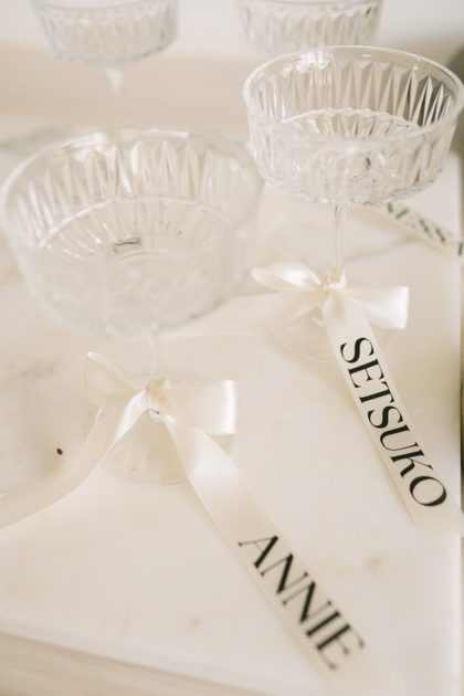
Once exposure and skin tones are locked in, you apply a shared set of subtle color profile rules that carry through every single image in the set. You set a consistent tint balance for shadows and highlights that stays uniform across every frame, so highlights always carry that faint soft warm glow and shadows hold that subtle muted cool tint that defines the gallery’s signature look. You adjust the HSL sliders for core colors to match across all photos: the shade of green for eucalyptus leaves stays consistent in every garden shot, the deep red of the wedding bouquet looks identical in both indoor and outdoor frames, and the soft blue of Melbourne’s bay water carries the exact same hue in every coastal portrait. Even the small, candid detail shots of the cake, rings, and table settings get their colors aligned to this shared palette, so every single element of the full wedding day feels like it belongs to the same carefully crafted visual story.