Melbourne wedding photography – post-processing of film-like color tones
Creating a Timeless Film Look in Melbourne Wedding Photography Post-Processing
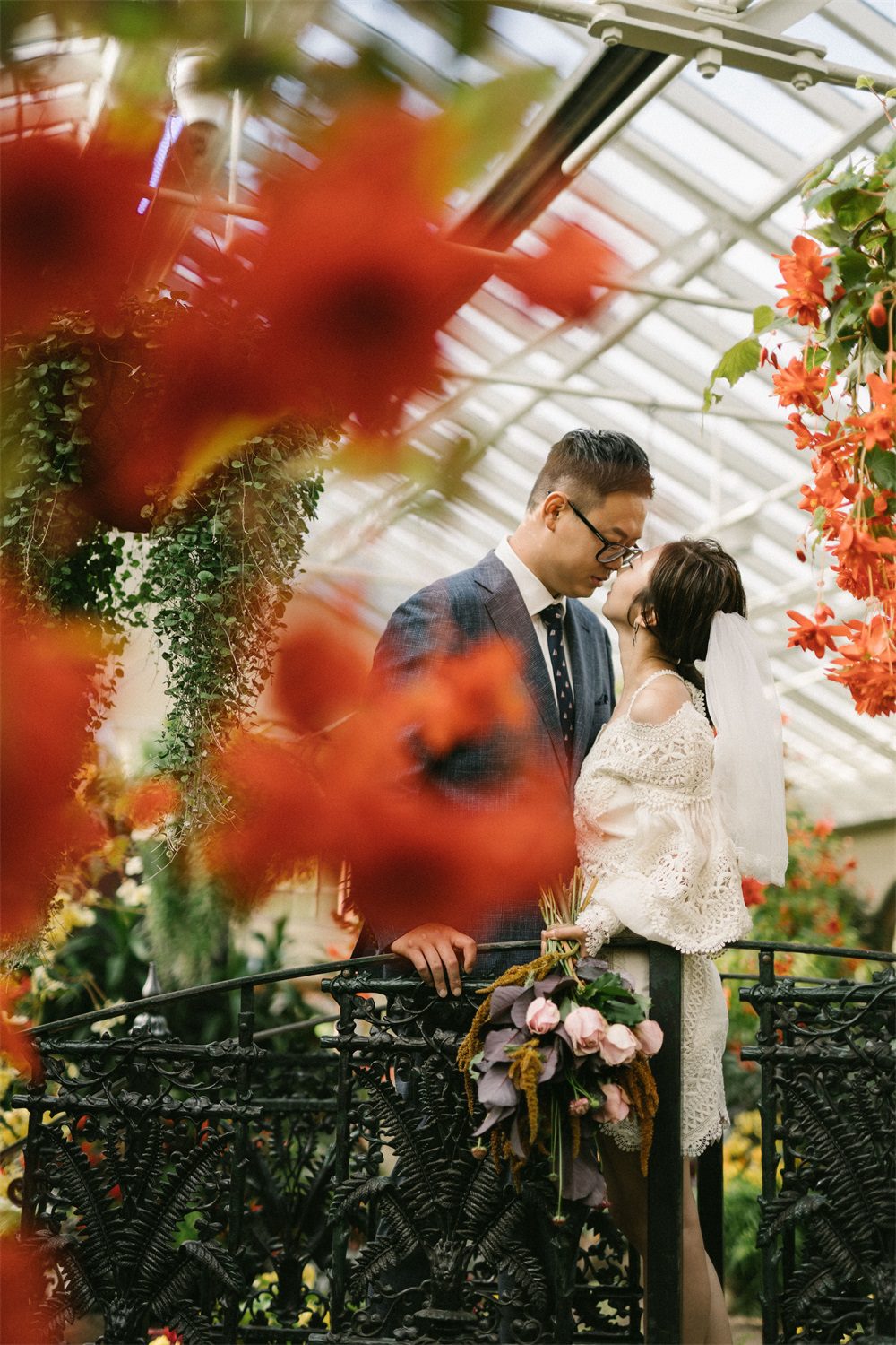
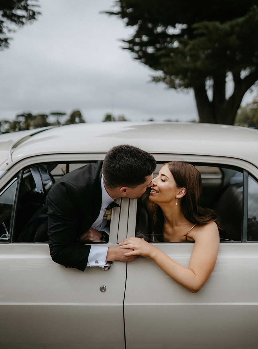
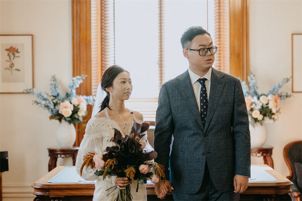
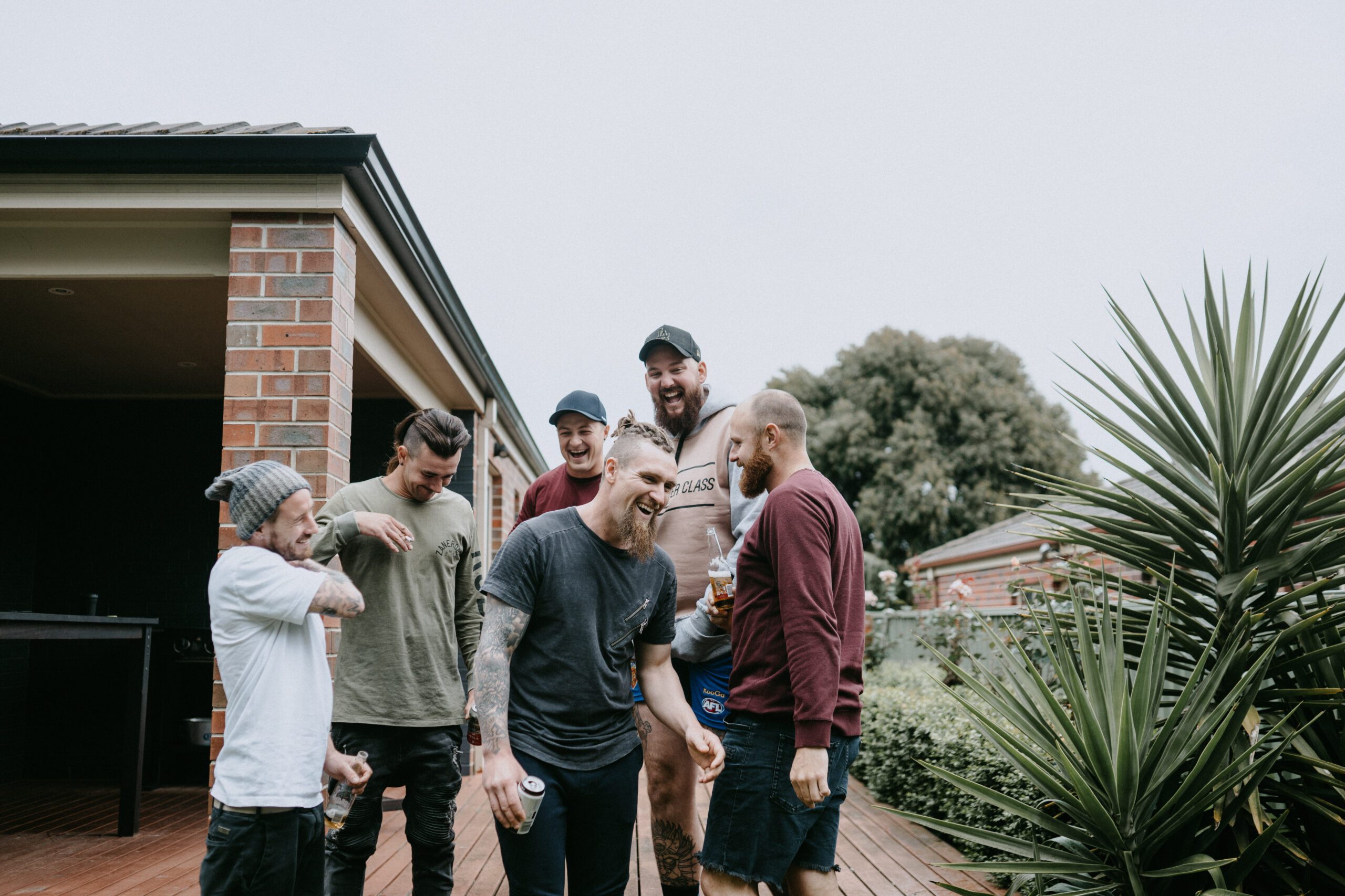
Melbourne’s unique blend of urban charm and natural beauty makes it an ideal setting for wedding photography that tells a story. One way to elevate these images is by giving them a classic film-inspired look through post-processing. This style adds warmth, texture, and a nostalgic feel, making the photos feel both timeless and intimate.

Understanding the Film Aesthetic in Wedding Photography
Film photography has a distinct look that digital images often lack—soft gradients, subtle grain, and muted colors that evoke emotion and memory. When applied to wedding photos, this aesthetic can transform ordinary shots into artistic keepsakes. The key is to mimic the characteristics of film without making the edits look artificial or overdone.
Why Couples Love the Film Look
The film aesthetic appeals to couples because it feels authentic and enduring. Unlike overly polished digital images, film-inspired photos have a raw, emotional quality that captures the genuine moments of the day. The softness, grain, and color shifts also add a sense of nostalgia, as if the images were pulled from a cherished family album.
Key Elements of a Film-Inspired Edit
To achieve a convincing film look, focus on these core elements:
- Color Grading: Film often has a unique color palette, with slightly muted tones and a warm or cool bias depending on the stock.
- Grain and Texture: Film has a natural grain structure that adds depth and character to images.
- Contrast and Highlights: Film tends to handle highlights differently, with a softer roll-off and less harsh shadows.
- Vignetting: Subtle darkening around the edges can draw the viewer’s eye to the center of the image, mimicking the natural fall-off of light in film.
Adjusting Color Grading for a Film-Inspired Look
Color grading is the most critical step in creating a film aesthetic. The goal is to shift the colors away from the bright, clinical look of digital and toward a more organic, muted palette.
Creating a Warm, Nostalgic Tone
Many film stocks, especially those from the 1970s and 1980s, have a warm, golden hue. To replicate this:
- White Balance: Slightly warm the white balance by adjusting the temperature slider toward yellow/orange. Avoid making it too extreme, as this can look unnatural.
- Color Sliders: Reduce the saturation of bright colors like blues and greens, while boosting the warmth in reds and yellows. This creates a more balanced, vintage feel.
- Split Toning: Add a subtle warm tone to the highlights (e.g., a light gold) and a cooler tone to the shadows (e.g., a soft blue-gray). This mimics the way film reacts to different light intensities.
Muting Bright Colors for a Timeless Feel
Film rarely has the hyper-saturated colors seen in modern digital photos. To soften the palette:
- Lower Saturation: Reduce the overall saturation slightly, then fine-tune individual colors. For example, tone down the vibrancy of greens in foliage or blues in the sky.
- Desaturate Highlights: Use a selective adjustment tool to desaturate the brightest parts of the image, such as white dresses or sunny skies. This prevents harsh, overexposed looks and creates a more cohesive tone.
- Add a Tint: Some film stocks have a slight color cast, like a faint pink or green tint. Experiment with adding a subtle tint to the midtones for an authentic touch.
Adding Grain and Texture for Authenticity
Grain is a hallmark of film photography, adding a tactile quality that digital images often lack. The key is to apply it in a way that looks natural and enhances the mood.
Choosing the Right Grain Type
Not all grain is created equal. Fine-grain film (like Kodak Portra) has a smooth, subtle texture, while high-speed film (like Ilford Delta 3200) has a more pronounced, gritty grain. For wedding photos, a medium or fine grain usually works best, as it adds character without overwhelming the image.
Applying Grain Subtly
When adding grain in post-processing:
- Start Low: Begin with a low opacity (around 5-10%) and gradually increase it until it’s noticeable but not distracting.
- Uniform Distribution: Ensure the grain is evenly applied across the image, including in the shadows and highlights.
- Match the Lighting: Grain tends to be more visible in darker areas, so adjust the settings to mimic this natural behavior.
Enhancing Texture with Clarity and Dehazing
In addition to grain, film has a unique texture that comes from its chemical composition. To replicate this:
- Clarity: Use a subtle clarity adjustment to add midtone contrast without making the image look harsh. This enhances the perception of texture.
- Dehazing: A light dehaze adjustment can add depth and richness to the colors, similar to how film renders tones. Be careful not to overdo it, as this can create an artificial look.
Fine-Tuning Contrast and Highlights for a Film-Like Feel
Film handles contrast differently than digital sensors, with softer transitions between light and dark areas. Adjusting these elements is crucial for achieving an authentic film look.
Softening the Contrast
Digital images often have high contrast, with deep blacks and bright whites. To soften this:
- Lower Contrast: Reduce the overall contrast slightly to create a more gentle tonal range.
- Adjust Blacks and Whites: Bring down the blacks slightly to avoid deep, inky shadows, and reduce the whites to prevent harsh overexposure. This creates a flatter, more film-like base.
- Use Curves: A subtle S-curve in the tone curve panel can add a touch of contrast without making the image look digital. Focus on the midtones for a natural effect.
Managing Highlights for a Dreamy Effect
Film highlights tend to bloom and roll off softly, rather than clipping abruptly. To replicate this:
- Highlight Recovery: If the image has overexposed areas, use the highlight slider to recover detail without making the highlights look flat.
- Add Bloom: Some film stocks have a slight glow in the highlights, especially in backlit shots. Use a radial filter or brush tool to add a soft, warm glow to bright areas like the bride’s veil or the groom’s suit.
- Reduce Clarity in Highlights: Applying negative clarity to the brightest parts of the image can create a soft, ethereal effect, similar to how film renders light.
Incorporating Vignetting for a Classic Film Frame
Vignetting—the darkening of the edges of an image—is a common feature in film photography, especially with older lenses or certain film stocks. When used subtly, it can enhance the mood and focus the viewer’s attention on the couple.
Natural-Looking Vignetting Techniques
To avoid an obvious, artificial vignette:
- Start Soft: Use a low feather setting and a gentle opacity (around 10-15%) to create a subtle, natural fall-off.
- Match the Lighting: Adjust the vignette’s shape and size to mimic how light naturally fades at the edges of a frame. For example, a wider vignette works better for landscape-oriented shots, while a tighter one suits portraits.
- Add Midtone Darkening: Instead of just darkening the edges, try reducing the exposure or brightness in the midtones of the vignette area. This creates a more organic transition between the center and the edges.
Using Vignetting to Enhance Composition
Vignetting can also be used strategically to improve the composition:
- Draw Attention to the Subject: Place the vignette’s center slightly off-center to align with the couple’s position in the frame, guiding the viewer’s eye naturally.
- Balance Bright Areas: If the image has a bright sky or window in the background, a vignette can help balance the exposure and prevent the viewer’s attention from drifting away from the couple.
- Create Mood: A stronger vignette can add drama or intimacy to the image, depending on the overall tone of the wedding. Use it sparingly to avoid overwhelming the photo.
Final Touches for a Cohesive Film-Inspired Album
Once the individual edits are complete, review the entire album to ensure consistency in style and tone.
Consistent Color Grading
Make sure all images share a similar color palette, even if they were taken in different lighting conditions. This creates a cohesive look throughout the album.
Balanced Grain and Texture
Check that the grain and texture adjustments are uniform across all photos. Some images may need slightly more or less grain depending on their composition, but the overall effect should feel consistent.
Natural-Looking Edits
Step back and view the images as a whole to ensure the edits don’t look forced or artificial. The goal is to enhance the photos’ natural beauty, not to create a heavy-handed, stylized look.
By focusing on these elements—color grading, grain and texture, contrast and highlights, and vignetting—you can transform Melbourne wedding photos into timeless, film-inspired masterpieces that couples will treasure forever.