Color matching suggestions for interior clothing in Melbourne wedding photography
Color matching suggestions for interior clothing in Melbourne wedding photography
Melbourne Wedding Photography Indoor Attire Color Coordination: Crafting Timeless Elegance
Indoor wedding photography in Melbourne thrives on harmonious color palettes that reflect the city’s blend of modern sophistication and natural charm. Whether shooting in loft-style venues or heritage-listed spaces, the right attire color combinations can elevate portraits, ensuring couples radiate confidence and cohesion. Below are nuanced strategies to master indoor color coordination without relying on rigid rules.
Neutral Foundations: Timeless Sophistication for Indoor Settings
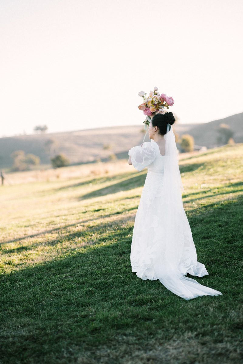
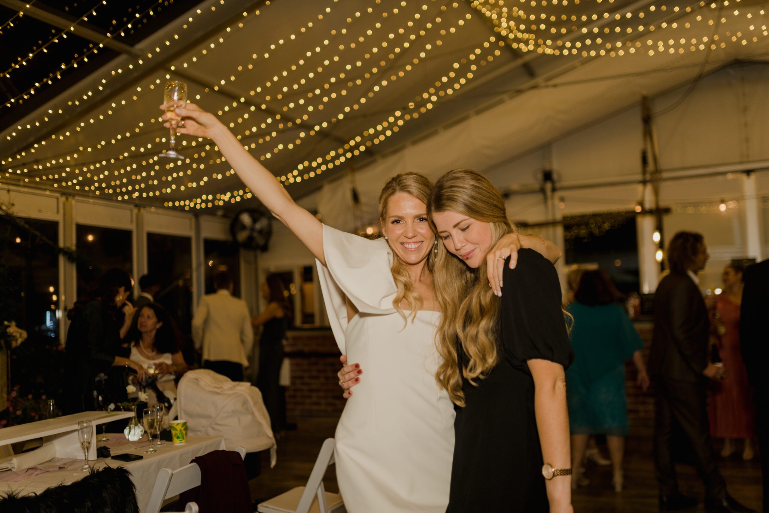
Neutral tones form the backbone of indoor wedding attire, offering versatility that complements Melbourne’s eclectic interior styles. Ivory, champagne, and soft beige gowns create a luminous base, especially when paired with natural light streaming through large windows—a common feature in Melbourne’s converted warehouses or art galleries. For grooms, charcoal, taupe, or slate suits provide a polished contrast without overwhelming the scene.
Layering neutrals adds depth: a bride might pair an ivory lace gown with a cashmere shawl in a muted oatmeal hue, while the groom could incorporate a textured tie in a similar earthy tone. This approach ensures the focus remains on the couple’s expressions and body language, rather than distracting color clashes. In venues with exposed brick or timber floors, neutral attire harmonizes with the raw textures, creating a balanced, organic aesthetic.
Bold Accents: Adding Personality to Indoor Portraits
While neutrals dominate, strategic pops of color inject personality and narrative into indoor shots. Melbourne’s creative subcultures inspire couples to experiment with bold hues that reflect their shared interests or cultural heritage. For instance, a deep burgundy sash on a bride’s gown or a groomsmen’s tie in emerald green can symbolize passion and growth, especially when set against minimalist backgrounds like white walls or concrete floors.
When incorporating bold colors, limit them to one or two elements per outfit to avoid visual overload. A bride might choose a statement necklace in cobalt blue, while the groom wears a pocket square in the same shade, creating a subtle yet cohesive link. In venues with industrial features, such as metal beams or pendant lighting, these accents can mirror the space’s modernity, tying the couple’s style to the environment.
Monochromatic Schemes: Creating Visual Harmony
Monochromatic color palettes—where both partners wear varying shades of the same hue—create a striking, unified look ideal for indoor photography. For example, a bride in a dusty rose gown paired with a groom in a blush-toned suit exudes romance and softness, particularly in venues with pastel-colored decor or floral installations. This approach works seamlessly in Melbourne’s boutique hotels or garden-inspired ballrooms, where the environment’s color scheme can guide the couple’s choices.
To prevent monotony, vary textures and tones within the same color family. A satin bridesmaid’s dress in slate gray can contrast beautifully with a groom’s tweed suit in charcoal, adding dimension without breaking the monochromatic theme. This technique also simplifies group coordination, as attendants can choose shades that flatters their skin tone while staying within the palette.
Complementary Contrasts: Balancing Light and Dark
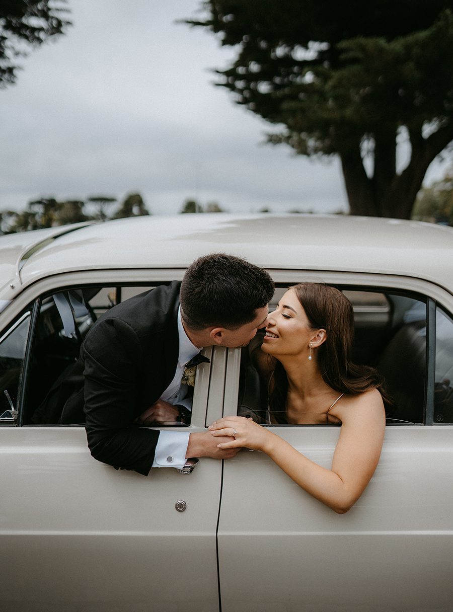
Pairing light and dark tones creates dynamic contrasts that draw attention to the couple’s features. A bride in a stark white gown against a groom’s black tuxedo is a classic choice, but modern twists—like a bride in a creamy off-white dress with a groom in navy blue—add depth and sophistication. This strategy works particularly well in Melbourne’s contemporary venues, where clean lines and open spaces highlight the interplay of light and shadow.
For a softer contrast, consider pairing a bride in a blush pink gown with a groom in a muted olive green suit. These hues, found naturally in Melbourne’s parks and gardens, create a grounded, earthy feel. When photographing in venues with large mirrors or reflective surfaces, complementary colors enhance symmetry and balance, making the couple appear both connected and distinct.
Texture and Tone: Elevating Colors Through Fabric Choices
The texture of fabrics influences how colors appear in indoor lighting. Matte finishes, like linen or raw silk, absorb light and create a subdued effect, ideal for muted palettes. Conversely, satin or velvet reflects light, making bold colors pop. A bride in a deep burgundy velvet gown will photograph differently in a dimly lit, candlelit room versus a brightly lit studio with white walls.
To adapt to Melbourne’s varied indoor lighting, couples can mix textures within their outfits. A groom might pair a wool suit with a silk tie, while the bride layers a lace overlay on a satin underdress. This interplay of textures ensures colors remain vibrant or subdued as needed, depending on the venue’s ambiance.
By thoughtfully combining neutrals, bold accents, monochromatic schemes, and complementary contrasts, couples can create indoor wedding attire that feels both timeless and uniquely their own. Melbourne’s diverse venues provide the perfect canvas to experiment with color, ensuring every photograph tells a story of love, style, and harmony.