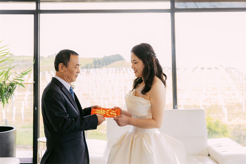
Melbourne wedding photography - uniform color tone adjustment for editing
Melbourne wedding photography - uniform color tone adjustment for editing
Achieving Consistent Color Tone in Melbourne Wedding Photography Editing
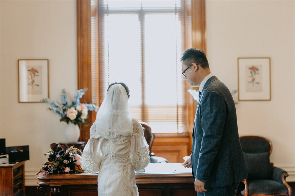
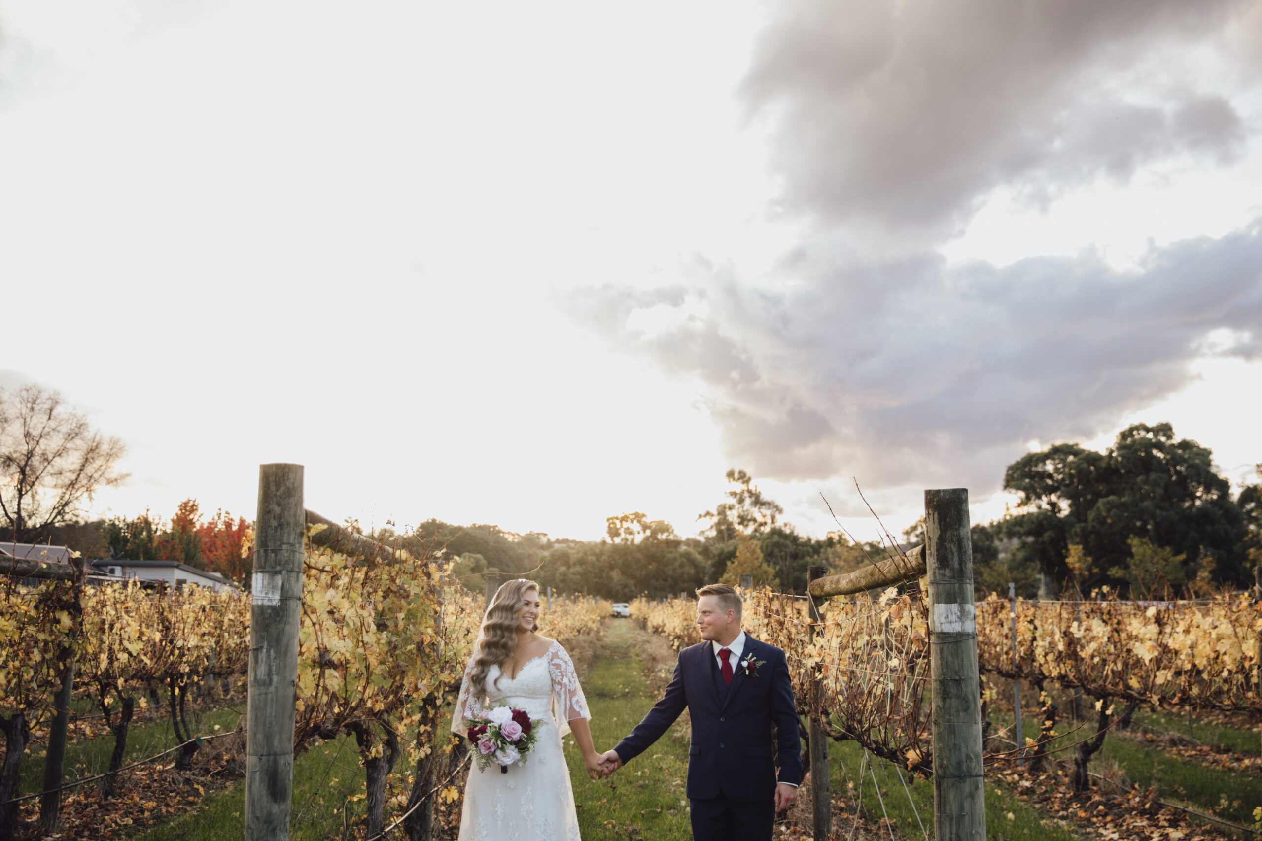
When it comes to wedding photography in Melbourne, a city known for its diverse landscapes and vibrant cultural scenes, achieving a consistent color tone across all images is crucial for creating a cohesive and visually appealing album. Whether you’re capturing the romantic charm of the Yarra Valley or the timeless elegance of the Royal Exhibition Building, here are some essential tips to ensure your wedding photos have a unified and polished look.
Understanding the Importance of Color Consistency
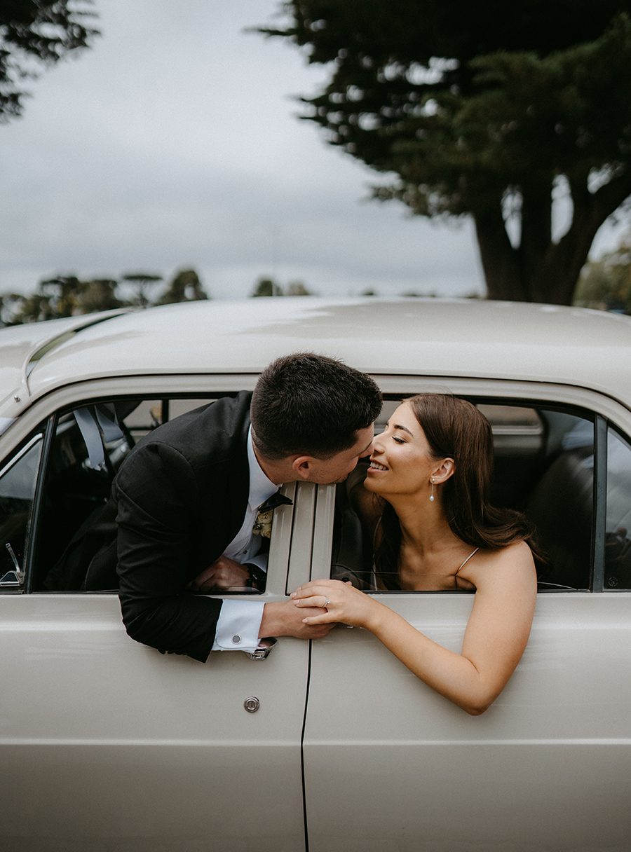
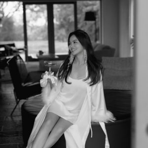
Color consistency plays a pivotal role in storytelling through wedding photography. It helps to establish a mood, evoke emotions, and create a seamless narrative that flows from one image to the next. Inconsistent colors can disrupt this flow, making the album feel disjointed and less professional. By maintaining a consistent color palette, you can enhance the overall aesthetic appeal of your wedding photos and ensure they stand the test of time.
Analyzing the Scene and Lighting Conditions
Before diving into the editing process, it’s essential to analyze the scene and lighting conditions of each photo. Melbourne’s weather can be unpredictable, with sudden changes in light intensity and color temperature. For instance, a sunny day might cast a warm, golden hue, while an overcast sky could result in cooler, bluish tones. Understanding these variations will help you determine the appropriate color adjustments needed to achieve consistency.
Start by examining the white balance of your images. If the colors appear too warm or too cool, use the white balance tool in your editing software to correct them. This step is crucial for ensuring that skin tones look natural and that the overall color palette remains balanced.
Utilizing Color Grading Techniques
Color grading is a powerful tool for achieving a consistent color tone across your wedding photos. It involves adjusting the colors in your images to create a specific mood or atmosphere. Here are some key color grading techniques to consider:
- Adjusting Hue, Saturation, and Luminance (HSL): The HSL panel allows you to fine-tune the colors in your photos by adjusting their hue, saturation, and luminance. For example, if you want to create a warm, romantic look, you might increase the saturation of reds and oranges while decreasing the saturation of blues and greens. Conversely, if you prefer a cooler, more serene atmosphere, you could do the opposite.
- Applying Color Lookup Tables (LUTs): LUTs are pre-defined color grading presets that can be applied to your images to achieve a specific look. They’re particularly useful for quickly achieving a consistent color tone across multiple photos. Many editing software programs come with built-in LUTs, or you can create your own custom LUTs based on your preferred color palette.
- Using Gradient Maps: Gradient maps are another effective tool for color grading. They allow you to map specific colors to different tonal ranges in your image, creating a unique and customized look. For instance, you could use a gradient map to add a subtle pink hue to the highlights and shadows of your photos, giving them a soft, dreamy quality.
Ensuring Consistency Across Different Shots
Achieving color consistency isn’t just about adjusting individual photos; it’s also about ensuring that all the images in your wedding album look cohesive when viewed together. Here are some strategies to help you maintain consistency across different shots:
- Batch Editing: If you have a large number of photos to edit, consider using batch editing techniques to apply the same color adjustments to multiple images at once. This can save you a significant amount of time and ensure that all your photos have a similar look and feel.
- Creating a Style Guide: Before you start editing, create a style guide that outlines your preferred color palette, tone, and mood. Use this guide as a reference throughout the editing process to ensure that all your photos adhere to the same visual standards.
- Regularly Reviewing Your Work: As you edit your photos, take regular breaks to review your work and ensure that the color tone remains consistent. It can be helpful to view your photos side by side or in a slideshow format to get a better sense of how they look together.
Conclusion
Achieving consistent color tone in Melbourne wedding photography editing requires a combination of technical skill and artistic vision. By understanding the importance of color consistency, analyzing the scene and lighting conditions, utilizing color grading techniques, and ensuring consistency across different shots, you can create a wedding album that’s visually stunning and emotionally resonant. Remember, the goal is to tell a story through your photos, and a consistent color tone is a key element in making that story come to life.